I’ve reviewed many different website designs for optimal user experience and aesthetics and found that the best websites all have the same things in common: an amazing user experience, strong visual appeal, and a clear conversion path.

I’ve collected 24 contractor websites that meet all of the criteria above. Some websites will be better at a specific aspect of design than others. I picked these websites in equal parts to show you what to do (and in some cases, what not to do). Let’s get started.
Best Contractor Websites
- Saba Stones
- Construction Sales
- Gordon Mitchell Contractors
- Owings Brothers Contracting
- Structure Corp
- Green Mountain Turf
- CDS Framing
- The Contractor
- Findlay Roofing
- Stortford Interiors
- Automatic Doorz
- HITT
- GTA Builders
- Milford Global
- List GC
- IEC Chesapeake
- A to Z Renovations NYC
- White Star General Contractors
- Lumina Builders
- Elite Remodeling and Design SD
- All In Service Group
- 4ever Remodeling
- Oasis Renovation and Construction
A contractor is someone who oversees certain aspects of construction projects. It’s easy to confuse a general contractor with a construction company, but while a construction company has multiple workers and handles projects, a contractor is generally an independent entity that can also work under a construction company.
1. Saba Stones
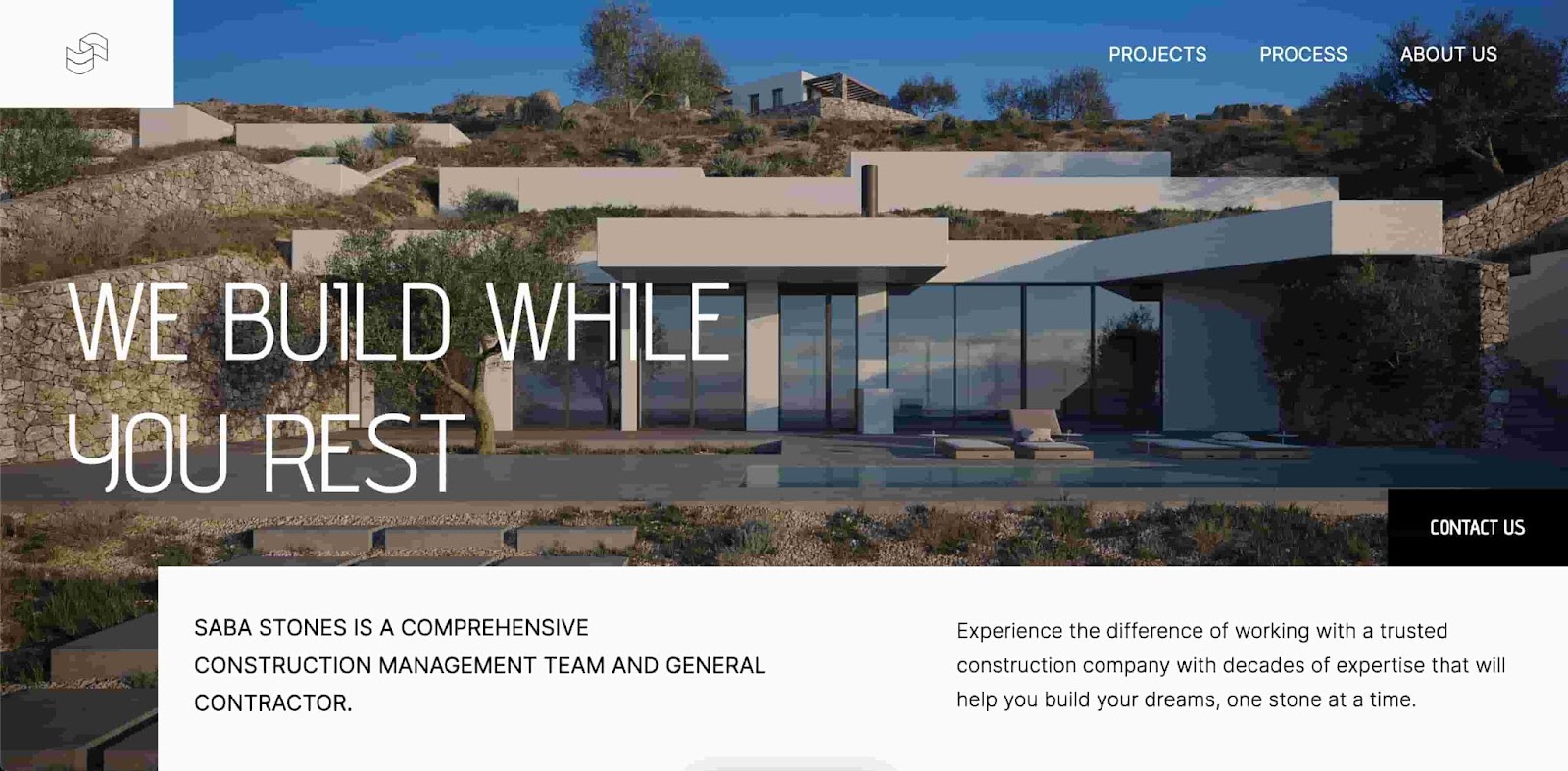
Saba Stones stands out for its exceptional attention to design details, user-friendly interface, and immersive visual experience. It effectively showcases the brand's unique collection, leaving visitors with a lasting impression of quality and style. The background visuals foster trust with website visitors and add credibility to Saba Stone’s services.
What’s not to like on this website? The expert use of typography contrasted with the background draws attention to where the designers want you to look. The design choice of a white footer with black font is also great for accessibility.
However, there is room for improvement in the conversion path. The “Contact Us” CTA has a black background in a place where the image is also somewhat dark, making the button difficult to spot if you’re not looking for it.
2. Construction Sales
The use of a minimalist color palette and ample white space on the Construction Sales site creates a sense of sophistication and elegance. The clear and well-organized navigation allows users to easily find relevant information and browse through different construction products and services. Additionally, a clear image adds visual interest and reinforces the credibility of the brand.
I like this website because it’s a prime example of how less can be more. The message is clear, and the website is easy to navigate and accessible to all users. The CTA is strategically placed in the header along with other website pages. If you want to create a simple yet effective website, this inspiration is for you.
3. Gordon Mitchell Contractors
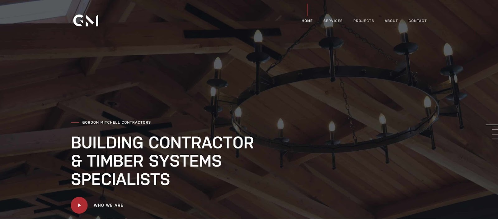
Gordon Mitchell Contractors showcases a unique design with a subdued color palette that immediately catches your eye. Combining different fonts may be less conventional, but it adds a bold touch to the overall aesthetic in our opinion. Additionally, the rotating GIFs demonstrate a level of creativity that sets this website apart, making it stand out.
This website is well-designed, with particular attention to detail. Video is one of the most effective ways to reach your audience, with a 53% engagement rate. The design is also effective in diverting your eyes to the white font contrasted against the darker background to make the navigation links pop.
4. Acclaim Contractors
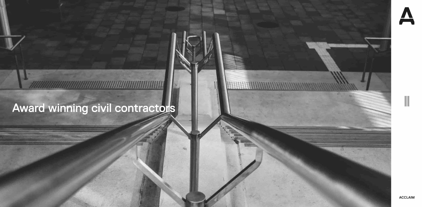
The Acclaim Contractors website showcases a clean and modern design that would make any designer proud. The color scheme provides a pleasant visual experience, making you feel like you're strolling through a beautifully designed home. The navigation is as smooth as a freshly polished floor, guiding users effortlessly to explore different services. And the clever use of animations brings a touch of playfulness, making it a delightful and engaging experience.
I love how sleek this website is. The black-and-white color scheme gives a sense of professionalism and matches the minimalist aesthetic of the rest of the website. Scrolling down takes you to the website's story and featured projects to build social proof.
You can also navigate the site through the three lines on the side, a cool way to match the aesthetic of the website while giving users functionality as well. I don’t have any notes on this website — it’s the bee’s knees.
5. Owings Brothers Contracting
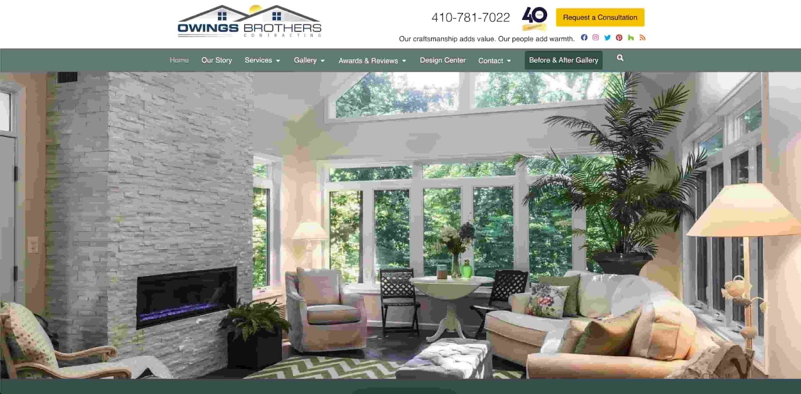
Owings Brothers’ web design takes you straight into a luxurious and stately home. The emphasis on greenery and simple navigation create a sense of craftsmanship and expertise. The intuitive navigation guides visitors through the various services offered, making it easy to find what they need. The thoughtful use of high-quality imagery and informative content creates a visually pleasing and informative browsing experience.
I can’t really put my finger on it, but this website just exudes professionalism. You get the sense that you’ll be working with someone with years of experience just by looking at the webpage. There’s nothing fancy about this website. It does exactly what you need for a website, exactly how you’d expect, in a modernized old-school package.
This is also my favorite example for CTAs. The “Request a Consultation” button is in yellow and contrasted against a white background. Scrolling down takes you to glowing customer testimonials and a branding video that takes you through the family business. This is a great website for anyone who doesn’t want something too fancy that still looks and functions well.
6. Structure Corp
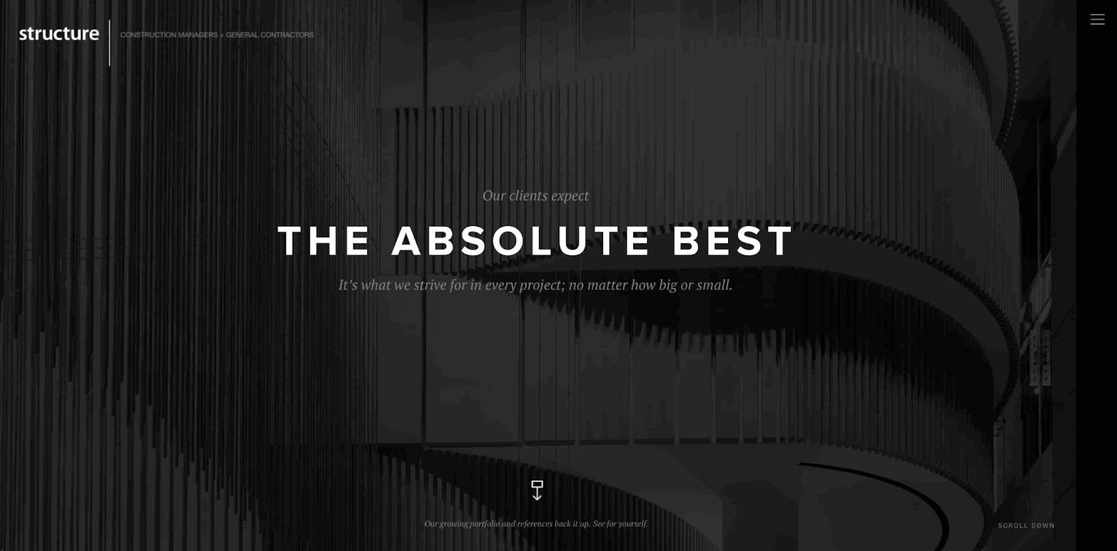
Structure Corp’s website's design is sleek and modern, like a shiny new skyscraper. The clean layout and strategic use of whitespace create a sense of sophistication and professionalism. The navigation is as smooth as well-oiled machinery, effortlessly guiding users through the wide range of services offered. With its seamless blend of form and function, this website is a true testament to the art of structural design.
If you visit this website, you may know what I’m going to say: This website is not secure! In other words, it doesn’t have an SSL certificate. Websites that are not SSL-protected have a lower user trust score, lower SEO performance, and are more prone to security breaches. The design of this website is great, but if you want to get a good review on Madhu’s prestigious website design lists, your website needs to be secure.
7. Green Mountain Turf
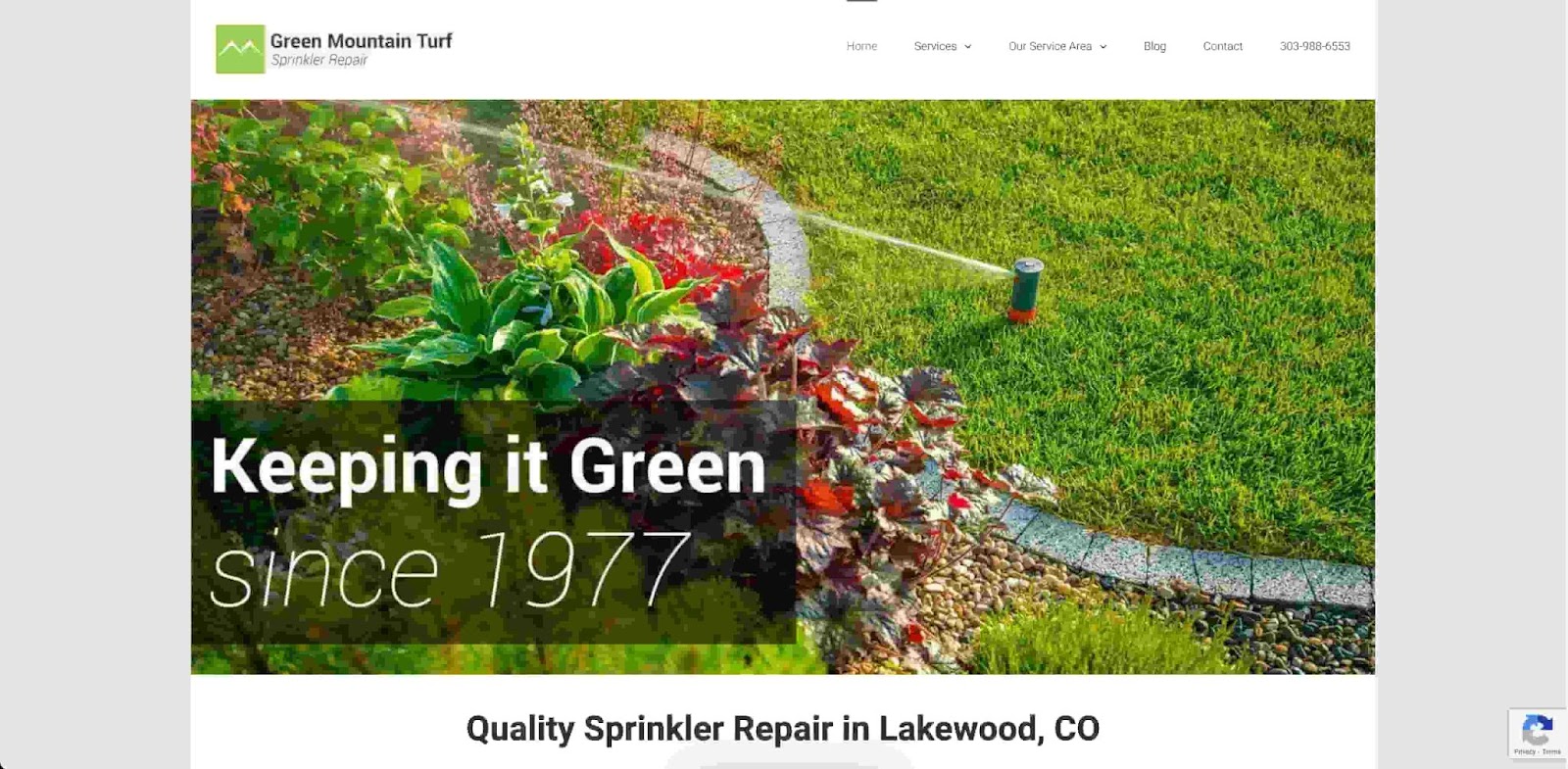
Green Mountain Turf’s design is like a breath of fresh air, with a soothing color palette that evokes lush landscapes and vibrant greenery. The clean and organized layout ensures that visitors can easily navigate through the various turf products and services. The use of high-quality imagery showcases the beauty and versatility of its turf offerings, making you want to kick off your shoes and enjoy the grass.
This is another great example of a website that just works. Visually, it could be cleaner by removing the gray bars on the side and extending the background color of each partition. Otherwise, it really checks all the boxes: social proof, CTA, storytelling, and navigation.
8. CDS Framing
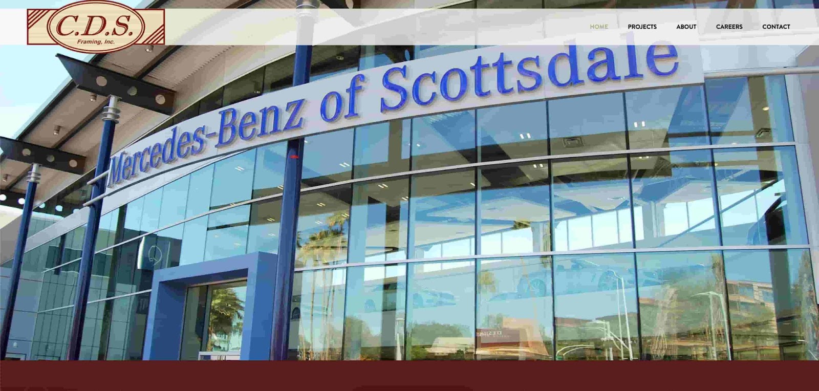
CDS Framing strikes a balance between elegance and functionality. The rotating background images and clean layout create a professional and refined aesthetic. The simple and intuitive navigation allows users to explore the various framing solutions and services offered.
The CDS branding is a really nice touch to a clean layout. The navigability is solid, as there’s a contrasting white header with black menu options to make it crystal clear how to get to which page. The rotating backgrounds keep visitors engaged while serving the dual purpose of showcasing past projects.
Still, I’d say this website does lack social proof, and the CTA could be better placed as you’ll see in some other examples. But overall, CDS Framing does a solid job without missing anything major.
9. The Contractor
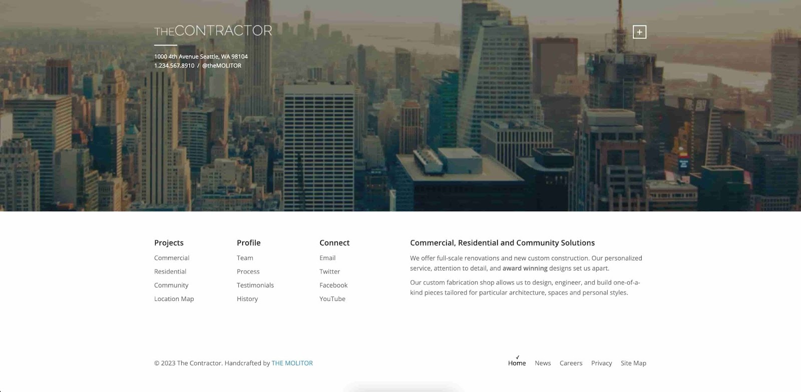
The modern and eye-catching layout of The Contractor’s website grabs your attention from the moment you arrive. The combination of bold colors and the striking Seattle skyline creates a dynamic and engaging visual experience.
The well-placed navigation allows visitors to effortlessly explore the different sections and discover the vast array of contractor-themed templates and features. This website truly showcases the creativity and versatility of TheMolitor's designs, making it a standout in the world of website themes.
While the website is tastefully done, I do have to dock some points because it isn’t self-hosted by the contractor. This takes a little bit of professionalism away from the overall website experience.
That aside, the design has a lot of great takeaways. The use of whitespace underneath the Seattle backdrop is a simple but effective way to drive visitors to the important parts of the website.
10. Findlay Roofing
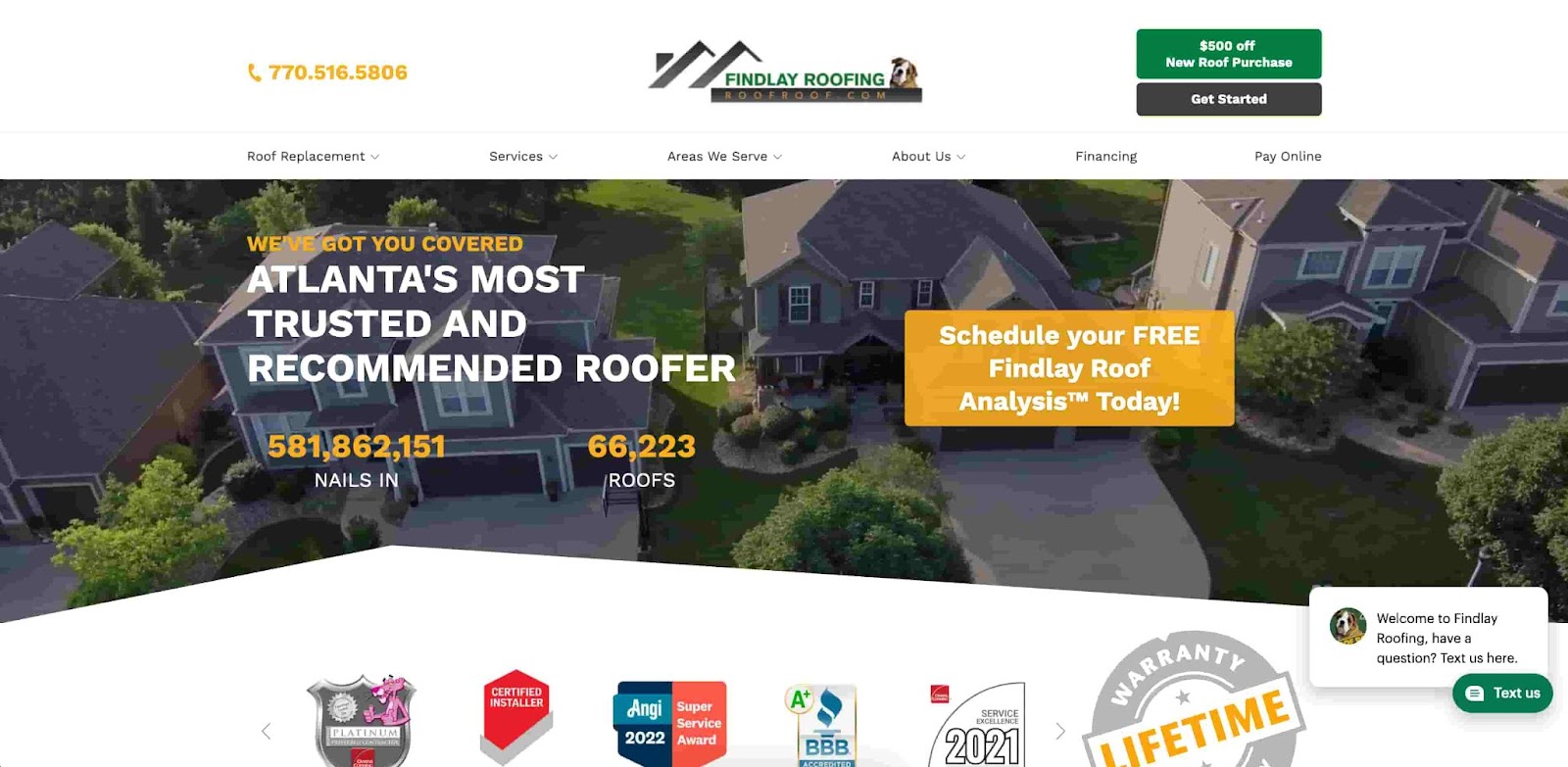
Findlay Roofing’s clean and organized layout makes it easy for visitors to find the information they need, whether it's about roof repair, installation, or other services. The use of high-quality imagery showcases the quality of their work and instills confidence in their services.
This website isn’t the cleanest design of all the websites I’ve listed, but it passes every checkbox with flying colors. The CTA is front-and-center in front of a tasteful, bright orange backdrop: “Schedule your FREE Findlay Roof Analysis Today!” The social proof is also fun and interactive, showing just how many roofs Findlay has covered and even the number of nails the business has installed. This conveys an attention to detail you might not get from other businesses in the area.
Take notes from Findlay Roofing. You don’t need an artistic homepage to have an effective website design.
11. Stortford Interiors
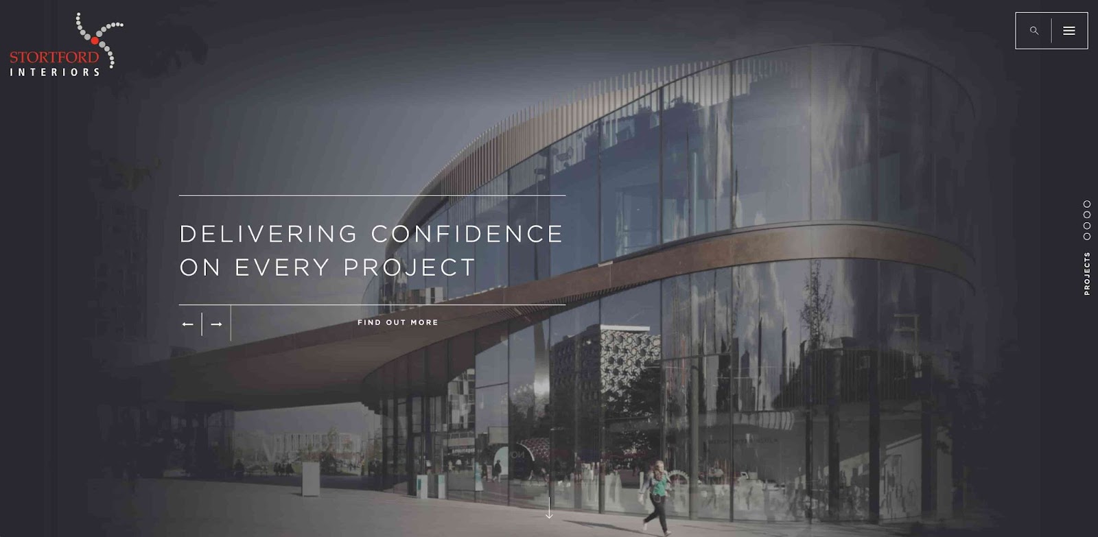
Stortford Interiors’ website is a visual feast, with its elegant and sophisticated layout that exudes luxury and craftsmanship. The tasteful color palette and refined typography create a refined and polished aesthetic that reflects the brand's expertise. The intuitive navigation allows users to effortlessly explore the diverse range of interior solutions and projects showcased.
Stortford Interiors prioritizes a classy design to convey the message that it is a professional business that takes its job seriously. The visual appeal of this website speaks for itself: beautiful imagery, an understated font, and intuitive navigation.
The accessibility of this website could be improved, as it isn’t immediately clear how to get to where you want to go if you miss the search bar and drop-down menu in the top right corner. But, overall, I think this is a well-designed website that effectively represents the Stortford Interiors brand.
12. Automatic Doorz
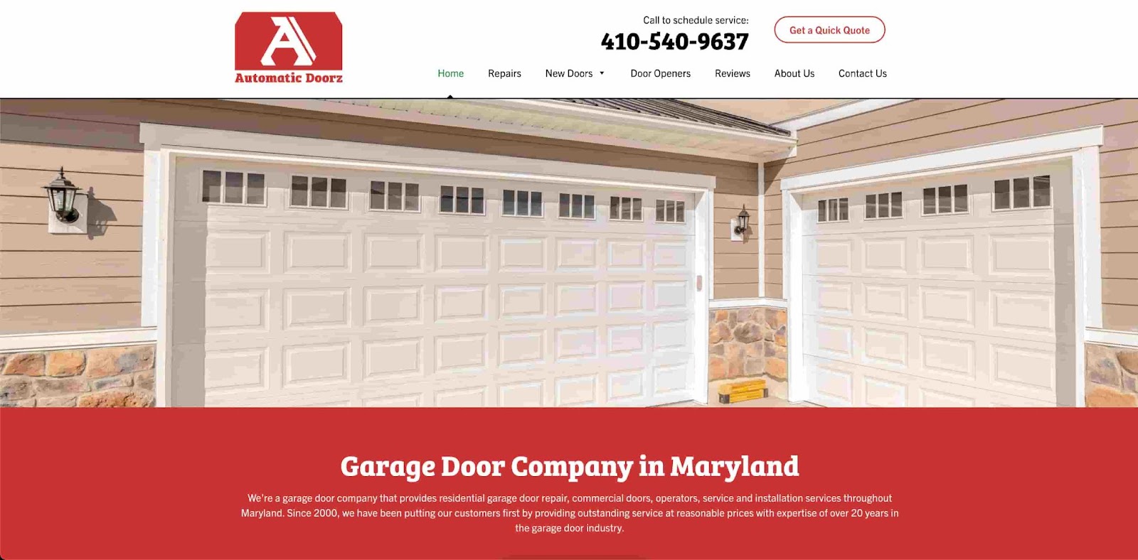
The first words that come to my mind for Automatic Doorz’s website are straightforward and user-friendly, emphasizing functionality and ease of use. The clean layout and clear navigation make it simple for visitors to find the information they need about the business’ services. With its streamlined design, this website ensures a seamless browsing experience for anyone searching for reliable automatic door solutions.
Despite the lack of fancy visuals, you can walk away from the website knowing exactly what the business is about and how to contact the contractors. If you’re a small business owner, this could be the website for you to emulate.
13. HITT
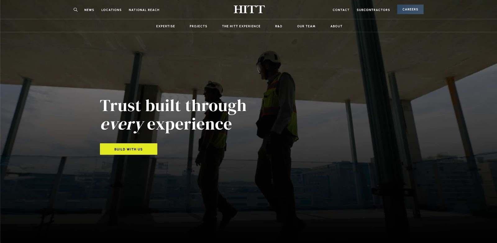
HITT’s clean layout and intuitive navigation make it a healthy source of inspiration. This website showcases HITT's commitment to quality and leaves visitors feeling in good hands.
I like how clean this website looks at a glance. Everything on this homepage is designed to lead your eyes straight to the CTA “Build With Us.” I do have to say that the website's navigability is too cluttered, with around a dozen clickable items in the header. An alternative would be using a drop-down menu to save space as some of the other websites I picked out have done.
14. GTA Builders
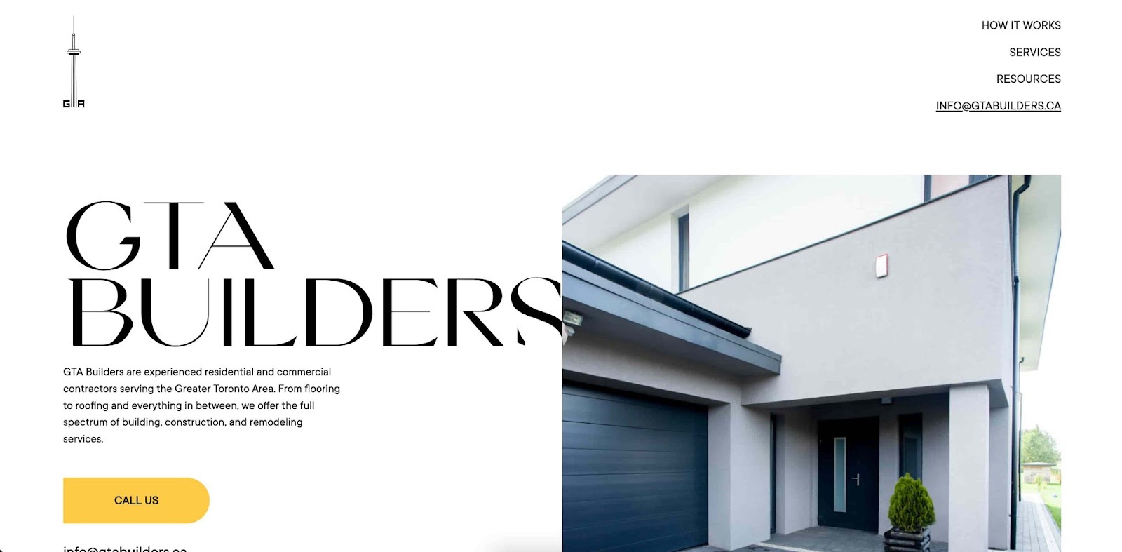
GTA Builders’ homepage features a clean and professional design that immediately conveys a sense of reliability and expertise. The color scheme is clean and the typography is easy to read and navigate. The layout is well-organized, allowing visitors to quickly find information about the company's services and view their portfolio. Overall, the design of this website reflects the professionalism and attention to detail that GTA Builders brings to their construction projects.
Plus, this is another example of how to structure your website to feature the CTA effectively. Amidst a sleek black-and-white homepage, there’s a yellow “Call Us” button. The rest of the website is sleek, and you can feel the minimalist approach to design here.
15. Milford Global
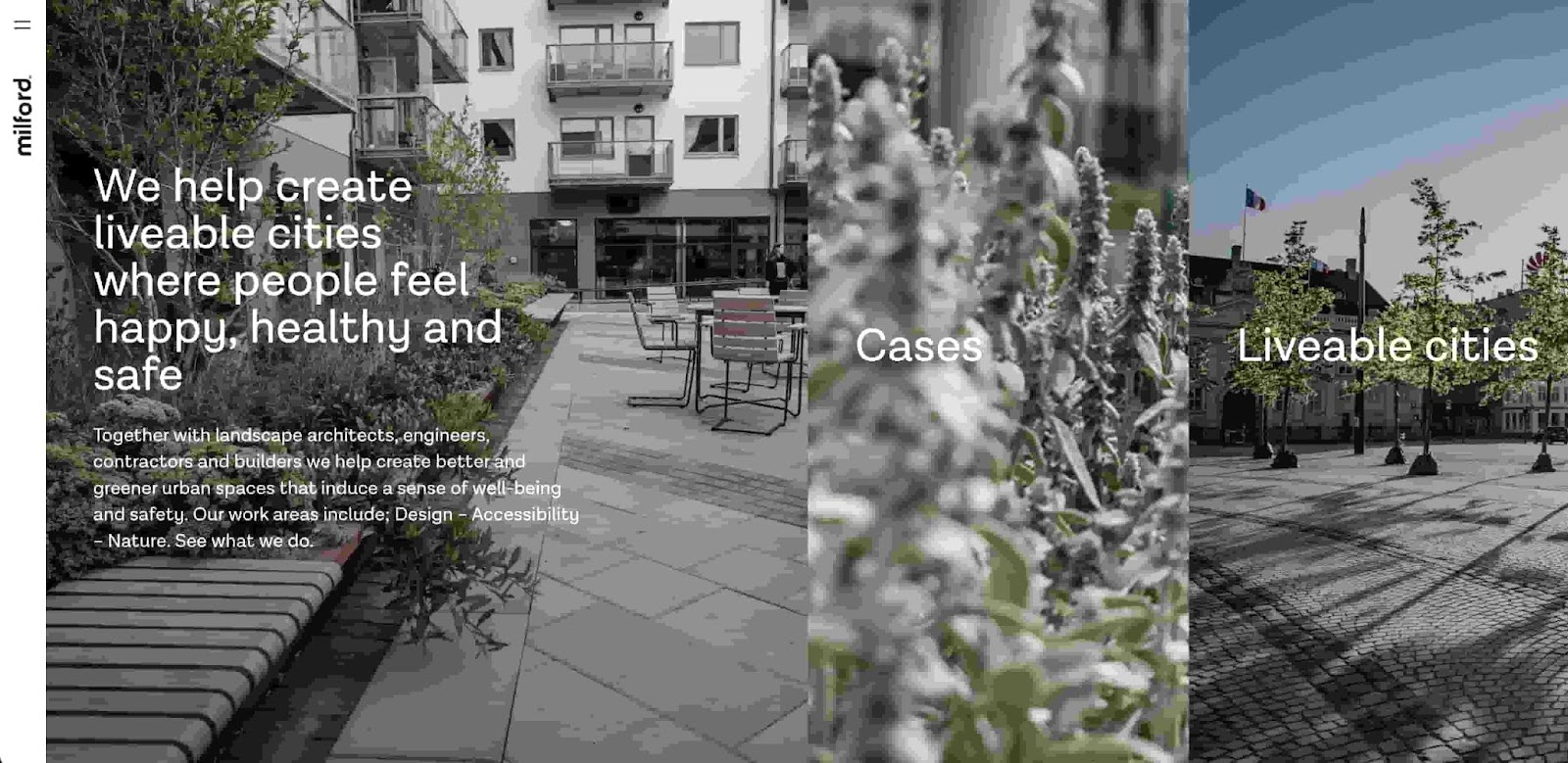
The Milford Global website embraces the spirit of innovation and sophistication that defines healthy urban development. With its unique layout and engaging color scheme, it's like a virtual canvas showcasing the firm’s transformative projects.
Navigating through the website feels like strolling in a well-planned city, effortlessly discovering their impressive portfolio. Milford Global's commitment to creating vibrant and sustainable communities shines through in this personable and captivating design.
Milford Global’s mission is to create livable cities and communities. I love the navigability of this website for what it brings to the table that other websites don’t. Simply scrolling through the homepage is fun and feels natural. I think this is a great example for businesses that have a greater mission or purpose and want to embody that through a website.
16. List GC
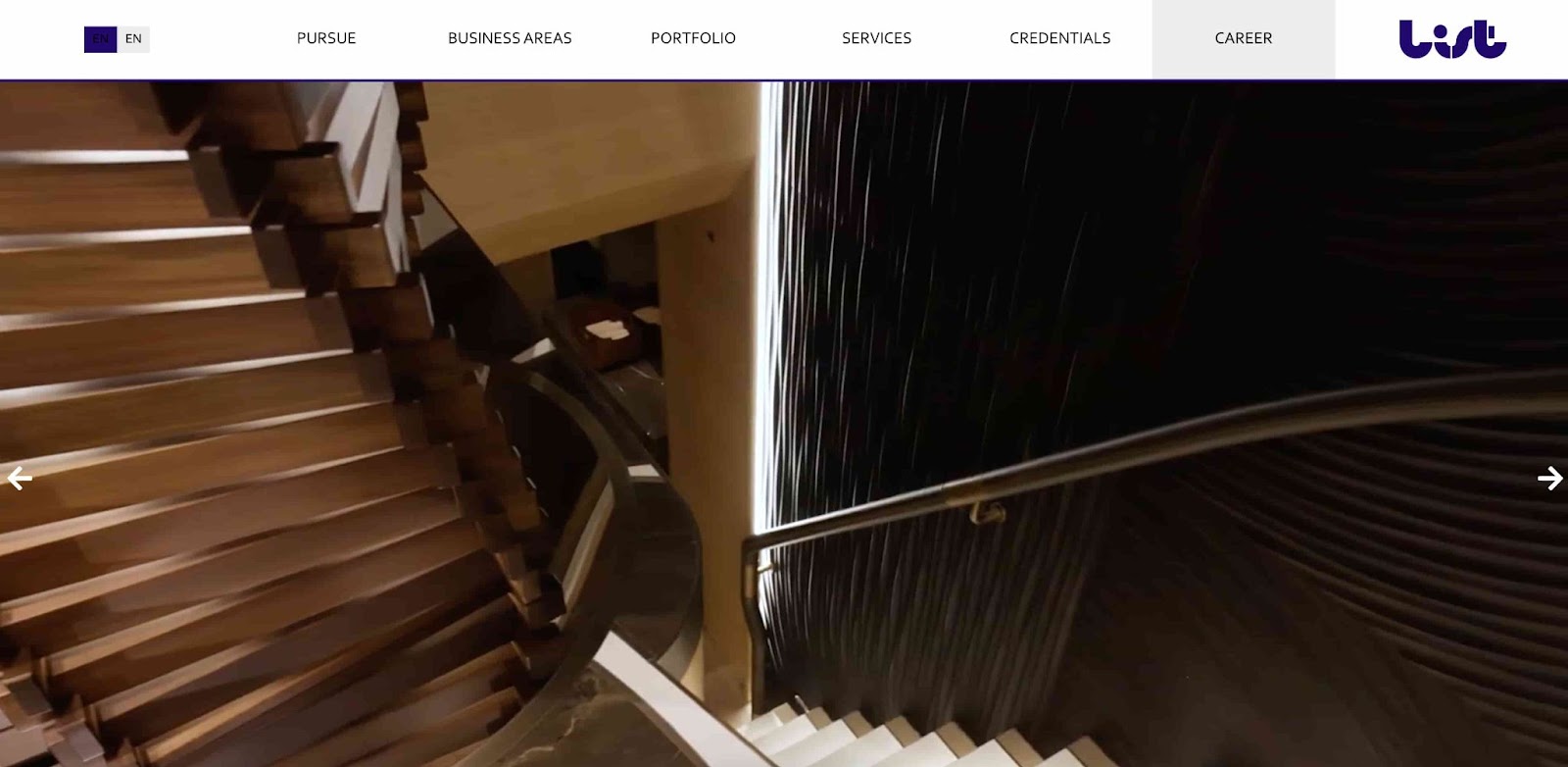
List GC’s website is a masterpiece of modern design, where minimalism meets elegance. The use of a clean layout and generous whitespace allows the content to breathe, creating a sense of calm and focus. The strategic placement of striking imagery not only captivates the viewer but also adds depth and visual interest to the page. The intuitive navigation and seamless user experience make it a pleasure to explore the diverse range of services and projects showcased.
I love the minimalist approach of this website because it’s the perfect reflection of List GC’s business approach. The navigability of this website is easy to emulate, with a simple header at the top of the page where you can toggle between languages and pick which webpage you want to go to. All the boxes are checked regarding social proof, services offered, and the business story. The site is missing a clear CTA, but is otherwise a great website to emulate.
17. IEC Chesapeake
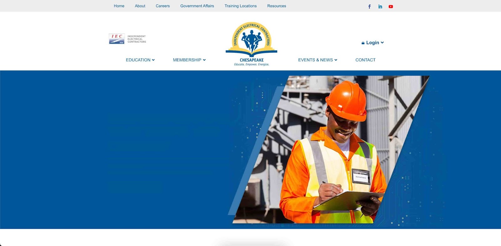
IEC Chesapeake’s website layout is well-structured, ensuring that relevant information about the services, events, and industry resources is easily accessible. Overall, the web design of this page reflects a professional and organized approach, effectively catering to the needs of the electrical contracting community in the Chesapeake region.
There are some remnants of old design philosophies, like 14 clickable buttons in the header. Generally, you want to keep that number lower, with the rest being accessible via drop-down menus. This is because too much information can make the most important parts of your website more difficult to access. By improving the website’s visual hierarchy, IEC Chesapeake can make its user experience even better.
18. A to Z Renovations
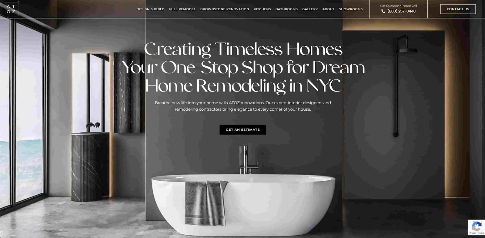
A to Z’s website design exudes a modern and stylish aesthetic that reflects the vibrant energy of New York City. The use of a clean layout and elegant typography creates a sleek and professional overall look.
While I don’t love the inflation of buttons in the header, I think this website’s copy is a great way to tell visitors exactly what your website is about and how to lead into a CTA. The white font is well contrasted with the darker background, and the beautiful backdrop gets visitors imagining what it would be like to work with these contractors.
19. White Star General Contractors
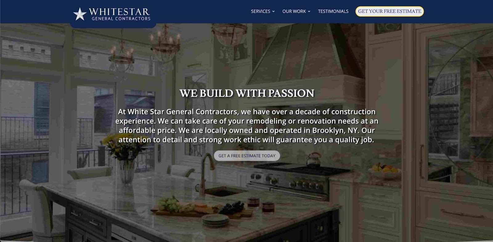
White Star General Contractors effectively uses copy to tell the story of its business. It also has a great template for CTA placement, with one right below the copy and one in the header. The CTA under the body paragraph content works because if the visitor reads through to the end of the copy, they are engaged and ready to take the next step with your website now that they feel personally connected to your business.
The header CTA effectively targets visitors who want to see if this is a reputable business and how much the job will cost. Also note how the header only has four categories, with two having drop-down menus. This is how you can make sure your website is efficient and informative.
20. Lumina Builders
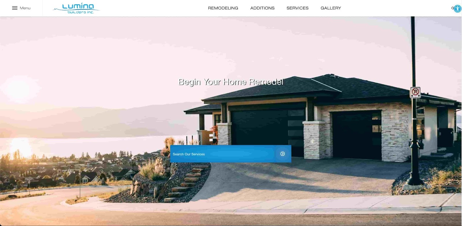
Lumina Builders is a family business, and you can tell from the website’s design. The warm colors of the image, along with a house on a street that looks nice but not cartoonishly lavish, bring about that warm fuzzy feeling in your heart.
I love this website design. The search bar in the middle is a great way to engage with customers. The strategy behind this website means that the purpose is probably to work with high-intent customers. That means if a customer has found the website, they are already likely to solicit its services.
You can tell because this website isn’t trying to convince you to use its services. You know why you’re there. The website knows that you know why you’re there. That makes it simple. This is a good example of a website for those with a loyal following built up over years of experience.
21. Elite Remodeling & Design SD
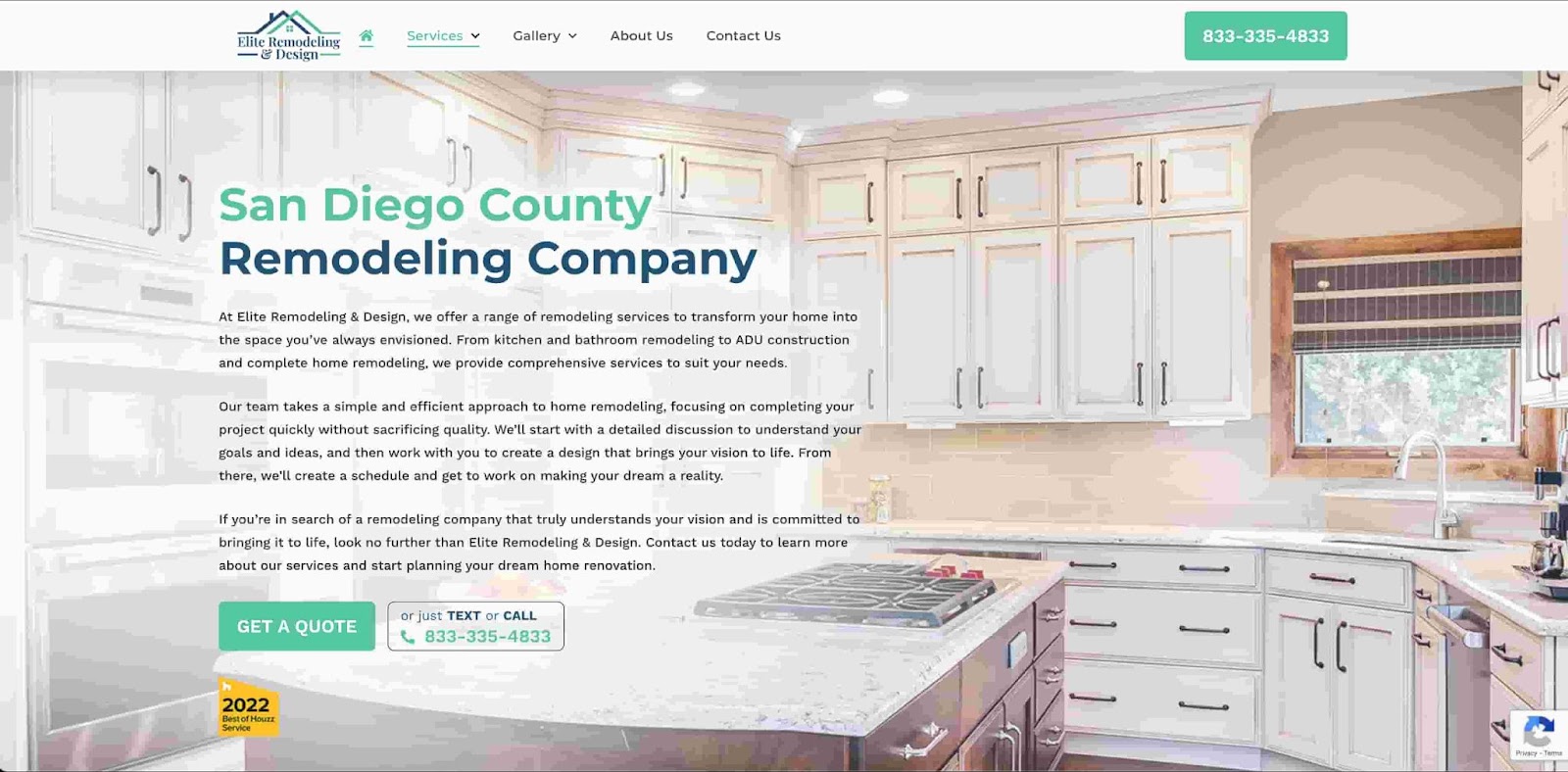
Elite Remodeling & Design SD is one of the top contractors in San Diego for home remodeling. The website design is simple but has good design practices like the use of drop-down menus and well-placed CTAs. The CTA of “Get a Quote” and the phone number in the top right are effective because of how well they contrast against the white background. There’s also social proof in the bottom left.
Where I think this website can improve is in the body copy. The font is too small and there are too many words, so visitors are likely to skim right through and straight to the CTA. This isn’t necessarily a bad thing, but other websites are more competitive in terms of using body copy for storytelling. Trust is paramount when it comes to contracting services, so making sure your body copy effectively conveys your trustworthiness is just as important.
22. All In Service Group
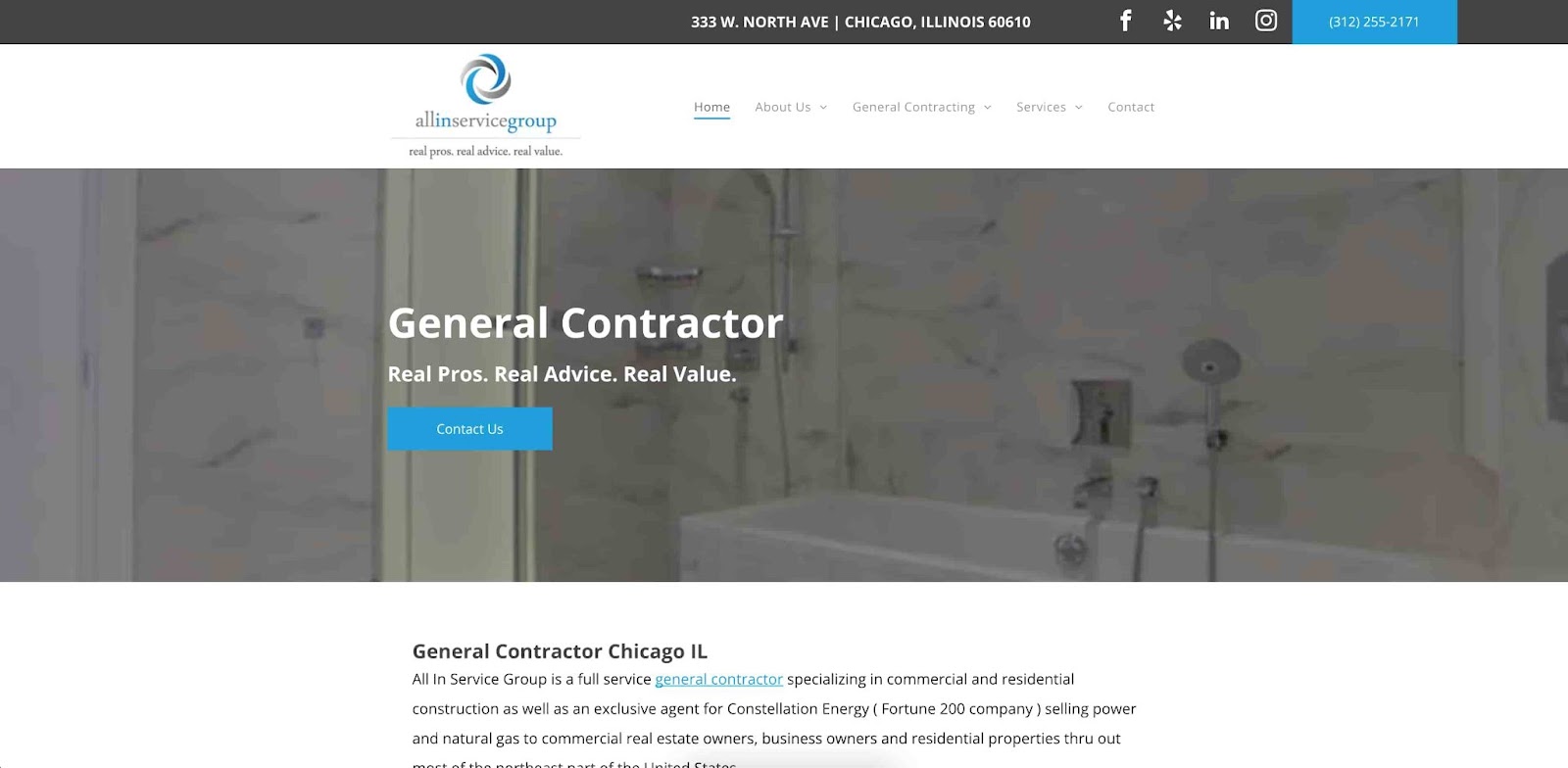
All In Service Group’s website embraces a contemporary design aesthetic that immediately catches the eye. The stunning backdrop adds a punch of energy, making browsing a delightful experience. The layout is well-structured and intuitive, allowing visitors to easily explore the diverse range of services offered.
Right off the bat, I like the social media links on the top right of the website. Social media marketing is an effective way to diversify your website traffic. The website is simple but uses contrasting methods to place emphasis on the CTA in the middle of the page. The navigability is also good, with the header having drop-down menus and only five categories.
I’d say this website could benefit from a face-lift to improve the visual appeal. Right now, it looks a little too corporate, but you could easily fix this by improving the background visuals to higher-quality images that capture visitors’ attention and showcase past work. The bones are there for a great website — this small change can make all the difference.
23. 4ever Remodeling
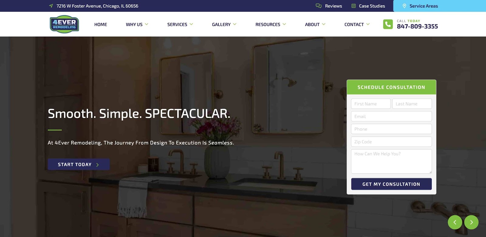
4ever Remodeling’s website is clean and delivers information to users effectively. The aesthetic does feel dated, especially the logo and the CSS form. Creating a visually pleasing CSS form can help with engagement and make your website feel more modern.
I really do like this website, in principle. All the information is easy to find, and it checks all the boxes for accessibility, engaging the visitor, and clearly placed CTA. I think there are areas for improvement with respect to visual appeal. The font choice makes the website feel robotic and lacking flair. The “why us” section can/should be combined with the “about” section.
The same goes for “gallery” and “services.” These categories are similar enough to each other that you can easily combine them and make use of the drop-down menus that are already part of the website. Overall, it’s a good model for a simple yet effective website.
24. Oasis Renovation & Construction
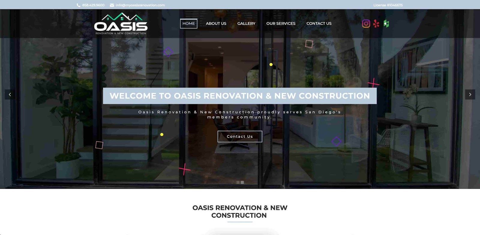
Oasis Renovation & Construction is structured pretty similarly to the last two examples, but you can clearly see the effort to modernize the approach. The design is representative of the business’ mission to renovate and remodel homes for the modern era.
Everything about this website is sleek and effective for new visitors. The font is personable and contrasts well against the background, making the business feel more approachable. The social media icons are colorful, drawing attention and making you want to click. It’s easy to navigate with an optimized menu and effectively showcases past projects with high-definition images.
Oasis Renovation & Construction is proof that you can have a website that is simple in structure but still looks sleek. All you need are compelling visuals, a modernized design, and a bit of flair to make you stand out.
Make a contractor website that stands out.
Now that you’ve seen some examples of contractor website designs, you should know what to do and, more importantly, what not to do. Don’t be afraid to add some personality to your website because, after all, being a contractor means having that personal touch.
Always keep in mind the user experience, accessibility, and how you plan on converting website visitors to potential customers. Then, you’re all set. Happy building!
![Artistic Web Design: Best Tips [+ 15 Examples We Love]](png/artistic-web-design%20(1).png)


![9 Website Designs that Embrace Valentine's Day [Examples]](jpg/valentines%20day%20website%20design%20.jpg)

![10 Brochure Website Examples to Inspire You in 2022 [+ How to Make One]](jpg/gettyimages-1306185043%20copy.jpg)