When you think of pop-ups, your mind could go in a few different directions. Maybe you don’t mind them or even enjoy them if they offer deals and discounts.

Or, you might flat-out hate them no matter what. Fair enough. But, the truth is that they work at generating leads, converting at around 9.3%. Otherwise, why would top brands continue using them at the risk of alienating some visitors?
In this post, we’ll look at some examples of high-quality pop-up website designs that you can copy for your own experiments, and review what makes each one stand out. But first, let’s get our definition straight:
What are website pop-ups?
A website popup is a window the appears in the user interface without an intentional action from the user — they “pop up” into view. Pop-ups are used primarily by marketers to promote offers and generate leads, but can also alert users of other things like cookie use.
On websites, pop-ups often appear soon after the page loads the first time the visitor accesses the page. They can also be triggered by actions like scrolling, clicking, or an exit intent (i.e., when cursor movement indicates the user is about to close the page).
Pop-ups can also appear in different forms, such as a modal that deactivates the rest of the page until the user interacts with the pop-up, a welcome mat that takes up the entire page, a banner that spans the bottom or top of the viewport, or a smaller window that still allows interaction with the rest of the page.
Should you use pop-ups on your website?
Let’s address the obvious: Not everyone likes pop-ups. They’re (understandably) seen by many as annoying or even intrusive. Pop-ups not only disrupt the user’s experience, but do so intentionally while trying to get you to do something.
Even still, pop-ups are widely common on business websites, especially ecommerce sites. They’ve been proven effective at channeling visitors into conversions by offering discounts, promoting an email newsletter, and/or offering membership of some kind.
So, while you may disagree with the ethics of pop-ups from a UX standpoint, they’re an easy, cheap, and effective way to get a visitor’s attention, which may result in them becoming a lead. Therefore, it’s at least worth experimenting with pop-ups on your website and seeing if your conversion rates improve.
Plus, pop-ups don’t have to be terrible. If yours offers a clearly stated benefit to the user, there’s a good chance they’ll take advantage. This could be a discount code, access to exclusive deals, a content offer, or anything else relevant to your unique business. If a user isn’t interested, allow them to easily close the pop-up somehow.
Best Website Pop-Up Examples
Now, let’s look at some high-quality pop-up examples across the web, broken down into the following categories:
Discount Offer Website Pop-Up Examples
1. Pipsnacks
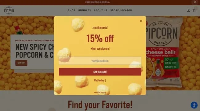
What we like: Vibrant and inviting, this pop up includes style and copy choices that convey the brand voice of Pipsnacks and actively encourage you to seize the deal.
2. Bonobos
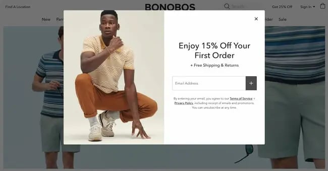
What we like: Clean and simple, this pop-up gets straight to the point and wastes no space or words. The “Free Shipping & Returns” copy is a nice touch as well.
3. Wild Souls
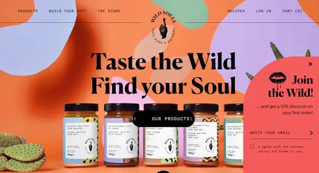
What we like: Wild Souls sports one of the coolest ecommerce websites out there, and its designers chose not to deactivate the main page with a modal. Instead, the email form pop-up is stuck to the bottom corner. It’s not overtly intrusive, but still visible enough to get your attention.
4. Absolution Cosmetics
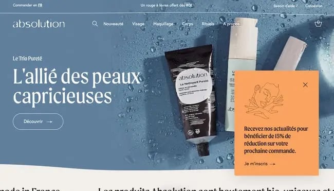
What we like: Absolution Cosmetics takes a similar approach with its pop-up, presenting the offer in the lower corner without completely disrupting visitors from their browsing. A subtle illustration also makes it more eye-catching.
5. Tommy Hilfiger
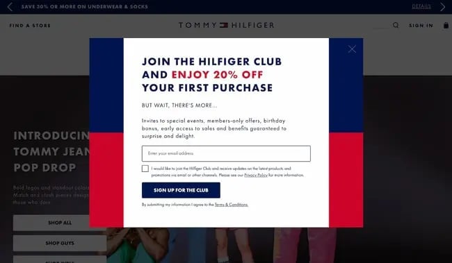
What we like: This modal takes the iconic red-blue logo of the Tommy Hilfiger brand and uses it as the background. The copy of the modal also does a good job of clearly stating the benefits of joining the “club.”
6. Maybell Studio
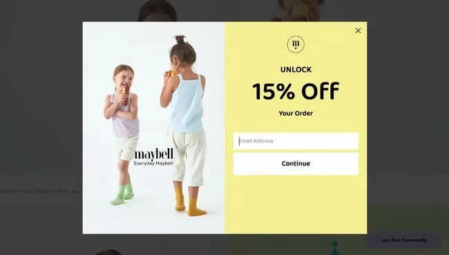
What we like: Here’s another delightfully simple pop-up with a bright color and playful photo. If pop-ups aren’t your favorite thing (which is understandable), this design tries to balance out any mild annoyance.
7. Blue Apron
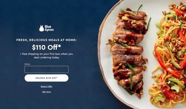
What we like: One of the first meal kit brands to really take off in popularity, Blue Apron offers visitors $110 off their order if they provide an email. In case you’re hungry, the savory visuals to the right make the offer all the more enticing.
8. Fable and Mane
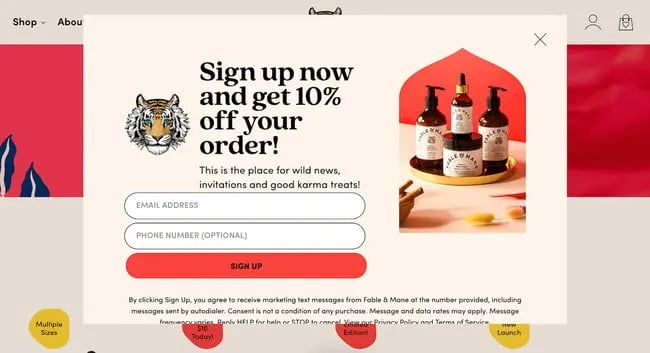
What we like: This plant-based hair wellness brand greets you with a friendly pop-up with clear form fields and a product photo that matches the rest of the site’s color scheme.
9. Partake Foods
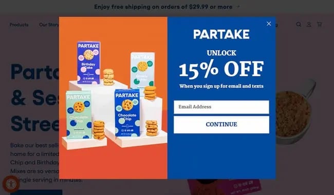
What we like: To match its brand imagery, Partake foods employs bold and bright colors, plus large text and an image that shows a few of its offerings instead of just one.
10. reHarvest
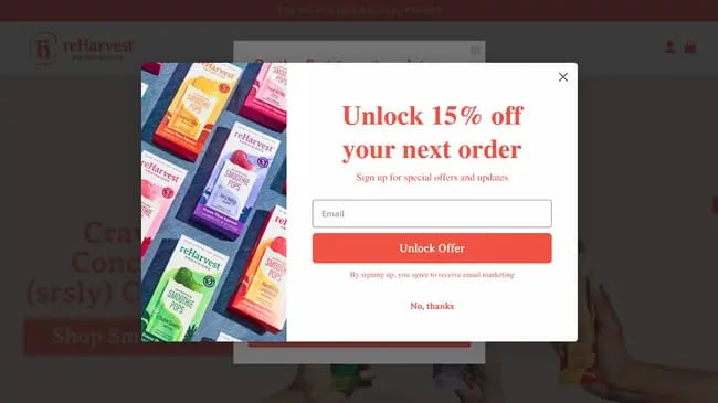
What we like: This is a particularly well-composed pop-up, devoting most of the space to the form and CTA but still designating some space for an engaging photo. We also like the specific CTA text, “Unlock Offer,” being placed on the bright button.
11. Chillhouse
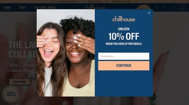
What we like: It’s probably not a surprise to you that people tend to like seeing fun, lively images on web pages. Chillhouse, a new-age spa based out of New York City, knows this and embraces it throughout the site.
12. Kinfield
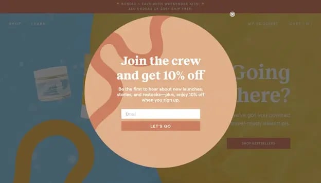
What we like: Using a different shape for your pop-up is one quick and easy way to make it stand out from competitors. Also, starting your copy with a strong, group-focused incentive like “Join the crew” appeals to our desire to belong.
13. Mr Blackman’s
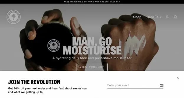
What we like: Here is another example of group-focused copy, this time turned up a notch. The rest of the pop-up’s design is stripped back so that “Join the revolution” is the most prominent element.
14. Slugg
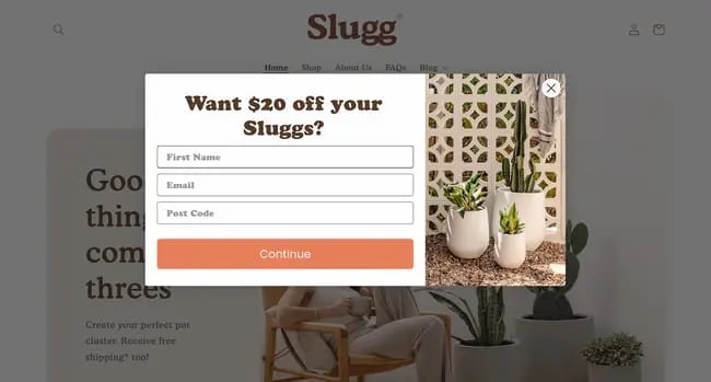
What we like: We like that this pop-up poses a question to users instead of just stating the benefit. It’s not a game-changing design choice, but it does put the ball in your court to take advantage of the discount.
15. Always Fits
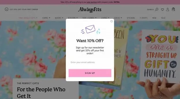
What we like: This pop-up also asks a question in the same way as the one before, but with fewer form fields and therefore fewer barriers to conversion.
16. Kind Socks
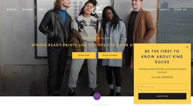
What we like: This CTA pop-up also has an excellent offer — the idea of being “the first to know” about a new line of socks is tempting enough to sway a lot of visitors to get on an elist. The 20% off benefit doesn’t hurt either.
17. Seoulbox
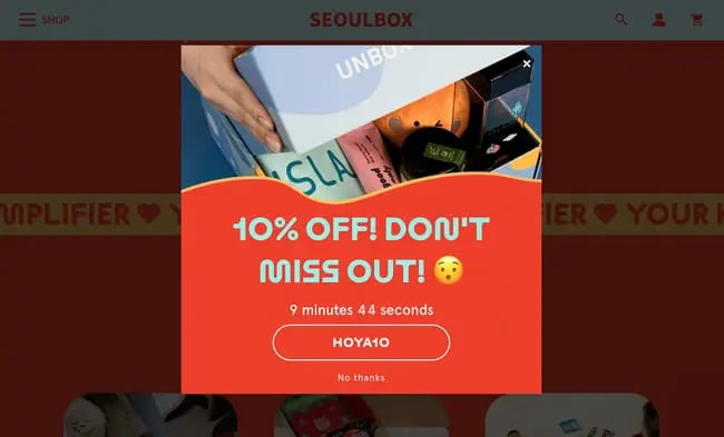
What we like: This pop-up, besides sporting a fun design, features a countdown until your offer expires to create more urgency and bump up purchases. You need to use that code within 10 minutes or the deal is off!
18. A Dozen Cousins
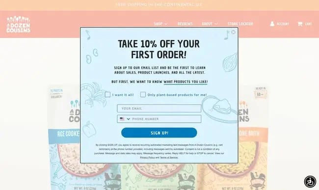
What we like: It’s cool that this pop-up form lets users customize their experience in addition to obtaining a discount. Customers may choose whether to shop all products from this store, or plant-based seasoning products only.
19. Numa Foods

What we like: In most cases, websites will dim the background content of the site when displaying a modal. To place all focus on your pop-up, you can dim the background completely, as shown here.
20. Unsun Cosmetics
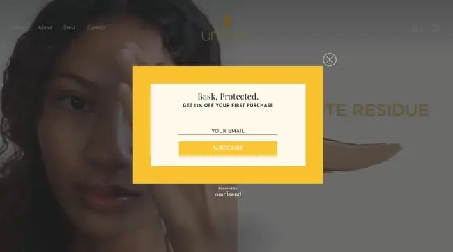
What we like: A strong border can also further separate your pop-up from its background. Since this website’s homepage features a full-screen video background, the pop-up’s border is made thicker, we think to its benefit.
21. Marlow
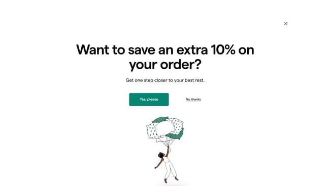
What we like: This full-screen welcome mat appears as soon as the homepage loads and demands your full attention. It’s a risky move, but it keeps things sparse and includes a prominent CTA so visitors don’t feel overwhelmed.
22. Yes You Can Drinks
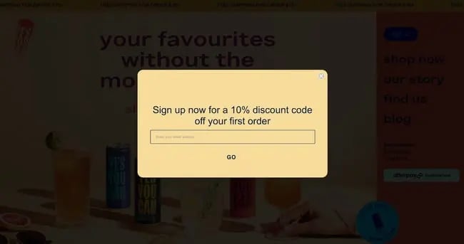
What we like: Opt-in pop-ups don’t need to be anything crazy. This example is about as to-the-point as it gets, so users instinctively put in their email address and get back to browsing Yes You Can’s dazzling website.
23. Uniqlo
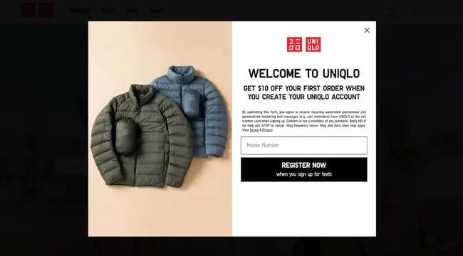
What we like: The world-famous brand Uniqlo is known for its minal branding, which it translates to its website and, in turn, its home page pop-up. This pop-up also differentiates itself from others by asking for your mobile number rather than an email.
Email Opt-In Website Pop Up Examples
24. Semicolon Bookstore
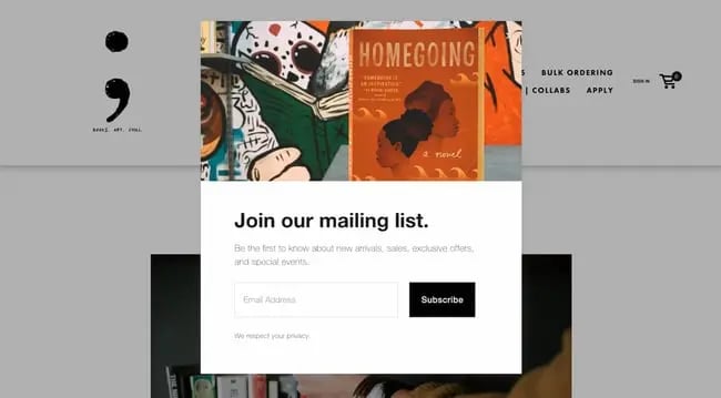
What we like: This CTA on the Semicolon Bookstore website does a good job clearly stating the benefits of joining its email list, but it also grays out the text as to not distract from the form. Users can read it if they want or skip to sign up.
25. Peak Moods
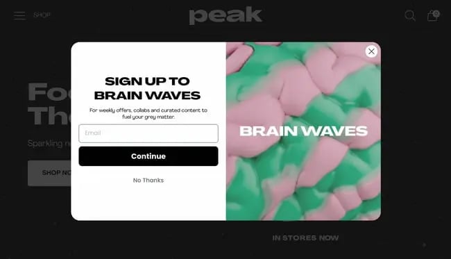
What we like: Here’s another great, engaging email opt-in pop-up. The newsletter has a cool name, accompanied by an intriguing image that piques our curiosity.
26. Noodz
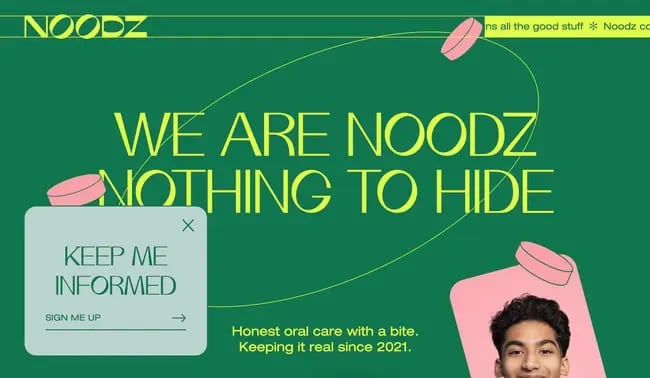
What we like: Noods sells organic, vegan oral care products. Its homepage includes another non-intrusive sticky pop-up that matches the rest of the website. When clicked, it opens a larger landing page that asks for four different pieces of information. That’s a lot, so it’s smart to keep it off the first pop-up and save space.
27. New Yorker
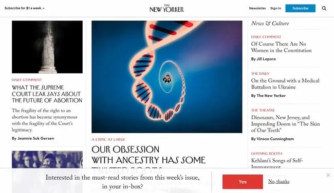
What we like: This CTA from the New Yorker website takes a similar approach, asking a simple question and only requiring users to answer “yes.” Once you do that, it takes down your necessary info on another page.
28. Portrait Coffee
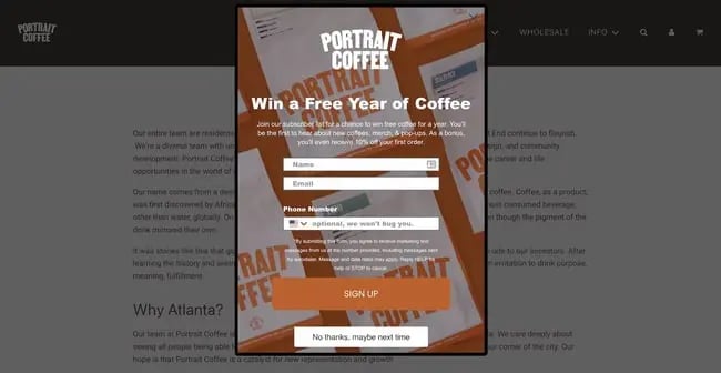
What we like: A year of free coffee? Sounds great, where do I sign up?
29. Vibrate Higher Daily
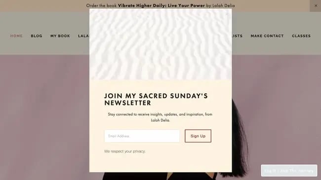
What we like: This pop-up is excellently composed, from its photo and color choices to its copy and organization of text. The extra “We respect your privacy” is a nice extra touch.
30. Omsom
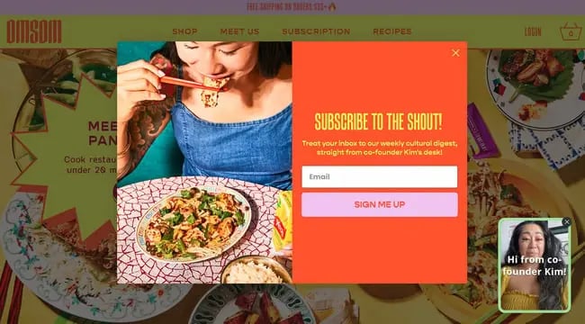
What we like: Omsom’s vividly website includes an equally vivid email opt-in pop-up. Serving as an exit-intent pop-up, the goal is to grab your attention in the crucial fractions of a second before you close the tab or window. Once it has your focus, it states the value in bright text.
31. Bukky Baldwin
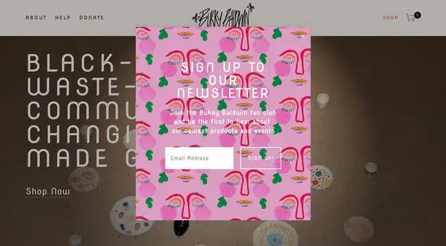
What we like: This pop-up is blooming with color and really inviting you to click. However, it’s not always the best design approach as it makes the copy slightly harder to read. Keep that in mind if you’re trying something similar.
32. Sienna Sauce
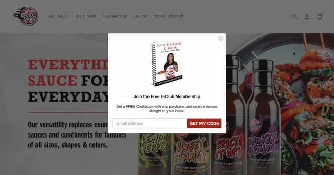
What we like: This pop-up isn’t just for a newsletter subscription — you also get an immediate content offer in the form of a cookbook. Consider placing a content offer in your email opt-in form to distinguish your business.
33. Sincerely, Tommy
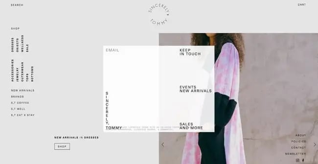
What we like: This pop-up is less conventional than others we’ve seen, but we respect that this brand isn’t afraid to take a risk with formatting. It shows the designers are committed to the site’s overall aesthetic and experience in every detail.
Cookie Notice Website Pop-Up Examples
34. Proweb
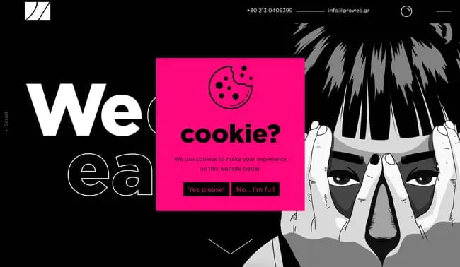
What we like: Since the GDPR went into effect in 2016, we’ve seen websites implement cookie noticies so much that they’ve become the norm. That doesn’t mean you can’t get creative with them, though. Take this example from digital agency Proweb, which injects some humor into the mix.
35. Castor and Pollux
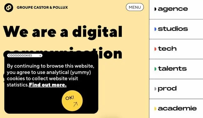
What we like: This digital consulting group doesn’t hide its cookie notice. Rather, it makes the notice large and clear (and easy to confirm and close) while, again, trying some humor too.
36. Lunchbox.io
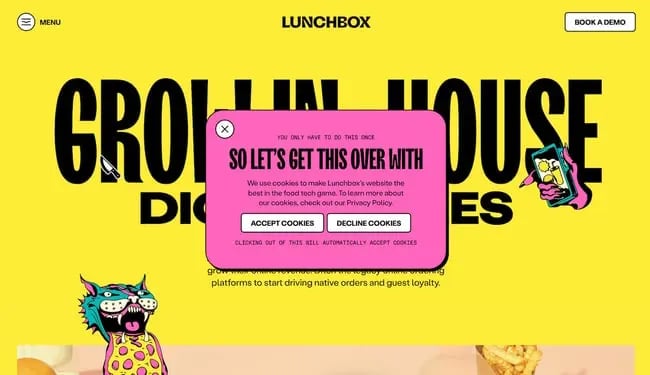
What we like: Lunchbox.io knows you’ve seen more than your fill of cookie notices and acknowledges this in its pop-up.
37. The Laughing Cow
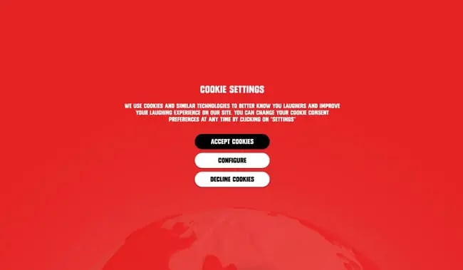
What we like: To ensure visitors are aware of your use of cookies, you can turn your cookie notice into a full-screen modal as The Laughing Cow does here. We like that it’s also just as easy to decline or configure cookies as it is to accept.
38. Moooi
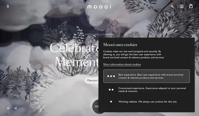
What we like: Moooi allows for fine-tuned control over its cookie use, and makes it possible to control from the initial pop-up. This may be more convenient instead of requiring users to click into a cookie settings menu — this gets the work out of the way up-front.
Other Website Pop Up Examples
39. Hubspot Blog
What we like: Surprise surprise, our blog also uses pop-ups! Namely, we have an exit intent pop-up to capture any visitors about to leave the page. Say you’ve just read several articles — with a button click (or two), you can subscribe and get new posts straight to your inbox.
40. Coschedule
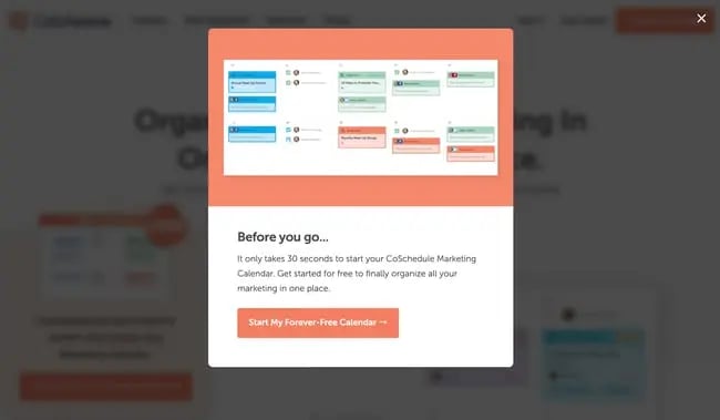
What we like: Here’s another exit intent pop-up with a last-ditch value proposition. What makes this one stand out is its animated image showing its marketing calendar feature. Also notice its single button, the goal being to get users into a subscriber flow quickly with minimal effort.
41. Briogeo
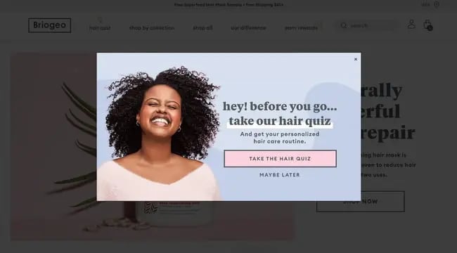
What we like: This pop-up features another strong content offer that’s more likely to capture some exiting traffic, a free hair quiz and a personalized hair care routine. This offer gives a lot of value to users, and has the added benefit of being unique to the type of product it’s selling.
42. Startward Consulting
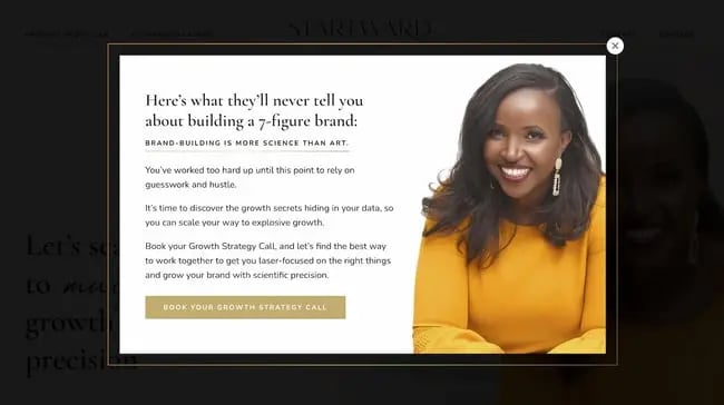
What we like: Brand consulting agency Startward Consulting employs a lengthier pop-up to convince visitors into booking a preliminary call. Of course, conversions are harder to come by when offering a service like this, which is why the site lends a more personal, emotional touch to its pop-up.
43. Madewell
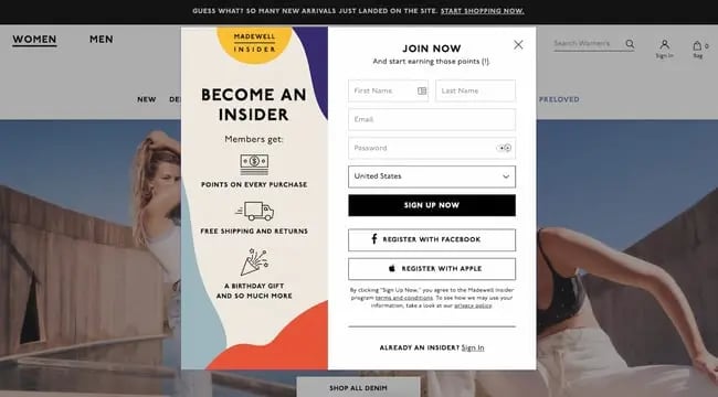
What we like: Madewell’s membership pop-up takes a different approach to most other examples we’ve seen and displays a relatively long form. To push visitors to make their account, it parades the multiple benefits of a membership.
44. Studio Viola
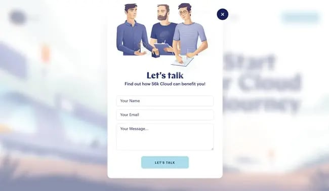
What we like: If you want to learn more about a business’s services, why not speak to them directly. Studio Viola takes this approach and encourages you to message the team directly with its simple pop-up.
45. The Fit In
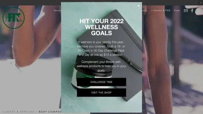
What we like: Finally, The Fit In leaves an air of mystery in its pop-up CTA: What does “challenge time” really mean? You’ll need to click to find out.
Make your pop-ups stand out (more than usual).
I’m not going to tell you that everyone who lands on your homepage will want to see a pop-up. Even if they offer value, a lot of people just find them annoying.
However, you’re missing out on potential leads if you don’t at least experiment with this technique. Clearly, pop-ups are popular. And, when done right on your site, you’ll end up with more happy leads than bounces.

![Artistic Web Design: Best Tips [+ 15 Examples We Love]](https://blog.hubspot.com/hubfs/artistic-web-design (1).png)


![10 Brochure Website Examples to Inspire You in 2022 [+ How to Make One]](https://blog.hubspot.com/hubfs/GettyImages-1306185043 copy.jpg)

