Have you ever been unable to find what you're looking for in the main navigation of a website? Have you ever been considering a product on an ecommerce site but been unable to find the return policy? The frustration that this causes prompts some users to leave and find a site that is more transparent or intuitive.
This instance of user behavior is exactly why your site needs a well-designed website footer. Think of a footer as a safety net for users who haven’t been able to find the information they’re looking for in other sections of your site. By providing a link to your return policy or contact form, for example, you can prevent some visitors from leaving your ecommerce site and never returning.
In this post, we’ll explain what a page footer is and why it’s important to the user experience. Then we’ll go over what to put in a footer and conclude with some of the most creative examples to inspire you.
What is the footer of a website?
The website footer is the section of content at the very bottom of a web page. It typically contains a copyright notice, link to a privacy policy, sitemap, logo, contact information, social media icons, and an email sign-up form. In short, a footer contains information that improves a website’s overall usability.
You might be thinking that there's no point in putting a lot of time and effort into the page footer because people don't pay attention to content below the fold. This type of thinking is validated by most scroll behavior research, including the last major study performed by Neilsen Norman Group in 2018. They found that 57% of page-viewing time was spent above the fold.
However, according to the study, time spent above the fold is decreasing over time as screens get larger, designers favor minimalism, and scrolling becomes normalized in general. The summary of this study states that "people will scroll if they have a reason to do it."
With that in mind, because footers serve navigational and informational purposes for your audience, it only makes sense to optimize this real estate for them despite it being so far down the page. You'll even notice that despite Neilsen Norman Group's discovery that time spent viewing decreased the farther down the page, there's an uptick at the very end.

This is an indication that users know that the page footer valuable information and they can go it, particularly when they are looking for something specific.
Now that we understand the importance of a website footer, let’s take a closer look at what information belongs in this section of a web page.
What to Put in a Website Footer
- Copyright Notice
- Privacy Policy Link
- Sitemap
- Logo
- Contact Information
- Social Media Icons
- Email Sign-up Form
It’s important to understand that the only requirement for designing a great website footer is knowing what your visitors are looking for. That’s why there’s no precise recipe for a website footer. There’s some standard ingredients but what exactly you put in, the amount, the order — it’s up to you.
Let’s take a look at some of the ingredients you might use to design your website footer.
.png)
Free Website Design Inspiration Guide
77 Brilliant Examples of Homepages, Blogs & Landing Pages to Inspire You
- Agency Pages
- Ecommerce Pages
- Tech Company Pages
- And More!
Copyright Notice
Arguably the most important element of a website footer is the copyright notice. According to Stephen Fishman, J.D., in a legal article on Nolo, a copyright notice is “a written notice stating that a particular work is protected by copyright, and that you own that copyright.” The purpose is simple: to deter anyone from copying an image, animation, paragraph or otherwise trying to steal content from your website.
All that’s needed is the copyright symbol © (or the words "Copyright" or "Copr.”), the year of the website’s publication or most recent substantial update, and the name of the copyright owner. The copyright notice only has to appear once on your website’s homepage, but it can appear on as many pages as you want. It can be placed anywhere on the homepage, but is most often found in the footer.
Here’s an example from HubSpot’s blog homepage.

Privacy Policy Link
If you’re collecting personal data from users, like their email addresses or payment information, then Privacy Policy agreements are mandatory by law. For this reason, it’s essential to draft a legally compliant Privacy Policy and ensure this policy is easy to locate and access on your website.
A best practice is to put a link to your Privacy Policy in your website footer. Not only will this satisfy the legal requirement — it will also meet most consumers’ expectations since they expect to find this information in the footer. Some companies like Conde Nast will choose to include an excerpt of their Privacy Policy, in addition to a link. Here’s an example from The New Yorker.

Sitemap
You can add a sitemap to your page footer in two ways. You can either provide multiple links to sections of your website, or you can provide a single link to your XML sitemap.
The first approach is known as creating a “sitemap footer.” These footers contain navigation points that can’t neatly fit into the top-level or global navigation bars of larger sites, or navigation points that encourage visitors to browse the site. The sitemap footer on Grace Eleyae, for example, includes navigation links that visitors might not have considered when first entering the site but would like to explore.

The second approach to including a sitemap is designed with search engine bots in mind. One of the most important things a search engine bot will be looking for is a link to your XML Sitemap. Your sitemap is a file that contains URLs and information of the pages and media files you consider most important on your site. According to Google, search engines use this file to better crawl websites, particularly large and content-rich sites. That’s why providing a link to this file in your footer is considered a best practice for SEO.
Logo
Page footers are a great place to reinforce your brand identity. There’s a few approaches you can take. You can include your logo, but present it in a different way than in your header. Maybe you increase the font size. Maybe you include an image. Maybe you include a mission statement or your brand values below the logo. These are just a few ways you can remind visitors what your company stands for and make a memorable last impression.
Bequant, for example, adds its mission statement right below its logo in the footer. It reads: “Pioneering network optimization that improves speed, reduces latency and congestion – along with full visibility.” That way, a reader would have an idea of what the company did, even if they didn’t read the About page.

Contact Information
You want potential leads to be able to get in contact with you as easily as possible. For that reason, website footers will often contain contact details like a business email, phone number, or mailing address. Or it might simply include a link that brings you to a contact form.
The luxury boutique hotel Bellevue Syrene dedicates one part of its website footer grid to its contact information. To ensure potential guests can contact the hotel in the way they want, the footer includes an address, phone number, fax number, and email address.

Social Media Icons
Social media is another way that potential leads can get in touch with you. Including social profile links in your page footer is considered a best practice for this reason. It’s also an easy way to grow your following across your platforms. Understanding these benefits, it makes sense that 72% of websites include icons for their social media websites in the footer.
Here’s a look at a display of animated social media icons on Rewind App by Flatstudio.

Email Sign-up Form
Ideally, you want to present an email sign-up form to a visitor who understands the value of your content and wants more. A visitor who has scrolled to the bottom of your web page is a likely candidate. That’s why many websites use their footer as an opportunity to increase their subscribers.
For example, Chobani includes a simple email opt-in form in its footer. The tagline above — “Get the freshest Chobani news” — helps set the subscriber’s expectations on what exactly they’re signing up for.

Types of Website Footer Design
What kinds of footers can you design for your website? There are quite a few options — we cover them next.
Fat Footer

A “fat footer” includes the grand majority of the website’s sitemap and usually categorizes links by a common theme or need. This is a good option for you if you have many pages that users could potentially be interested in.
In the above example, Asana includes links for its own company pages, product pages, solutions, and resources. It’s neat and easy to scan, which is what you want in a website footer. At the bottom are the quintessential links to the company’s terms and privacy pages, as well as its social profiles.
.png)
Free Website Design Inspiration Guide
77 Brilliant Examples of Homepages, Blogs & Landing Pages to Inspire You
- Agency Pages
- Ecommerce Pages
- Tech Company Pages
- And More!
Narrow Footer

A narrow footer contains the basic information your website visitors need and has a smaller footprint compared to “fat footers.” The main benefit of a narrow footer is that you can choose its focus, because you don’t have to include all your website links. Bonus: It’s not as overwhelming to look at!
In the above example, a university targets in-person visitors by including links to its “Visit” page, campus map, news page, and events calendar. This is information someone would need if they were planning to explore its campus.
No Footer

If your website is particularly artsy, or if you have a one-page website, you may not need a footer. (Although you should always include copyright information and terms of use, as in the above example.) Forgoing the footer may conserve your website’s aesthetic, but having a footer is best for most brands and companies.
That said, even if you don’t have a footer, you could always maximize your copyright area by including social and email links, like the above example does.
Product Footer

Businesses that sell a specific line of products (like SaaS companies) would benefit from a “Product” footer. Essentially, the first links users see are for the products and its features, like in HubSpot’s footer, pictured above. Company links and other pages are usually listed last in this type of footer, or sometimes not at all.
This example is particularly effective because it lists features first, which is what users are usually looking for when they’re searching for a product (i.e, they’re not searching for the product itself, but for a benefit).
At the bottom is a row of social links in a cohesive light gray color — if you think you’re required to include the original icons, there’s no need. You can always edit the icons so they fit your brand’s color palette.
Legalese Footer

A legalese footer contains pertinent legal information that website visitors should know when scrolling through your website. Apple’s footer is an emblematic example, with its paragraphs upon paragraphs of legal footnotes.
You can always create a legalese footer even if it’s a simple line, such as “All views are my own.” This type of footer can be mixed in with other types, such as narrow or fat footers.
CTA Footer

CTA footers are a popular type of footer that includes either a contact form, an email form, or a prompt to call your team. This type of footer is highly effective for converting traffic that may be showing exit intent, which could be better (and less annoying) than an exit intent pop-up. It’s also a great way to re-engage users when they get to the bottom of the page, removing a barrier to conversion.
Site Index Footer

Site index footers include all of the links on your website — a great option if your site is small. There’s no reason to not include all your links unless you have a particularly large URL library. This type of footer is great for improving the user experience and ensuring visitors find what they’re looking for if they couldn’t find it using your top navigation menu.
Now that we know what possible content and elements we can put in a website footer, as well as the types of footers you can create, let’s look at some real examples that might inspire you.
Best Website Footer Examples
As discussed above, there’s no “right” way to create a website footer as long as it reflects your unique brand identity and is tailored toward your audience. Let’s check out a few examples that do exactly that.
1. Lorelei Londres

Lorelei Londres is a luxury hotel in Italy that strives to provide hospitality and charm. Its footer succeeds in both aspects.
Anticipating any question from a site visitor or guest, there’s contact information on the left, navigation links at the center, and a newsletter opt-in form to the right. On the right, there’s also the privacy policy link as well as the submit form directly in the footer. Below there’s another link to the privacy policy, cookie policy, and the agency that created the website as well as the copyright notice. All of this is placed against an image background depicting someone in a pool on a balcony overlooking a beach. The result is a footer that’s standard, but perfectly aligned with the brand.
2. Superfluid

Superfluid is a vegan beauty brand designed for anyone to use. Like Superfluid’s mission, its footer is basic but also redefines what basic means. Superfluid’s footer contains the information you expect — a well-organized menu of help articles, legal info, and social media accounts to follow, an email sign-up form, logo, and copyright info — but not in the way you might expect it.
The logo is enormous compared to the other text in the footer. Beneath the footer, you see icons representing its value propositions — cruelty free, vegan, easy to use, no mineral oils. Below that is a traditional copyright notice as well as the accepted payment methods. In short, this footer provides important information to address any questions that either potential or existing customers might have in a bold but clean way.
3. Spline Group

Spline Group is a mechanical and electrical engineering firm that values effective communication and simplicity.
This is clear in its footer. A minimalist design, the footer features black text on a white background. There’s an address and links to its Instagram, LinkedIn, and Careers page. Below that is much larger text. But unlike Superfluid, it’s not Spline’s logo or brand name. Instead, it’s a contact link with the simple but inviting CTA: “Let’s talk.”
.png)
Free Website Design Inspiration Guide
77 Brilliant Examples of Homepages, Blogs & Landing Pages to Inspire You
- Agency Pages
- Ecommerce Pages
- Tech Company Pages
- And More!
4. Art4web

Art4web is a creative digital and branding studio committed to making unique websites, mobile apps, and brand designs. Its own footer section is an example of unique design. Rather than offering one touchpoint to potential customers like Spline Group, Art4web offers three. Potential customers can email them, fill out a form to get a quote for their project, or give them a call. Or they can opt to connect on any of the social media platforms represented by the icons below.
5. gOOOders

gOOOders is an online platform and series of hotel boutiques that sell ethical and sustainable products. Its mission is to help people make better choices in the products they buy and the way they travel.
Since gOOOders is a brand focused on action, it makes sense that the footer is so action-oriented. Most of the footer section is dedicated to the email sign-up form. The form’s background is colorful and animated so your eyes are drawn to that section. Below is a simple white row containing a copyright notice, contact link, links to gOOOders’ cookie policy and terms and conditions, and social media icons. This is a great model for websites that want to optimize their footer for conversions.
6. Ajeeb

Pranjal Kaila, also known as Ajeeb, is an independent interdisciplinary designer. According to his bio, one of his specialties is “creating interactive spatial and sensory experiences.” This is clear in every part of his website, including his footer.
His footer contains basic information — links to his sketchbook and work, contact information, social media icons, copyright notice and link to his privacy policy — but their presentation is unique. Against the black background, the white typography looks like constellations. The cursor acts like a spotlight. When hovering over any of the links, the font becomes bold and blue.
7. Hideout Space

Hideout Space is a unique place for small startups and teams to gather to work and explore the surrounding area of Garmisch-Partenkirchen through hiking, swimming, and other experiences. Its website is designed to immerse visitors so they feel ready to book a trip, especially by the time they scroll to the footer.
The page footer contains a simple CTA to "Book Now." Despite its simplicity, several design choices help draw the visitor's attention to this CTA. First, as the user scrolls to the footer, pieces of the Hideout Space logo slide in from the top and assemble right above the CTA button. The button is also centered and the same color as the cursor, which helps to draw the eye. Finally, it has a larger font size than the links, contact information, and social media links at the bottom, which helps to establish a visual hierarchy.
8. HUGE

HUGE is a full-service digital agency that has worked with some of the world's most innovative companies to create ground-breaking brands and experiences.
This mission is reflected in its own website and footer design. As the user scrolls to the website footer, they're greeted with a "Hello" in bold typography. The background color also changes from black to green, which helps to recapture the visitor's attention. On the right side of the page, visitors can find helpful links and contact information for different inquiries. On the left, there is the logo and tag line of the agency "Make huge moves." This helps remind visitors what the agency stands for and makes a lasting impression.
9. Tenzo

With a mission to provide a clean caffeine beverage alternative to coffee, Tenzo sells matcha tea in an affordable, accessible way.
The homepage features multiple CTAs to try today with a money back guarantee to make prospects more confident in their purchase. Its footer offers another incentive: a 10% discount if they enter their email. For visitors who want to stay connected but not provide their email, they can follow Tenzo on Pinterest, Facebook, Instagram, or Twitter. The footer also contains important links for visitors who are looking for different ways to purchase Tenzo's products or want to learn more about matcha or the company. Thanks to all these elements, the website footer effectively targets top and middle-of-the-funnel customers.
10. Envoy
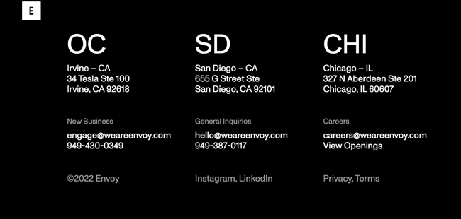
Envoy is a brand and digital innovation firm that aims to create transformative brands and digital experiences. Its website is a great example of a transformative digital experience.
Its footer is particularly unique. It has a clean, three column layout to display its three office locations. Below are three ways to get in touch depending on whether the visitor is interested in working with the firm, making a general inquiry, or applying for a job.
Finally, there is a copyright notice, links to the firm's Instagram and LinkedIn pages, and links to its privacy policy and terms and conditions, which are all aligned in their own columns. This simple, black-and-white design perfectly aligns with Envoy's branding and is a stark difference from the colorful, animated featured work section above.
11. Aisle
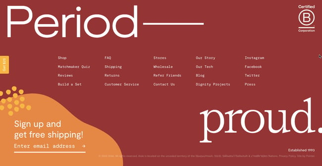
Aisle is an ecommerce business that provides reusable alternatives to disposable pads and tampons. Top to bottom, its website is designed to inform and inspire customers to purchase its ethically-made sustainable products.
Aisle's footer is framed by its tagline, "Period proud," in large, bold font, which helps to draw the eye, as does the background color. The way the tagline is laid out with "period" in the left corner and "proud" in the right ensures that visitors see the many helpful links included in the footer. Finally, the email opt-in form stands out thanks to the orange background color and yellow shapes as well as the free shipping offer.
.png)
Free Website Design Inspiration Guide
77 Brilliant Examples of Homepages, Blogs & Landing Pages to Inspire You
- Agency Pages
- Ecommerce Pages
- Tech Company Pages
- And More!
12. Will Ventures

Will Ventures is an early-stage venture capital firm that mostly works with consumer, health, and media startups.
Its black and white website helps present the user with clear options and prevent information overload. For example, if a user scrolls to the footer, they only have a few options: they can sign up for Will Ventures' newsletter, follow the firm on Twitter or LinkedIn, or check out the site credits. If these were the only elements in the footer, it might seem bland. But the text "WILL" is animated to move up and down the page to keep users engaged.
13. Tāmras Gin

Tāmras Gin is meant to invoke the lush paddy fields, backwaters, and rustic charm of the village of Colvale in Goa. Its website footer also aims to invoke these images.
It features hand-drawn animations of people drinking and relaxing beneath trees, which represents the botanicals and citrus fruit used in the gin. These animations also serve another purpose: to frame the logo, email opt-in form, and other standard elements of a footer like the Instagram social icon. This helps to reinforce Tāmras Gin's brand and encourage visitors to take action, either by opting in to the email list or following the brand on social.
14. Callista
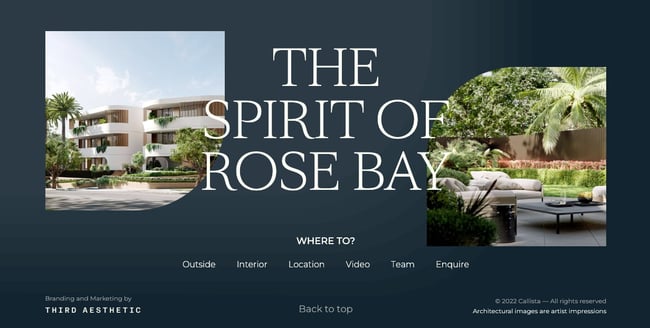
Callista is a new development of luxury apartments in Rose Bay. Its website is designed to provide a virtual tour of these apartments.
Its footer, for example, contains images of the front and back of the apartments. It also features a navigation menu with the inviting question,"Where to?" So visitors can choose to click on certain navigation links to see the outside and interior of the development, its location, or a video tour. The footer also contains a "Back to top" button, which encourages visitors to keep browsing.
15. Lemkus
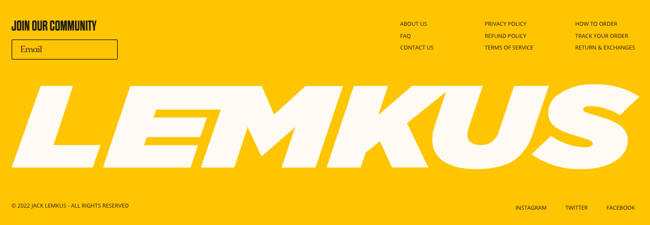
Lemkus is a leading retailer in sporting apparel and branded sneakers in South Africa. Its website design is designed to be as unique as its product designs.
Its footer on the homepage is a great example. Most of the page has a white background with black text color and yellow accent color, but its footer has the yellow as its background color.
Its logo is huge, spanning the entire footer, which makes it more likely that visitors will remember the brand name even after they've left the site. The email opt-in form also stands out thanks to the bold, black font inviting visitors to join the community. The other text is understated but not easy to overlook thanks to hover animations.
16. Rejouice

Rejouice is a digital marketing agency based in San Diego and Paris with a beautiful website and an even more beautiful footer. What makes its footer so unique? Well, it’s not just a footer — it actually takes up the entirety of the screen when users scroll down to the bottom. I’ve never encountered that, but it sure makes for an impactful experience.
It includes everything a footer needs, from a site map to a logo to a link to its legal documentation. What I like the most is the unique CTA, which tells visitors to relax and take a seat. The user then arrives at the contact page, where they can reach out to the Rejouice team.
17. Royal Clinic

Royal Clinic is a skincare brand based in Poland, and while I may not understand the language in their footer, I can still recognize a great footer example when I see one. Site links, contact addresses, phone numbers, operating hours, and legal links (such as “Polityka prywatności,” which I assume means “Privacy policy”) — everything that a site visitor needs is there for additional browsing or for traveling to their physical location.
I especially like the prominent social buttons in the upper right-hand corner. In mobile, they’re actually centered, cementing their importance even more. That move demonstrates that even if you don’t have a specific CTA (such as “Contact us” or “Sign up for our newsletter”), you can still signal what you want users to do. In this case, it’s to get them to follow you on social media.
18. Unveil

The first thing I noticed about Unveil’s footer was its mission statement, placed front and center. That’s a great way to remind website visitors what your company is about and drive home your mission before users leave your site.
But what I like the most is that it’s a minimalist footer without much fuss or over-designing. The website owner wanted to keep the interest on the platform’s curated photography, so he or she kept the footer simple. That’s a great move if you’re creating a footer for a highly visual website.
19. Olivier Tardie

Web developer Olivier Tardie pulls out all the stops in this fun and imaginative footer, which takes up the entire screen after you scroll down. It includes a meta note about the footer: “This is the end of the page, but the beginning of our journey.” That’s a great way to summarize the utility of this section.
A paper airplane flies around the screen, signaling that visitors should send a message to him for a work opportunity. The bottom CTA is clear and unmissable: “We should talk.” Serious, but reflective of his tone and personality! When you click on it, a pop-up slides onto the screen with a contact form. Everything about this footer is delightful.
20. Sycom

IT service provider Sycom implements a similar tactic to Olivier Tardie, where they include a CTA to contact them. I like the large, unmissable text, the descriptive subtitle (“Let's discuss your project together. We will be happy to help you”), and the circular “Contact Us” button that’s easy to click with your thumb on a mobile device.
This footer is quite minimal — it doesn’t include any sitelinks and you can barely identify the legal links at the bottom. That’s a great tactic to implement if you’d like the focus to stay on your CTA, and if your website is small enough to not need a footer sitemap.
Designing Your Website Footer
Designing your website footer requires careful planning. It’s a section where humans and search engine bots look for important information that they haven’t found elsewhere. You want to make sure you’re providing them with the content and elements they need so they continue to explore your site, rather than exit out in frustration.
Editor's note: This post was originally published in September 2020 and has been updated for comprehensiveness.


-1.png)
-1.png)
.jpg)

