Website carousel sliders are a great way to feature your most important content through a series of images and text. However, they can sometimes be an eyesore or, worse, a deterrent for your visitors.

In this post, we’ll cover best practices for creating an engaging website carousel, then go over the best examples we’ve seen online. Let’s get started.
Website Carousel Best Practices
- Ditch autoplay.
- Provide easy navigation.
- Adapt to all devices.
- Optimize for SEO.
- Curate the slides with intention.
When implementing a website carousel on your site, it's important to do so in a way that enhances your user experience (UX). If you don't have a clear intention for how a website carousel will enhance your UX, then you might want to consider a different design element to achieve your goals.
HubSpot’s very own Website CRO Strategist & Copywriter, Rebecca Hinton, shares that while carousels may not be ideal, they can be a great way to personalize content for different types of customers.
A well-designed carousel should feature your content and make it so that your users have an easier and more enjoyable experience on your site. Your carousel should intrigue visitors to learn more about what you have to offer and spark their interest.
Now, let’s review some website carousel best practices to help you do just that.
1. Ditch autoplay.
It’s common for carousels to flip through content automatically. However, it might be better to stray away from autoplay for a few reasons.
A carousel's automatic advancing and frequent movement can be reminiscent of an ad, which can be a big turn-off for visitors and cause them to bounce. Giving the user full control of the carousel’s speed and pace will make for a more comfortable experience.
A well-executed carousel slider should attract and inform the viewer. Autoplay carousels may not give your visitors the time they need to digest the content of each slide. This can be frustrating and confusing for your visitor and can potentially snap them out of their buying journey. For this reason, it's best to leave the carousel switching in their hands.
From a technical standpoint, autoplay carousels can also interfere with a webpage’s performance by lengthening loading times. Additionally, an auto-advancing carousel can hurt your page's accessibility and alienate users who suffer from motor skill issues.
By giving users control over when to advance in the carousel, they’ll stay engaged and consume your content at their own pace, ultimately empowering your customers.
2. Provide easy navigation.
Now that you've passed on autoplay, you'll need to provide navigation so your users can surf the carousel on their own. The most common types of website carousel navigation are left/right arrows and dot-based systems.
Left/Right Arrows
Left and right arrows are a straightforward way for your users to navigate your carousel.

What we like: Your carousel navigation should be intuitive and simple for your visitor to use, and it doesn't get more intuitive than left/right arrows. The arrows in the above example are cohesive with the design of the site, which is a nice touch.
On click, the arrows should advance to the next slide or move back. Just make sure your arrows are pointing in the direction they move in.
Dots
Dot-based navigation systems show a series of circles representing a slide in your carousel. Typically, the circles are hollow by default, but display as filled for the current slide.

What we like: Dot-based navigation is minimal and clean in design, and shows the user exactly where they are in your carousel.
3. Adapt to all devices.
According to Statista, worldwide mobile web traffic has consistently hovered around 50% since 2017. With a host of devices from phones to tablets to laptops nowadays, it’s important to adapt your website accordingly.
This means website carousels must have a responsive design, meaning that the design of your carousel needs to automatically adapt to smaller screen sizes. Remember, mobile users are also limited to tapping, pinching, and swiping, so make sure these gestures are functional on your web carousels as well.
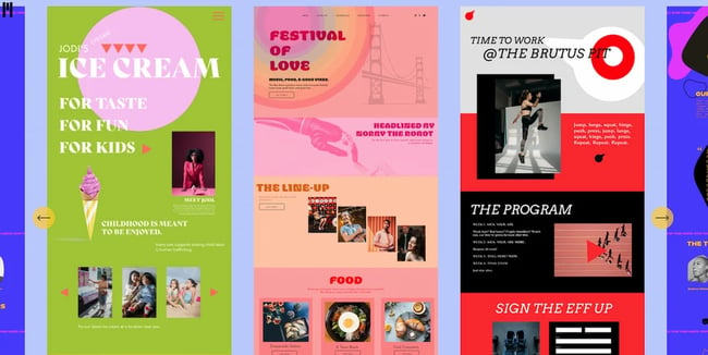
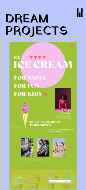
The above examples show how the carousel on Chia Studios adapts from desktop to mobile screens.
What we like: In these examples, the carousel content is optimized for a mobile screen size. In the desktop version of the carousel, multiple slides are displayed horizontally. The mobile version hides the content on the sides and only displays the current slide, allowing it to occupy more space on the smaller screen.
4. Optimize for SEO.
Website carousel sliders aren't exempt from SEO scrutiny. You’ll need to optimize the headers and image alt-text within your slider if you want Google to look favorably upon it.
Regarding headers in your carousel slider, the slides themselves may contain headers, and maybe H1 headers at that. Search engines view H1 headers as your page’s title, so if each slide contains one, it can lead to some SEO confusion. When crafting your website carousel slider, it’s best not to include H1 headers.
Each slide in your carousel presents an opportunity to land one of your keywords using image alt text. Alt text is a written description of an image that displays when images fail to load. It also helps screen-reading tools describe images to blind readers. Even if you can’t see the words on the page, search engines will index your image alt text.
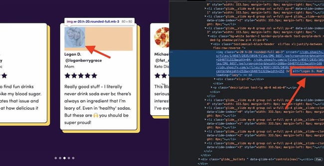
The above example shows the image alt-text within a website carousel slider. Upon inspection, we can see that the image alt text reads "Logan D. Mom," which describes the image a lot better than "IMG_3607.jpg".
5. Curate your carousel sequence with intention.
When it comes to website carousel sliders, you should save the best for first. The first slide in your carousel is your make-or-break opportunity to engage viewers, so make sure to lead off with your strongest asset. If you nail the first slide, the likelihood of your viewers interacting with your carousel is greatly improved.
Every slide in your carousel is equally important. Even if the first one gets the most attention, each one should be intentionally crafted and achieve a specific goal. If a slide in your carousel doesn’t enhance the user experience and deliver vital information, it’s best to leave it out of your sequence.
Website Carousel Examples
Now that we've covered the best practices for using carousels on your site, let's take a look at some examples for inspiration.
1. Material Kitchen: Ecommerce Product Slider
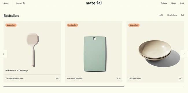
We love this product slider from Material Kitchen. The design of the slider is clean and attractive. Right off the bat, the viewer is drawn in by the minimalist design that places the focus on the products. Additionally, this slider checks all the boxes we discussed above. It doesn't autoplay, it uses left and right arrows for navigation, and it's mobile responsive and SEO optimized. This slider also includes a progress bar along the bottom that shows the user where they are in the carousel.
What we like: A sleek design with a focus on the products. Plus, the progress bar is a neat touch to indicate navigation.
2. JVN Hair: Dot-Based Delight
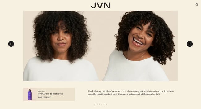 This is a great example of a slider that features a dot-based navigation system. JVN Hair's carousel is attractive and intuitive to use, and the dots at the bottom make navigation a breeze. We also love the value this slider brings to the visitor. Each slide entices the viewer with an image and offers a corresponding product and testimonial. This slider includes left and right arrows as well. We won't let the additional navigation options go unappreciated!
Best for: Brands aiming for a chic, minimalist aesthetic. The dual navigation—dots and arrows—is a user-friendly bonus!
3. Beeline: Creative Card-Based Slider

Plenty of websites display their brand testimonials, but Beeline shows off its positive feedback in style with an elegant carousel slider that features content in a card-based format. We like the clean left/right navigation and the way that the current slide is in full focus, while slides to the left and right are translucent and tucked behind.
Why it works: The testimonial cards with a translucent design for off-focus slides make it visually appealing and functional.
4. Muros: An Immersive Carousel Experience
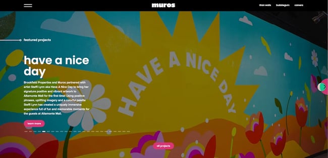 We love the immersive experience that Muros creates in this website carousel example by letting the content of the slider fill the entire page. Muros is in the business of art and murals, so it makes sense for them to take advantage of a full-page carousel to show off their work. When crafting your slider, consider your goals and the type of content you want to feature, and strive for a design that serves those needs.
Pro Tip: If your content is visual-heavy, like art or photography, consider a full-page carousel for an immersive experience.
5. Dropbox: A Traditional Website Carousel Example

There's nothing wrong with sticking to the classics. We love this traditional-style carousel from Dropbox because it does exactly what it's supposed to do. This slider presents featured case studies with a related image, excerpt, and a CTA to read more. It's very clear to the viewer what they are looking at and how to proceed for more. This slider also features arrow-based navigation and doesn't autoplay — we approve!
What we like: Simplicity at its best! Dropbox ensures clarity with each slide, promoting focused user interaction.
6. Rolling Stones: Rocking the Carousel

The Rolling Stones' official website presents an engaging carousel that masterfully marries automation with user interaction. A streamlined progress bar effortlessly runs in the background, signaling the imminent arrival of the next slide. Yet, if fans wish to linger a little longer or quickly revisit previous images, manual navigation buttons are readily available.
What we like: The Rolling Stones' carousel epitomizes user-centric design. By providing both automated progression and manual control, it ensures an immersive experience that adapts to the visitor's pace.
7. Nike: Product Highlight Carousel

Nike amps up the energy with a carousel that shines a spotlight on its freshest releases. The crisp, attention-grabbing images combined with smooth animations make each transition feel like an event. And with a concise product descriptor and an unmissable CTA button, users might just find themselves a click away from a new purchase.
What we like: Nike's carousel brings their products to life by showcasing them in real-world scenarios. The images, combined with the interactive design, not only highlight the product's features but also resonate with the emotions and aspirations of the audience.
8. National Geographic: Story Carousel

National Geographic’s carousel showcases intriguing stories from around the world. It uses captivating images coupled with intriguing headlines, urging users to dive deeper into each video story. The carousel navigation shifts one image in front of the other when the arrow is clicked.
What we like: True to its reputation, National Geographic delivers imagery that is nothing short of breathtaking. Their carousel is a testament to the brand's commitment to showcasing the beauty and intricacies of our world.
9. Tesla: Feature Exploration Carousel

Tesla effectively leverages its carousel to showcase the distinct features of its vehicles. By clicking on the arrows, viewers can seamlessly navigate through a series of images, each highlighting a different aspect of the car, giving a comprehensive visual tour of its innovative design and capabilities. This user-centric approach not only underlines Tesla's attention to detail but also offers potential buyers a captivating glimpse into what sets these vehicles apart.
What we like: Tesla's carousel is as futuristic and smooth as the vehicles they produce. We appreciate the attention to detail, ensuring each slide not only highlights the aesthetics of the car but also its advanced functionalities. The ability to click through and explore more about each feature is incredibly user-friendly.
10. Apple: Showcasing Innovation

Apple, the tech giant known for its cutting-edge designs and breakthrough products, uses carousels on its website to highlight the features of its latest products. With a blend of captivating visuals, animations, and succinct text, the carousel offers an immersive experience that encapsulates the elegance and sophistication of Apple's products.
What we like: Apple's carousel reflects its brand ethos of simplicity blended with innovation. The high-resolution images with the smooth transitions between slides are indicative of Apple's commitment to a seamless user experience.
Use Website Carousels to Engage & Convert Users
Website carousels can organize content on your website in a visually interesting way while also engaging your audience to help you drive conversions. Be sure to keep the above best practices in mind when incorporating carousels on your website to ensure yours are effective.
Editor's note: This post was originally published in July 2020 and has been updated for comprehensiveness.


-1.jpeg)

![What Is End-User Experience Monitoring? [+Tips For Implementing It]](https://blog.hubspot.com/hubfs/end-user-experience-monitoring.png)


.webp)