I love museums. There’s nothing quite like entering one for the first time. With a well-crafted museum website, you can give your visitors a similar feeling before they even walk through your doors.

Of course, the ultimate goal of any museum website is to get visitors to purchase admission. If they’re landing on your website, chances are they’ve heard of your museum and are considering a visit, or browsing local museums and seeing which one is most worth their time and money.
That’s why the design of your website is crucial. It needs to nudge visitors toward a ticket purchase without feeling pushy or gimmicky — visitors expect a level of classiness from these kinds of websites. That’s why we’ve rounded up some of our favorite examples of museum websites. Let’s explore.
Best Museum Websites
- Van Gogh Museum
- Heide Museum of Modern Art
- The Metropolitan Museum of Art
- Louvre Museum
- MIT Museum
- Museo del Prado
- MoMA
- Getty Center
- National Museum of African American History and Culture
- Museum of Modern Art in Warsaw
- Frans Hals Museum
- M+
- National Academy of Design
- Chrysler Museum
- Museum of Pink Art
- Art Institute of Chicago
- Rijksmuseum Amsterdam
- Tokyo National Museum
1. Van Gogh Museum
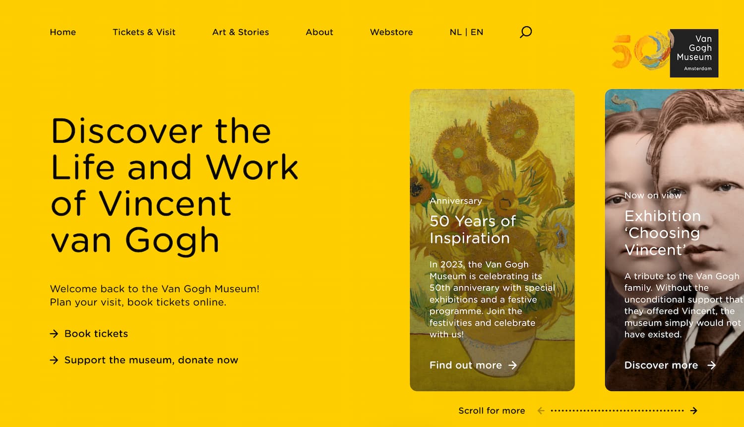
We’ll begin with the gorgeous website for the Van Gogh Museum in Amsterdam. Contrasting with van Gough’s heavy strokes and post-impressionist style, this website gives the art some room to breathe with a minimal and modern layout. The homepage employs side-scrolling to take you through what’s on display, and links to everything are accessible at the top. Through consistent use of color and fonts, the site feels coherent and enjoyable to navigate.
2. Heide Museum of Modern Art
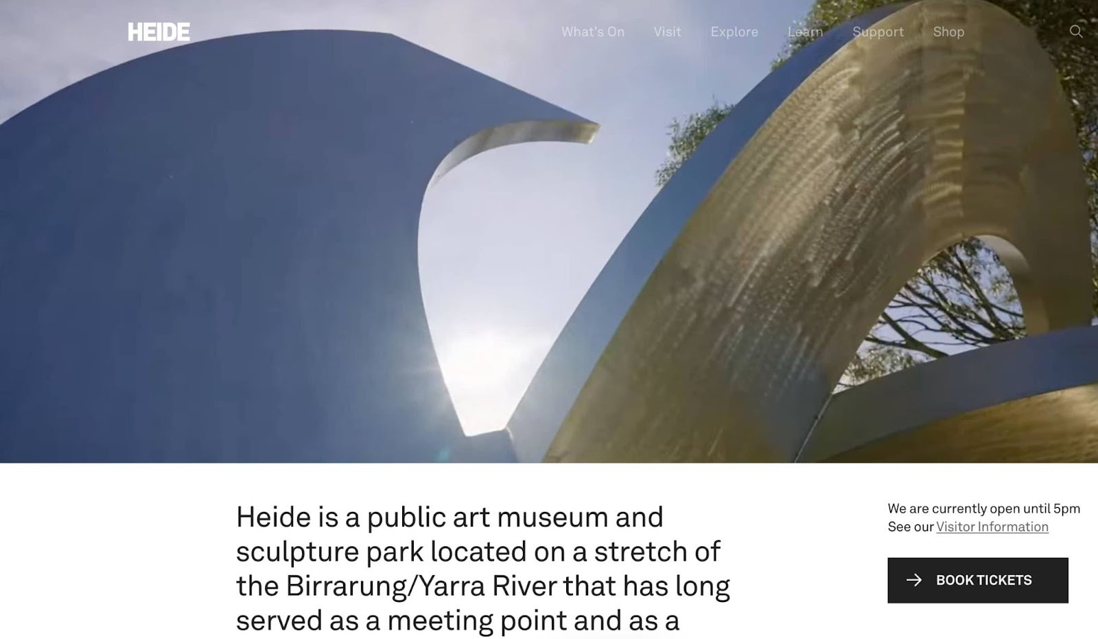
Australian art museum and sculpture park Heide employs a website that dazzles with a full-width video display of its finest pieces. Website visitors can quickly book tickets through the above-the-fold CTA and see what exhibits are currently on display. Also, take some time to explore its Art, Architecture, and Landscape pages — it feels like you’re touring the museum yourself.
3. The Metropolitan Museum of Art
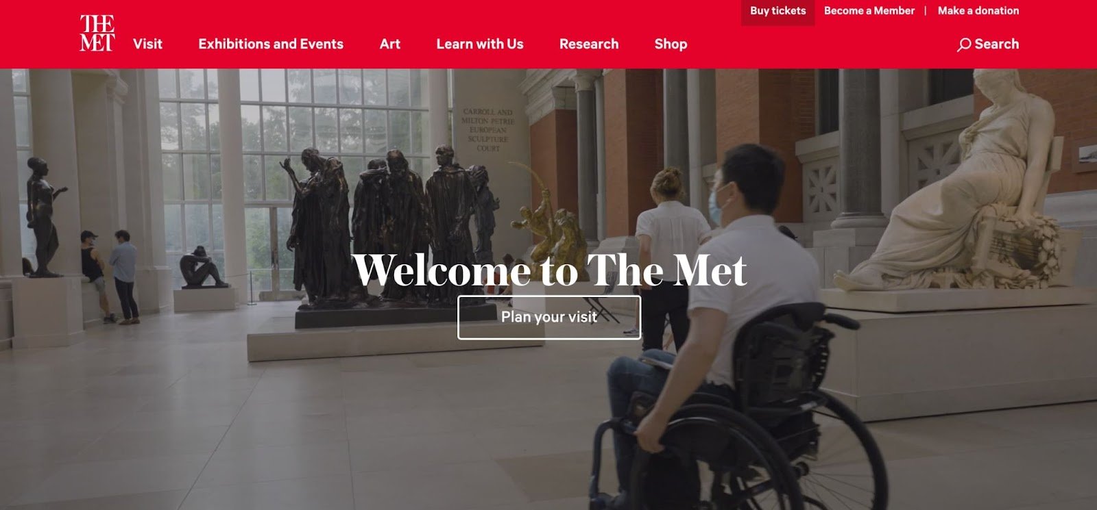
The iconic “Met” museum is hailed as one of the finest art collections anywhere. From the homepage alone, you’re given all the information you need to plan a visit, get a membership, browse the store, and access learning resources and audio guides. Additionally, its visitor guidelines are made clear so you can have a respectful visit. Overall, the Met's website has a design you could easily emulate in a content management system like CMS Hub.
4. Louvre Museum
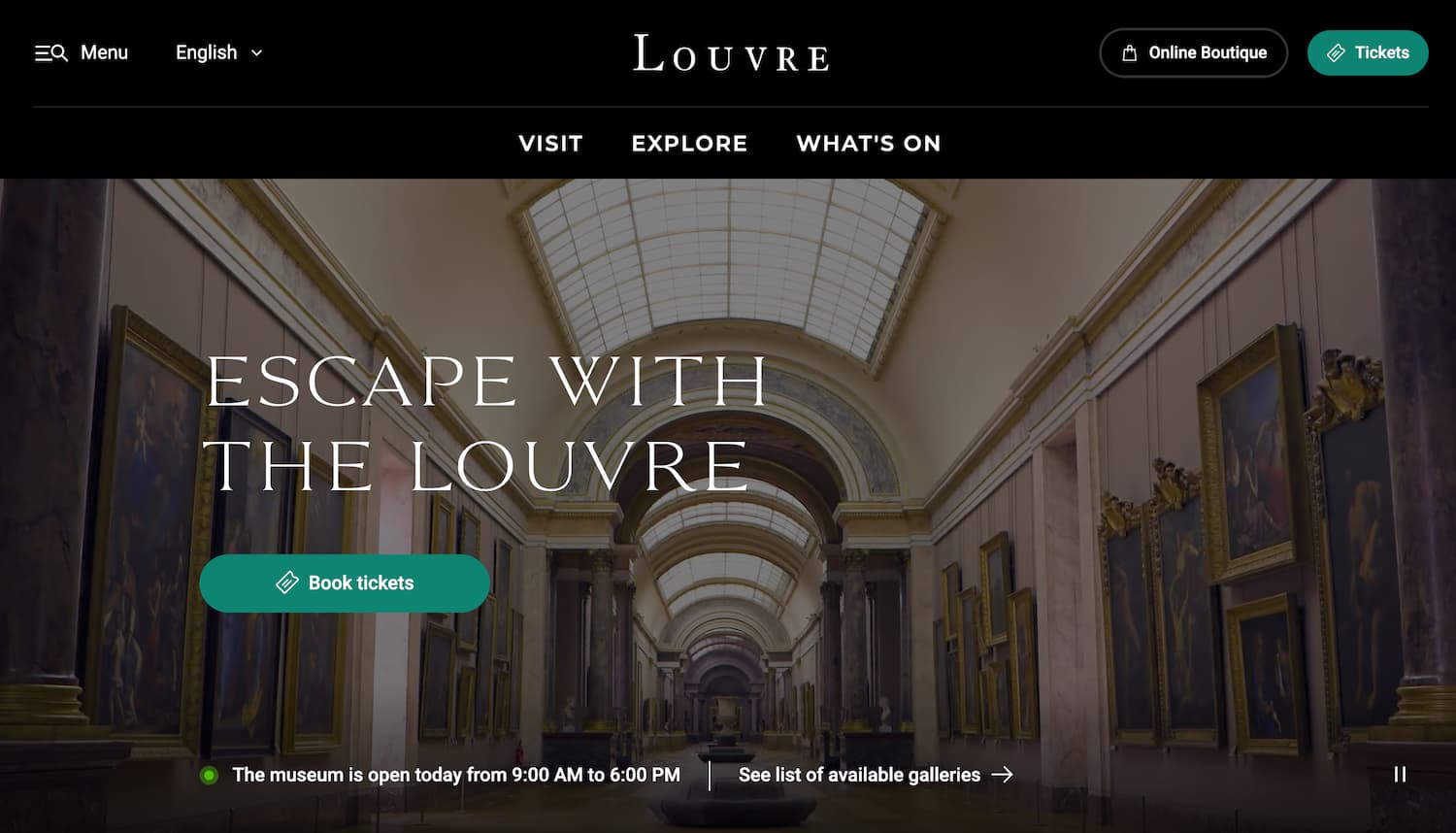
Let’s just get this one out of the way — as it is the most-visited museum in the world, you would expect the Louvre website to impress. While it probably won’t blow you away, the Louvre's website is still a well-designed experience that makes it easy for visitors to quickly book tickets, see what’s on display, and access the online store.
5. MIT Museum
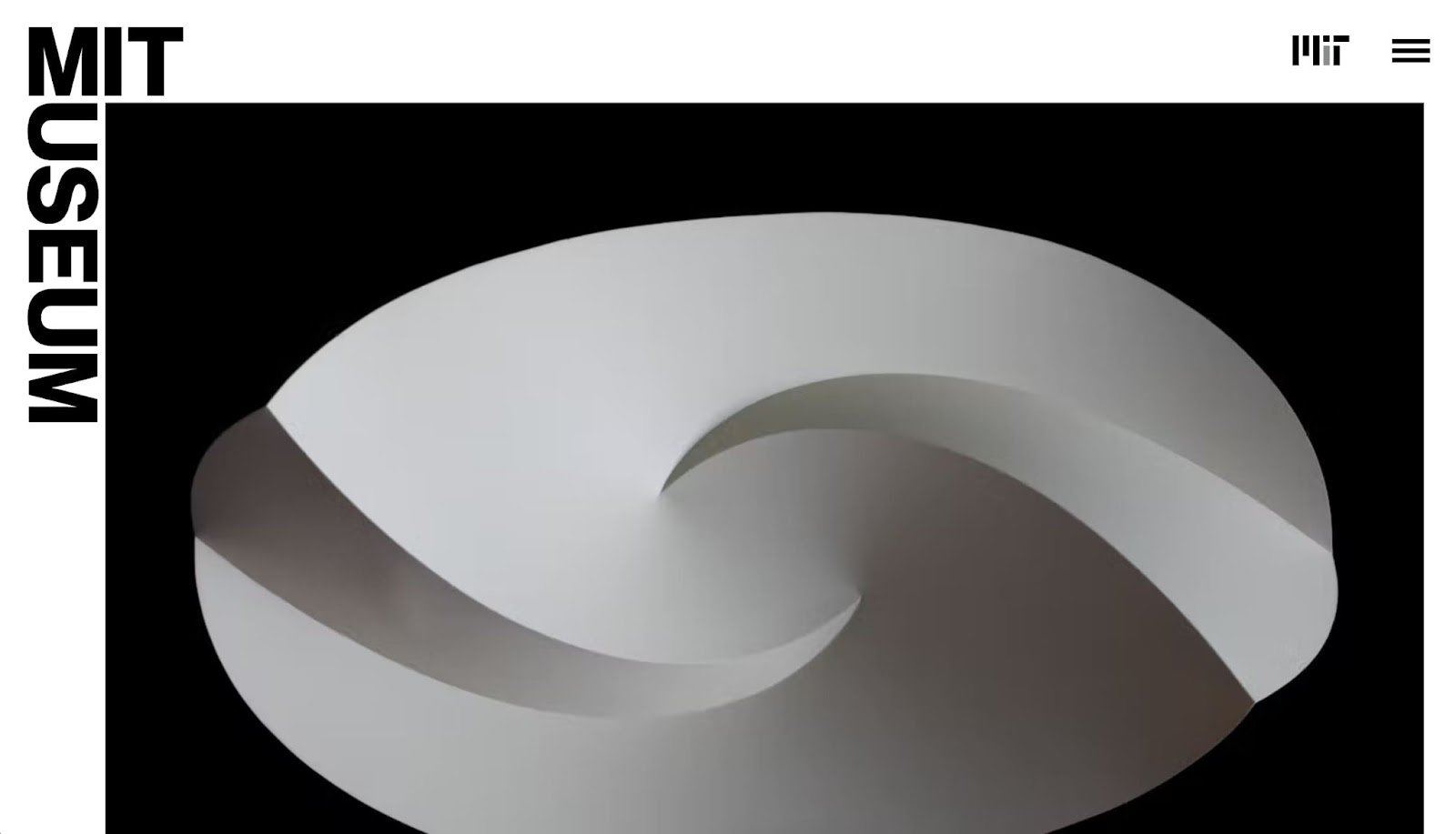
If you're ever in Cambridge, Massachusetts, I recommend stopping by the MIT Museum. It’s essentially a showcase of some of the coolest projects out of the Massachusetts Institute of Technology. We love this website’s stripped-back aesthetic that keeps focus on the works themselves, tempting you to plan a visit and learn more.
6. Museo del Prado
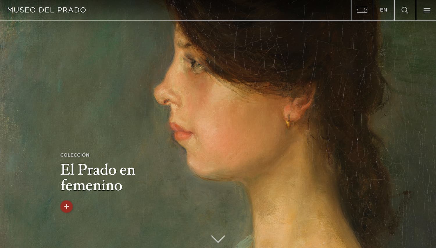
Museo del Prado’s website puts some of Spain’s best fine art on full display on its website, with paintings filling the entire screen in enough detail that you can see the textures of the brush strokes. It feels like you’re right up against the art viewing it yourself. Another detail we appreciate is how each background image resizes to the shape of the viewport. Whether you’re on mobile or a desktop browser window of any size, the painting fills your view.
7. MoMA
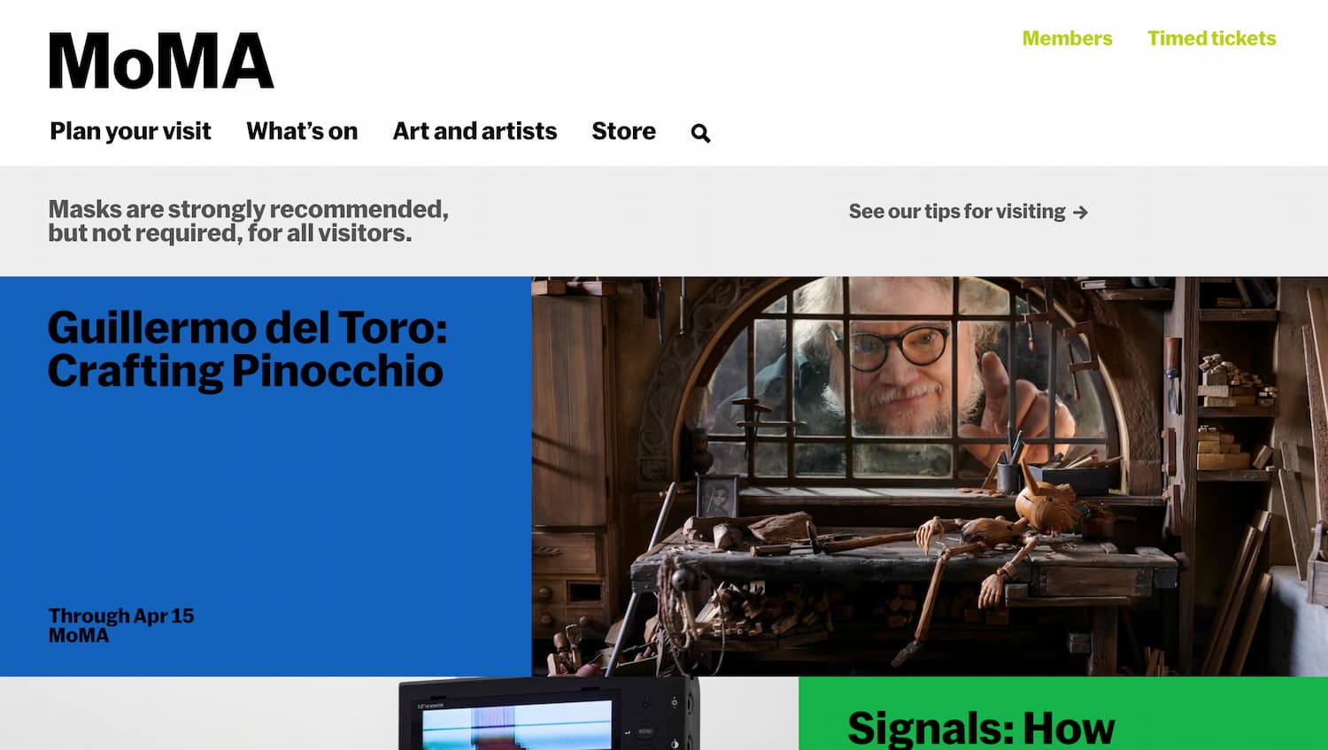
The website for the Museum of Modern Art in New York City (MoMA) features an Art and Artists section, a catalog of all pieces in its collection. You can browse the collection by searching by name or artist — almost half of all pieces in the collection can be viewed online, letting you preview the art before your visit.
8. Getty Center
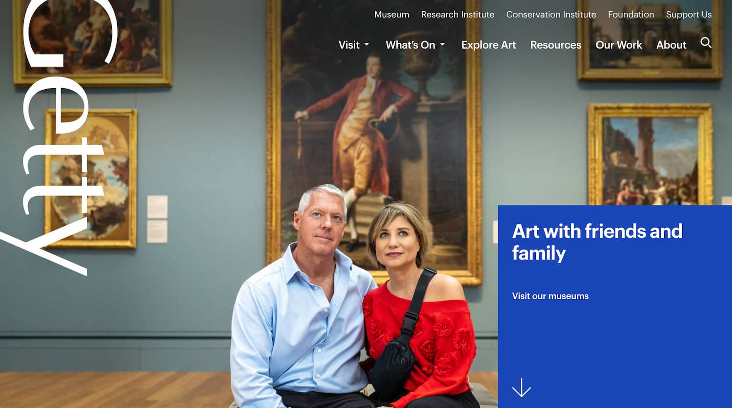
Known for its diverse range of international paintings, sculptures, and other art, the Getty Center is Los Angeles, California boasts a stunning website that tempts any visitor to buy a ticket. While straightforward in its presentation of content, the website is meticulously crafted. Each page leads with an attention-grabbing CTA or image, followed up by info for visitors. Some pages even switch background colors as you scroll to differentiate sections of the page in a unique and entertaining way.
9. National Museum of African American History and Culture
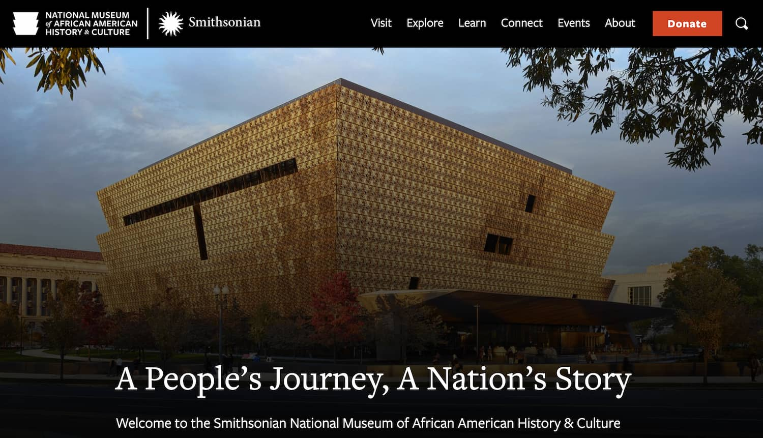
The Smithsonian National Museum of African American History & Culture in Washington, D.C. is housed in one of the most visually stunning buildings in the area. The designers of its website knew this and chose to feature it front-and-center on the homepage. One other section of the site that sticks out is its blog, titled Stories, which features educational pieces on the Black American experience.
10. Museum of Modern Art in Warsaw
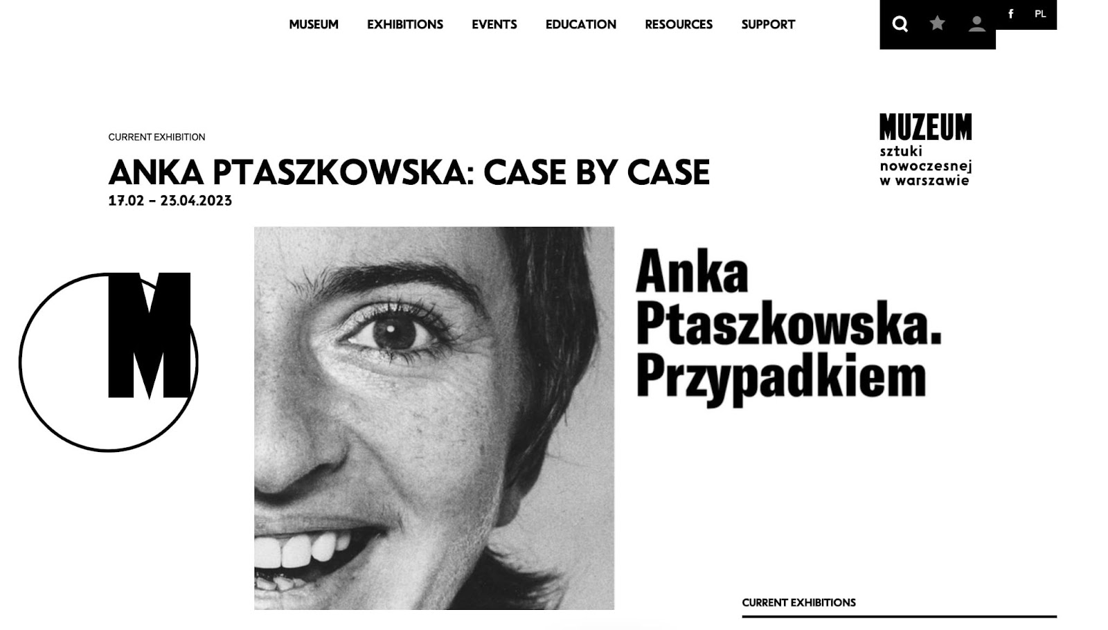
This next fascinating modern art website looks almost more like an online publication or newspaper than a museum site, thanks to its black and white color scheme, as well as the way it displays its exhibits and museum information. It’s a remarkably unique yet cohesive aesthetic that’s actually achievable for new website designers to emulate.
11. Frans Hals Museum
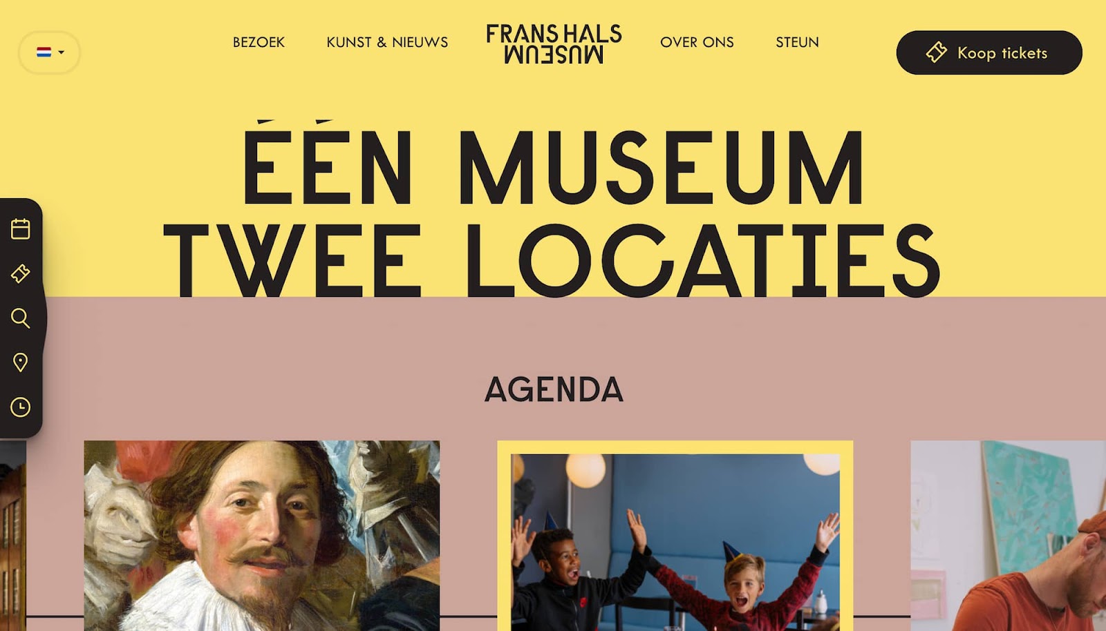
The Frans Hals Museum displays both modern art and art from the 16th and 17th centuries, including works by portrait artist Frans Hals. Its website is perhaps our favorite on the list — a perfect synthesis of animation, navigability, color, and small details on every page. We love the intricate scroll effects, as well as the sticky sidebar that follows you as you scroll, so you always have access to the most important links.
12. M+
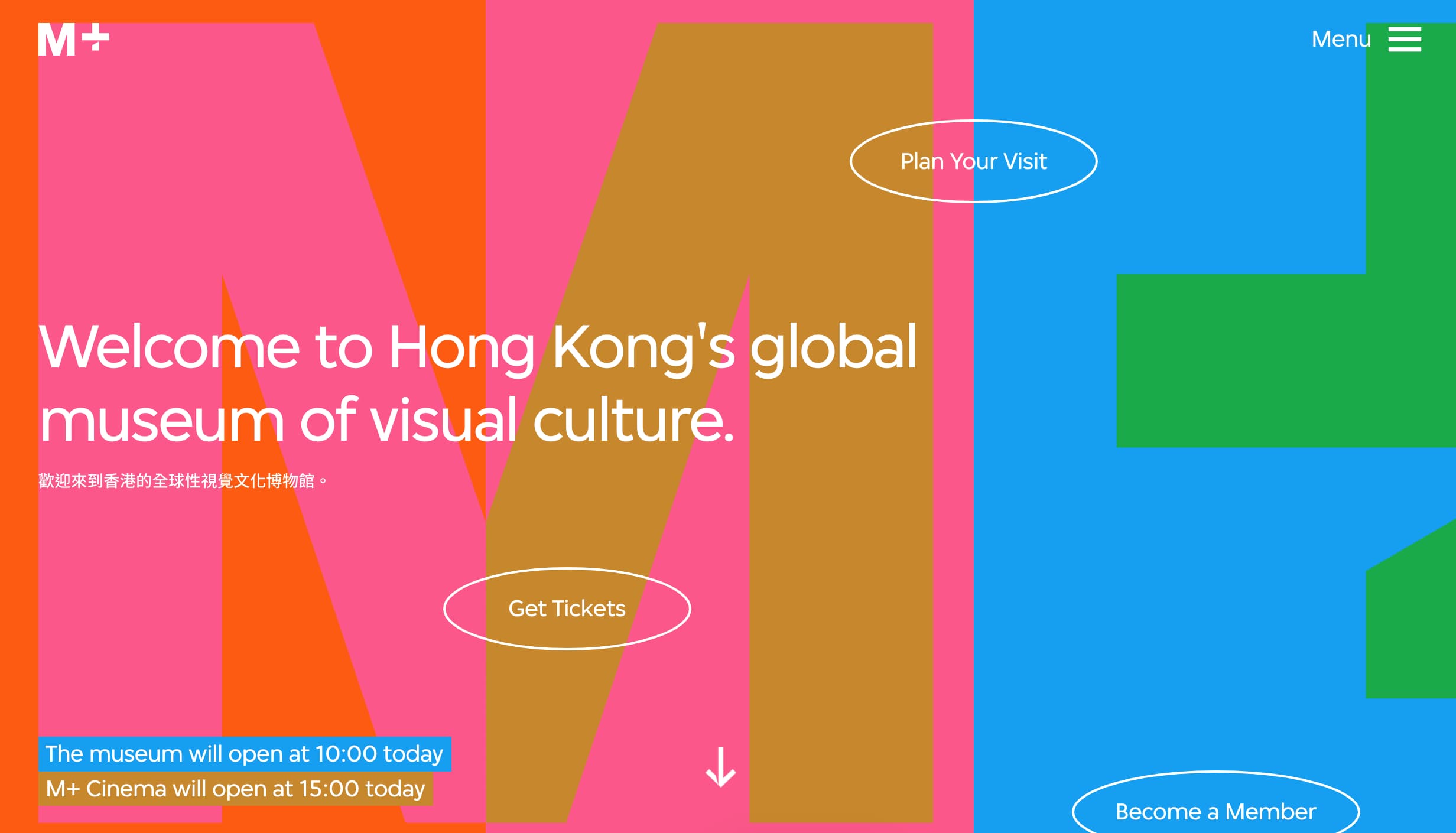
M+, a museum of visual culture in Hong Kong, employs color in impressive ways. The three background colors form columns to separate information, and change color on scroll to indicate different regions of content. This allows for flexibility — if the authors want to separate content into two or three columns, they can. Or, they can feature content that spans all three color columns without confusing visitors.
13. National Academy of Design

While not strictly a museum, the National Academy of Design highlights artists and their work with gallery events. Its website is simple, sleek, and to-the-point, showing the faces of its latest inductees and presenting links to informational and events pages, as well as a more prominent donation CTA at the top.
14. Chrysler Museum
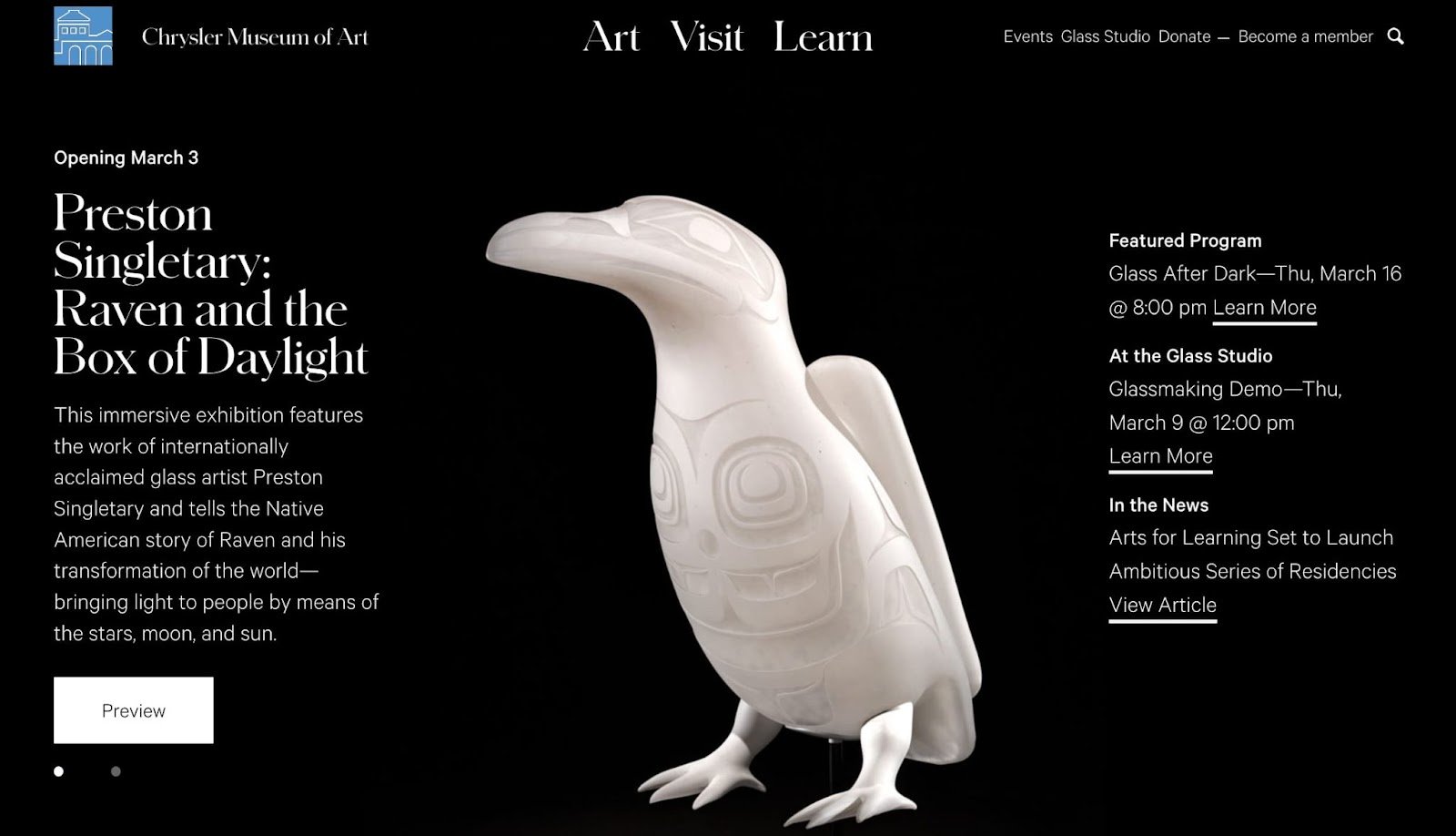
Like MoMA, the Chrysler Museum has cataloged its sizable collection of works online, allowing you to search through it. You can even filter by medium like glass or photography. Besides that, the website feels inviting with its copy and emphasis on free admission for all visitors.
15. Museum of Pink Art
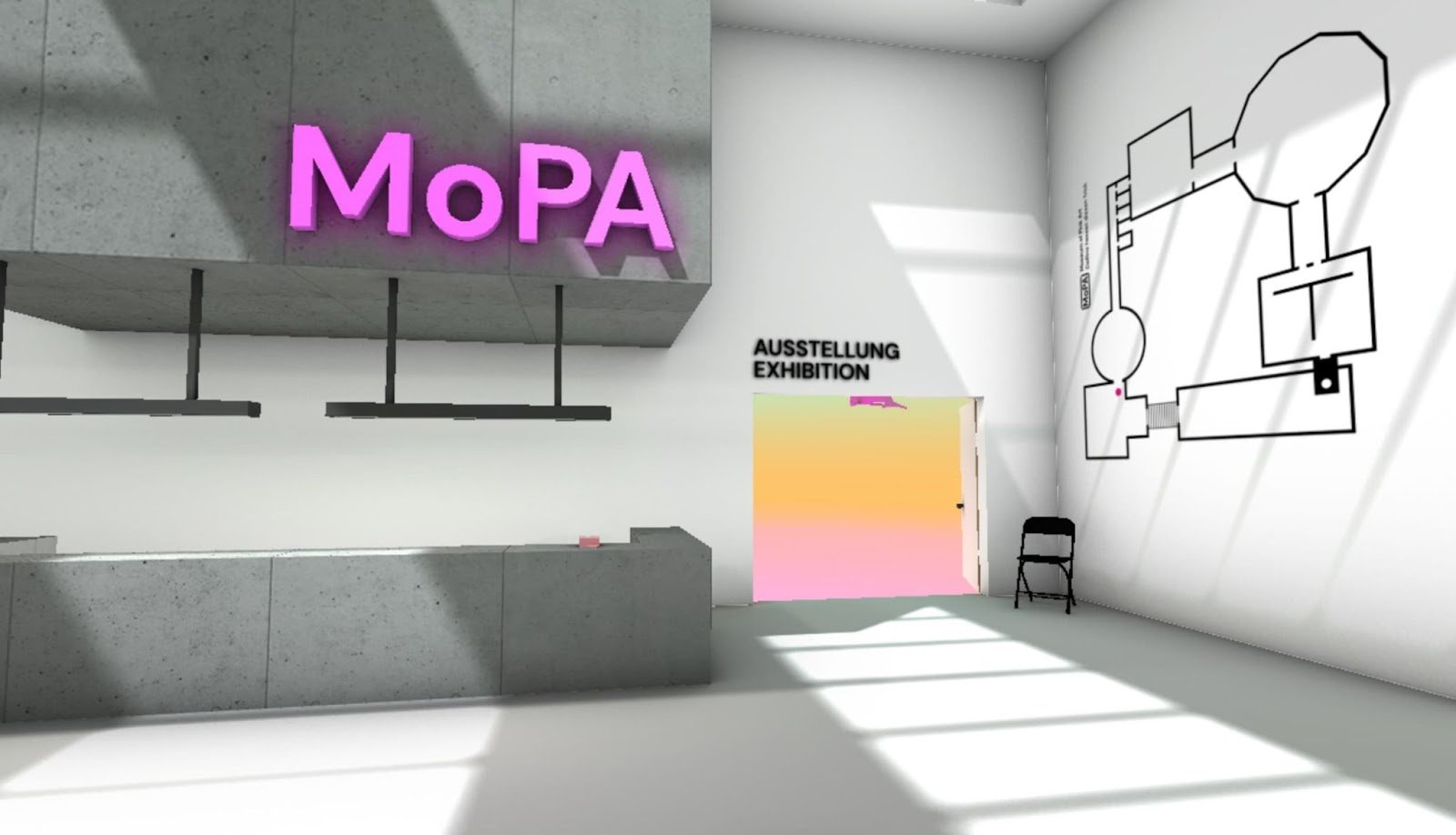
Here’s something a little different: The Museum of Pink Art (or “MoPA”) is a virtual museum featuring the color pink. Use the arrow keys and cursor to move and look around, and explore a space that often defies the laws of physics — something you unfortunately can’t have in a real-life museum.
16. Art Institute of Chicago
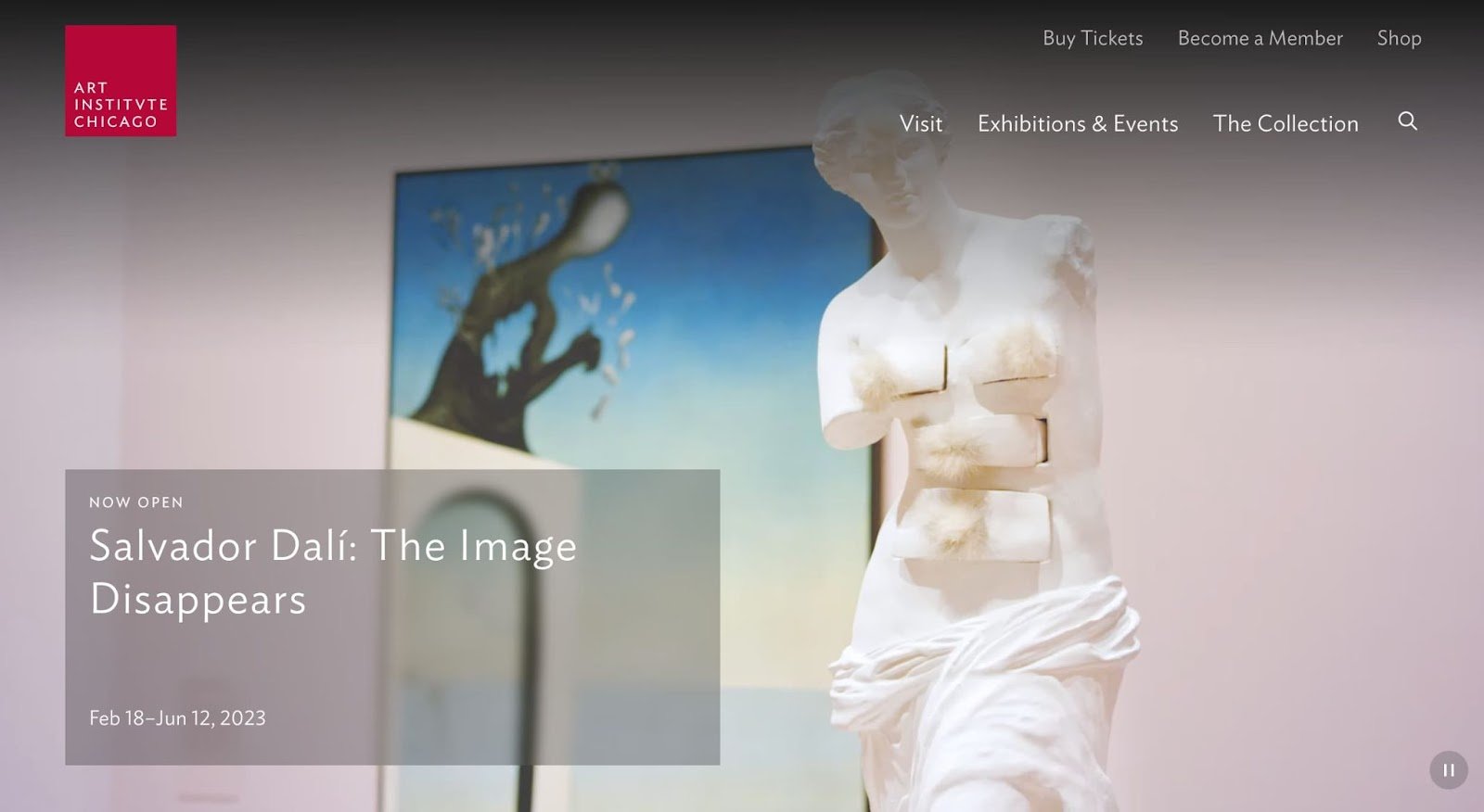
If you’re looking for a straightforward but well-crafted example of a museum website to emulate, definitely check out this one from one of Chicago’s most well-known museums, the Art Institute. The website makes extensive use of grids, sliders, and neutral colors for a pleasant viewing experience.
17. Rijksmuseum Amsterdam
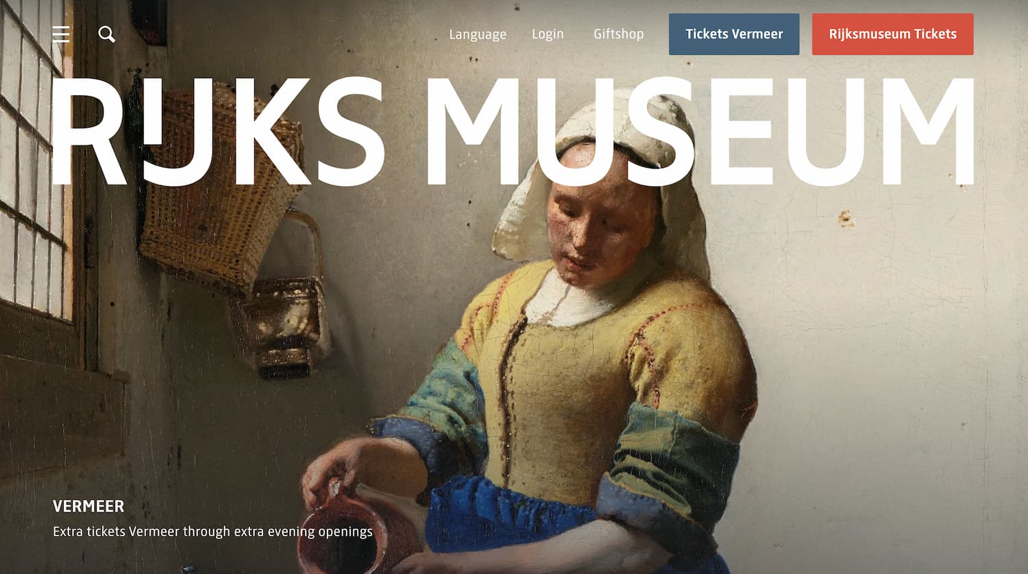
The website of the Rijksmuseum in Amsterdam wastes no time getting visitors up close and personal with the art, allowing you to see the finer details of the works on display. They also offer several high-quality video tours to get a better understanding of what the museum offers.
18. Tokyo National Museum
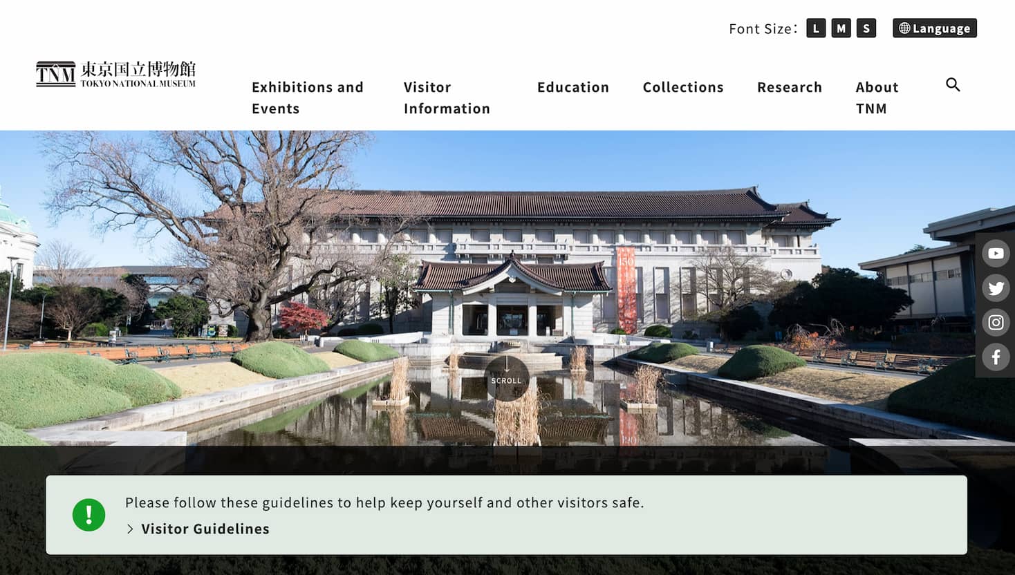
To wrap up the list, the Tokyo National Museum website is dynamic, immersive, and overall a fun scroll. The most pertinent information is available at the top of the homepage, but there is tons of content to explore and get lost in, with accompanying visuals that personally make me want to book a flight.
Craft your perfect museum website.
When building and improving your museum website, it can help to think of it as an exhibit itself. Elements must be carefully placed to guide viewers toward the desired destination. And, also like a museum exhibit, there are possibly dozens of other options competing for their attention.
So, take some inspiration from these examples and build a website that captivates both new and repeat visitors. And once you’re done, let me know so I can plan a trip.


![Artistic Web Design: Best Tips [+ 15 Examples We Love]](https://blog.hubspot.com/hubfs/artistic-web-design (1).png)


![10 Brochure Website Examples to Inspire You in 2022 [+ How to Make One]](https://blog.hubspot.com/hubfs/GettyImages-1306185043 copy.jpg)


