Looking to launch a gym, yoga, meditation, or general wellness site for all to see? With over 200,000 fitness centers globally, you’ll need to stand out from the competition to encourage signups.
When I’m looking to enhance my fitness journey, I turn to Google and look for options near me. That could be a new climbing gym in my area, a race to test my speed, or a CrossFit program that’s in tune with my skill level. If I see a place with a philosophy in line with mine, I check it out.
The deal breaker? An unprofessional website. If the site won’t load or if it looks like it was made in 1993, I’m less likely to check it out. I wonder if the place takes itself seriously as a business. What if the last time they updated their equipment was when the site was launched decades ago?
A cutting-edge website can impress potential visitors, getting them through the doors. A website that falls behind sends clients to other businesses. Now that you know why your site matters, let’s learn from role models. Check out our favorite fitness sites below for inspiration.
1. Fitlab
Kicking off our list is Dutch personal training and yoga studio Fitlab, which features a friendly, intuitive website that invites new clients in. I love the bold and prominent text over a simple, pastel color pallet. This branding falls in line with today’s wellness culture. I know they’re taking modern approaches.
For those who want to dive further in, the Fitlab website includes a useful fly-in sidebar menu with hover effects for each menu option. Each option leads to its own page featuring more images and convincing copy, ending with a form for lead capture.
Pro tip: Think about the fitness service you provide and align your color palette with your offering. If you’re into modern wellness, soft greens, pinks, and lavenders match. If you’re a swim shop, go for blues.
2. Yogamaya
I looked at dozens of yoga studio websites for this post. Most that I encountered featured people in the warrior position and triangle pose.
Yogamaya does have these classic pictures to show its instructors know their stuff. But before you see them, you encounter beautiful works of graphic design. I didn’t see anything else quite like it during my search.
The menu has a flowing squiggle going through it, with the different website sections in bold. You can explore class options, rates, teacher training, events, and more. When you hover over a menu item, a stylized drawing appears in the center. I was impressed by the art and wanted to explore every section to see what would appear.
Pro tip: Art, collage, or intelligent use of graphic design can help you stand out from standard fitness sites.
3. Soul Cycle
A leader in spin classes across the U.S. and Canada, SoulCycle offers a membership website that makes it easy for both new riders to join and for experienced members to book a spot. Visually, the site is minimal and clean — it doesn’t try to upsell visitors or place distractions on the page. Instead, it’s obvious how visitors can sign up.
SoulCycle’s website also features an interactive map integration for finding local SoulCycle studios and reserving a spot in a class. I can easily search by state or city, select the location, and then reserve for my desired time.
Pro tip: If you operate a fitness chain with multiple locations, make it easy for people to find the spot closest to them. Interactive maps or search bars offer helpful solutions.
4. Boombox Boxing
When I workout, I need the right soundtrack to keep me motivated. The folks at Boombox have the same philosophy. They offer box-to-the-beat classes, where your moves mirror the drums.
Plus, the website for Washington D.C.-based boxing gym Boombox pulls no punches. The first image is a full-width photo of a man boxing in front of a background of boomboxes. You don’t need to know what the site does. You can infer from the picture.
Boombox opts for a bold and minimal aesthetic, and this extends to its scheduling page too. Users may easily search for classes by date and filter by instructor, room, and class type. By keeping things simple, this website ensures that everything customers want is, at most, a few clicks away.
What we like: Boombox integrates its Instagram onto its homepage. You won’t ever miss an update and know where to follow them off the site.
5. ytfitnesslab
ytfitnesslab is a testament to what the WordPress CMS and the Elementor page builder can accomplish together — this highly dynamic, engaging website utilizes parallax scrolling effects, a grayscale palette, and subtle textural animations to achieve a modern site with a touch of gritty edge.
This personal training site makes heavier use of text than other examples in this list. However, the text is balanced with images and whitespace to prevent information overload.
Plus, the site has only three main pages. I had plenty of information to learn about their services but never felt overwhelmed. When researching this piece, some sites made me feel like I was reading a short novel before signing up. That was never the case with ytfitnesslab.
Pro tip: Text is a great way to communicate your mission and offerings. However, be wary of large walls of text. They turn visitors away. Instead, bold phrases and bulleted lists keep text digestible.
6. Deja Riley
This next personal training website is a stark contrast to the previous one. Its vibrant colors, encouraging copy, higher page count, and other visual touches combine to capture attention and hold visitors on the site for longer. There’s even a small store section and blog to cap it off.
However, what really sells the Wix-powered site is Riley herself. Through the text and images, her confidence and drive are obvious. This is a website that not only works on a visual level but on an emotional level as well. I could tell that her goal was to make clients “smile while you sweat.”
Pro tip: If you’re a personal trainer or offering consulting services, remember that you are an essential part of the brand. Find ways to play up your personality.
7. Phive
If you want inspiration for an immersive gym site, check out Phive. Its fantastic fusion of videos, detailed images, sound effects, scrolling effects, and interactive elements tell you everything about what the gym offers. Every page is a masterclass in how to combine text and media in a cohesive and engaging way.
My favorite aspect of the site is its page-loading animations, which feature the gym’s logo (the letter “P”) animated to perform different exercises. It’s a detail that likely took a lot of additional effort, but delightful moments like this are invaluable when trying to sway visitors.
What we like: Animations and transitions on your site are subtle ways to make your offerings stand out.
8. BK Yoga Club
This Brooklyn-based yoga studio emphasizes inclusion, and the same can definitely be said for its website. The design choices made on this site appear carefully crafted to put visitors at ease, inviting us into the space to experience a class, private session, or event.
From browsing the site, it’s obvious that yoga is the main offering. However, that’s not all this studio does. The BK Yoga Club website prominently features its blog, BYC Body Times, as well as community events and a merch shop.
Pro tip: If your offerings go beyond classes, feature them prominently on your site. That includes any blogs, shops, or video series that you make.
9. Crunch Fitness
Whether I’m exploring my local area or I’m away on a trip, I’ve often spot Crunch Fitness gyms in the wild. And with over 400 locations in the U.S., many recognize the logos and have peered through he club’s glass windows.
That’s why Crunch Fitness’ website falls more in line with what you might expect an enterprise site to look like. However, there are still some features that help it to stand out. For example, take its emphasis on customer-centricity. The homepage lists the gym’s four “crunchisms” that highlight a commitment to positivity, inclusion, and crushing goals.
Also notable is the site’s navigation. Despite its array of offerings and locations, the website carefully structures its pages to guide visitors exactly to where they want, whether it’s a membership, personal or group training, or classes.
What we like: Crunch Fitness prominently features free trial options. If you offer a similar opportunity, make sure people can learn about trials on your site.
10. Yoga and Juliet
Offering yoga instruction, retreats, and mentorship, this yoga site exemplifies how to translate a personal yoga business into an online presence.
Though you could call it a simple WordPress-WooCommerce site, the design shows an appreciation for space and attention to detail that visitors will expect and enjoy.
Several pages on this website begin with full-width videos that lull users into the site’s experience. Then, the inviting copy helps us get to know Juliet, her mission, and where we can sign up to learn more. Those looking for more value can read the blog containing dozens of articles centered on wellness and mindfulness.
Pro tip: There are many disciples and angles a yoga business could follow. Make sure your site reflects your specific approach. Yoga and Juliet’s site shows images from peaceful retreats and nature. That’s different than a business that focuses on high-intensity, hot yoga.
11. Harlem Cycle
Harlem Cycle uses its full-width video a little differently — to dial up the intensity. Offering in-studio and online spin classes, this company has created a straightforward website to get visitors booked and behind the handlebars.
Harlem Cycle’s website also takes steps (or, rather, pedals) to feel more personable. That includes prominently featuring its staff members, incorporating the studio branding into the site’s color schemes, and sharing its commitment to the community.
What we like: Testimonials and mentions in leading publications let visitors know that this is a top-notch facility. If your fitness business has similar clout, provide examples. Social proof goes a long way.
12. HealHaus
For a change of pace, let’s head to the HealHaus website. This holistic healing and health center sports a website to paint a picture of its space and approach to wellness — the pastel colors carry over from the images to the site’s color scheme for a consistent look and feel.
HealHaus offers a variety of holistic health treatments as well as yoga and meditation. Visitors may book a session or class, view offerings and rates, or explore the online shop.
What we like: This website ultimately works because, while being a relatively simple WordPress site, it translates the physical space of HealHaus to an online medium. Don’t be afraid to lean into simplicity.
13. Luminous Face Yoga
Have you heard of face yoga? I hadn’t until I came across this website. Fortunately, Luminous Face Yoga takes the time to explain the practices and benefits of face yoga and sell you on its products, which include a monthly membership, classes, and beauty products.
It starts with a full-width video on the homepage to demonstrate some basic face yoga techniques. As you scroll, you’ll learn more about the practice and how Luminous can get you involved.
Another particularly interesting feature is the before and after comparison photos, in which users can drag a vertical bar to see results.
Pro tip: If you practice a niche form of fitness, make sure your pictures and videos show what you do. Don’t just tell your audience. You need images as examples.
14. Kinective Fitness
Based out of El Paso, Texas, Kinective Fitness has created a truly impressive and dynamic website. The homepage opens with a side-scrolling effect to establish the gym’s philosophy early on, then provides its location and offerings, including personal training, cycling, group exercise, and yoga.
For first-time visitors, a detail like this can immediately swing the perception of your business in a positive direction. Since websites have such little time to grab attention, Kinetic understands that a unique design choice can make the difference between a new membership and a bounce.
What we like: The photos on Kinective Fitness’ site look like editorial photos from magazines. This communicates a high-class experience.
15. Sweat FXBG
Unearth the electric energy at Sweat FXBG — a Virginia gem where HIIT, indoor cycling, barre, rowing, and yoga collide in a dance of fitness ecstasy. At the helm are Carrick and Robin, visionaries not just out to craft a gym but a pulsating brand odyssey.
Every corner of their boutique studio tells a story, from the vivid murals that greet you to the charismatic instructors weaving tight-knit community bonds. Dive deeper into their world through the Wix Branded App, meticulously designed to mirror their ethos.
What we love: The website promotes the Sweat FXBG app. Visitors can get connected before they even step inside the gym.
16. Aly Gray Fitness
Meet Aly Gray: not just a personal trainer, but a digital fitness maestro. She‘s dialed into the beat of her clientele’s desires, crafting a symphony of online fitness escapades. That includes thrilling challenges, immersive live Zoom workouts, a treasure trove of video tutorials, and a buzzing group chat hub.
And for the jet-setting fitness enthusiast? An intuitive app (powered by Fit by Wix) awaits, letting them book a sweat session with Aly with just a tap.
What we like: Every digital avenue, from desktop to mobile, unveils this suite of offerings with crystal clarity, ensuring members are always in the know. Dive into Aly's world; a new era of fitness is here!
17. The Limit
Step into the new dawn of fitness with the electrifying concept of “Hybrid Fitness” — a seamless fusion of face-to-face adrenaline rushes and digital sweat sessions. The Limit isn‘t just riding this revolutionary wave; they’re shaping its crest.
Their homepage is a vivid tapestry showcasing exhilarating in-person workouts, invigorating Zoom rendezvous (did someone say ‘live Saturday dance parties’?), and an always-ready arsenal of on-demand workouts.
Pro tip: If you‘re navigating the vast seas of multi-platform, multi-location fitness offerings, let The Limit be your beacon. The future of fitness isn’t on the horizon; it's right here. Dive in!
18. Equinox
Equinox memberships come with a high price tag. I’ve walked by the sleek, floor-to-ceiling windows and have wondered, is it worth it? The website’s job is to convince you, a mission that it pulls off.
The homepage shows images of people working out. But unlike other website, it shows just as many images of the facilities itself. That’s because the brand knows the top-of-the-line equipment and services draw customers in.
There’s even a section titled “Where Luxury and Fitness Meet” that features a full-width video. Here you can see classy lounges, sleek juice bars, rooftop pools, and a peaceful spa. You can see what you’re paying for, making you more likely to purchase.
What we like: Equinox is more than a gym. It’s a wellness experience. There’s one section on the homepage that focuses on spa offerings to drive this point home.
19. Core Power Yoga
With over 200 locations in over 21 states, Core Power Yoga is one of the biggest chains in the U.S. That means site visitors can likely find a location in their area and book a class in no time. There are also virtual options for those outside of Core Power’s range. The site is built on the principle that anyone can take classes at Core Power.
This purchasing philosophy is present across the site. Most CTAs relate to how to book classes either online or in person. Visitors are never confused about how they can participate in a core power offering.
Beyond that, there are opportunities to get discounts across the site. I love this bonus feature.
When I first visited Core Power’s site, I could spin for a chance to win a discount on my purchase. This could be used on class packs or apparel. I spun before inputting my email, making me more likely to try my luck. (I got 30% off — the maximum amount — so maybe it's time for a shopping spree?)
What we love: If you can offer discounts, make the process interactive and fun. Tell people what discount they’ll receive before having them input their email to build trust.
20. Hot 8 Yoga
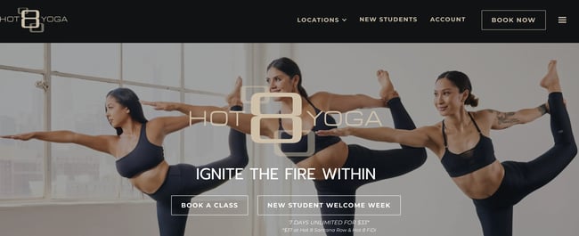
As a fitness enthusiast, I’m not just going to a website to look for new workout classes. I’m revisiting the same sites, so I can book my next sessions. You’ll need to make sure that your site appeals to returning users, making it easy for them to rebook with you.
Hot 8 Yoga in San Jose, California, gets this right. Its home page is simple, prominently featuring a calendar option. You can click on a day, see what classes are available, and view the times they take place. There’s a button to sign up next to every option. Easy-peasy!
What we like: There’s an option to see a full calendar view for folks looking to book further into the future.
21. Barre3
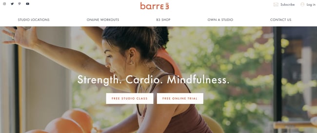
What is barre anyway? Well, this full-body exercise blends elements of yoga, pilates, and ballet to get you moving. While the practice was started in the 1950s, barre’s popularity exploded in the 2010s. Many people haven’t yet tried this type of exercise.
Barre3 gets it. Sometimes, you need to try a new exercise out before you make a long-term commitment. That’s why the first thing you see on their website are two prominent CTAs. You can book a free studio or online class so you can test it out.
Beneath, the site describes what barre is and its health benefits. You also see pictures of people using this method to work out. The trifecta of discounts, description, and imagery pull visitors right in.
Pro tip: If your fitness option is relatively newer, be sure to describe what you do with images and text.
22. Invictus Boston
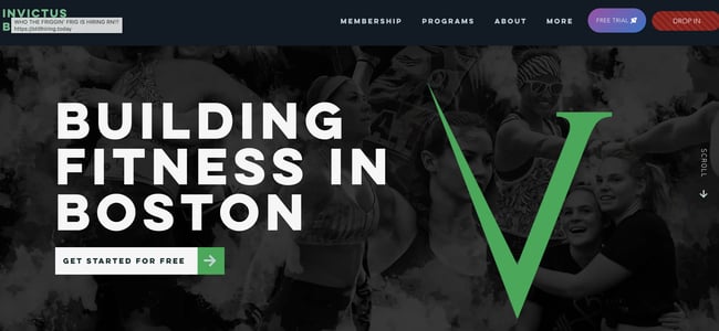
Parallax scrolling means the background stays stagnant while the images in the foreground move or change. This web design technique is used by cutting-edge sites to create a sense of movement. Invictus Boston uses this technique throughout its site.
Text appears in the foreground, next to images of folks working out. You can see the pictures of weight lifters shift as you scroll to read.
Beyond this exciting effect, the site includes a video that shows off its program and facilities. You can also learn more about the three locations the business has in Boston.
What we like: There’s a carousel of five-star reviews with quotes from satisfied customers. These testimonials can convince people on the fence to give Invictus a try.
23. Community Rowing

If you’ve ever lived in the Boston area, you know that rowing is a big deal. You can see the long boats floating down the Charles River with the names of top universities plastered on the side. I’ve always wondered what it’s like to try that out. Community Rowing is the place to see.
This rowing company does everything, from teaching you proper form on rowing machines to taking you out on the water. The site shows of a featured image slot with photos of rowers in the water, so you can picture yourself there. You can also watch videos about Community Rowing’s philosophy and programs.
When it comes to rowing, a first-timer will have many questions before they book. Community Rowing takes this into account with its frequently asked questions section. Here, you can learn more about the programs, how big classes are, and what to do if you have physical limitations.
What we like: Diversity and inclusion are a big part of Community Rowing’s mission. There’s a whole section on their site that share what they’re working on in this space.
24. The Spot
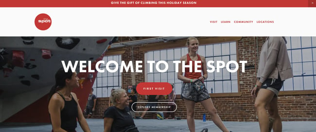
Rock climbing is a great way to get a full-body workout. Climbers want to know what facilities look like, how difficult the climbing paths are, and what comes with membership. The Spot puts all of this information prominently on its website.
If you’re new to climbing, the first visit page lays out your options simply. You can take intro classes and see FAQs specifically for people new to the activity.
What we like: I visited The Spot’s site around the holidays when researching this piece. Holiday deals and gift cards were featured prominently on the site. If you have seasonal deals, make sure your customers know how to snag them.
25. Bay Club
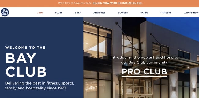
You may not be loyal to just one type of exercise. Perhaps some days you want to swim. On other days, you want to golf. Some days you want to lift weights. Bay Club is a facility that offers you a wide range of exercise options so you can hit your fitness goals.
For fitness facilities like Bay Club, their sites need to show off the breadth of their offerings. Bay Club does this in two ways. They have a carousel that features what you get in a membership — from pickleball to classes to summer camps for the kids. They also have an amenities section with all of the offerings you can explore.
Pro tip: If your facility has a wide range of ways to exercise, your site should have sections showcasing each one.
Your website is one of the most important tools you have to craft a delightful customer experience and grow your business. Ready to build your own top-notch fitness website? Check out Hubspot's free CMS tools to get started today.
What is the best fitness website?
From browsing these examples, we can see that there’s a lot of variety within the fitness business niche. Gym websites are going to look different from yoga studios and wellness websites.
So, which of these examples is the best? While your opinion may differ, I’d have to go with Yogamaya’s yoga site. This site nails the basics with an artistic flair. This approach avoids overwhelming new clients and sums up all offerings succinctly with a hint of fun.
As for gym websites, I’ll shout out Phive one more time — exploring this site is an experience in and of itself. I can’t get enough of its quirky loading animations and gorgeous imagery. It makes me want to get moving, and I can’t think of any higher praise.


![Artistic Web Design: Best Tips [+ 15 Examples We Love]](https://blog.hubspot.com/hubfs/artistic-web-design (1).png)


![10 Brochure Website Examples to Inspire You in 2022 [+ How to Make One]](https://blog.hubspot.com/hubfs/GettyImages-1306185043 copy.jpg)


