When creating web pages, user experience should be top of mind. That means that simplicity, visual hierarchy, and navigability must be prioritized in your build process.

These guidelines for exceptional web design and usability have the same goal: to make it easy for visitors to find the information they’re looking for or complete the action that they set out to accomplish. Legible typefaces, a consistent color scheme, and breadcrumbs are just a few design elements that can improve the user experience on your site.
Another is the drop cap. In this post, we’ll explain what a drop cap is and how to create them in CSS.
What is a drop cap?
A drop cap is short for “dropped capital.” It’s the large capital letter you sometimes see at the beginning of a paragraph in print and digital publications. This decorative element is usually the size of two or more lines of text in a paragraph.
In The Atlantic, drop caps are used to break up sections of an article and signify the starting point of each for the reader. They take up the space of three lines of text, as seen in the excerpt from “The American Nightmare” by Ibram X. Kendi below.

The New Yorker uses drop caps for a similar purpose on its site, but at a smaller size. Its drop caps take up two lines instead of three, as seen in the excerpt from “How Pandemics Wreak Havoc—and Open Minds” by Lawrence Wright below.

When choosing fonts for your own site, you might decide to use drop caps to improve the readability of your content. In that case, let’s walk through the process for designing drop caps in CSS.
How to Design Creative Drop Caps in CSS
There are two ways you can create drop caps in CSS.
The first way is to wrap the first letter of a paragraph with span tags. You can then style the span, without affecting the rest of the paragraph, by using a CSS selector. Below, we’ll use the type selector span.
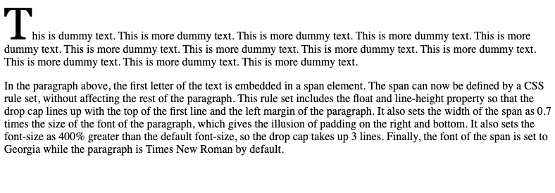
To make the drop cap line up with the top of the first line of the paragraph and the left margin of the paragraph, you can use the float and line-height property. Set the float property to left and the line height to 85%. By setting the line height to 85% instead of 100%, you align the top of the capital “T” with the top of the lowercase “h.”
Then, to ensure the drop cap and paragraph do not overlap, set a fixed width for the span. Using 0.7em, or .7 times the width of the font of the paragraph, will give the illusion of padding between the drop cap’s right and bottom edge and the paragraph. To make the drop cap the size of three lines of text, set the font-size to 400%.
Finally, to ensure the drop cap really stands out, change the font family to Georgia. Let’s look at the code all together.
Here’s the CSS:
   span {
  float: left;
  line-height: 85%;
  width: .7em;
  font-size: 400%;
  font-family: georgia;
}
Here’s the HTML:
   <p><span>T</span>his is dummy text. This is more dummy text. This is more dummy text. This is more dummy text. This is more dummy text. This is more dummy text. This is more dummy text. This is more dummy text. This is more dummy text. This is more dummy text. This is more dummy text. This is more dummy text.</p>
<p>In the paragraph above, the first letter of the text is embedded in a span element. The span can now be defined by a CSS rule set, without affecting the rest of the paragraph. This rule set includes the float and line-height property so that the drop cap lines up with the top of the first line and the left margin of the paragraph. It also sets the width of the span as 0.7 times the size of the font of the paragraph, which gives the illusion of padding on the right and bottom. It also sets the font-size as 400% greater than the default font-size, so the drop cap takes up 3 lines. Finally, the font of the span is set to Georgia while the paragraph is Times New Roman by default.</p>
Here’s the result:

Feel free to play around with the CSS or the HTML via this interactive code pen.
See the Pen Drop Cap Example by HubSpot (@hubspot) on CodePen.
The second way to create drop caps is to use the pseudo class ::first-letter. This will target the first letter of the first line of a block element, including a paragraph. Using a pseudo-class selector, you can then style away. We’re going to get more creative with the example below.
As with the example above, start by setting the float, line-height, font-size, and font-family properties. Save for the float property, which must be set to left, you can use different property values. The example below uses pixels instead of em units and percentage values, for example, and opts for the Montserrat font. Note: it also changes the default font-size of the paragraph from 16px to 14px.
Now let’s say you want to change the color and add a border around your drop cap. To do so, you simply set the color property to whatever hex color code you want. We’ll use a nice purple below.
Then, using the shorthand border property, you can set the style and color. In the example below, we’ll use a solid line and a shade of purple for the border. Next, add padding on all sides to put space between the capital letter and the border. Finally, set the margin-right property to a positive value to make sure the border and paragraph don’t overlap, and set the margin-bottom property to a negative value so that the paragraph wraps around the drop cap.
Let’s look at this code altogether, then see how it would render on the front end.
Here’s the CSS:
   p::first-letter {
  float: left;
  line-height: 35px;
  font-size: 55px;
  font-family: Montserrat;
  color: #7D3C98;
  border: solid #D5C5EC;
  padding-top: 5px;
  padding-bottom: 5px;
  padding-right: 5px;
  padding-left: 5px;
  margin-right: 5px;
  margin-bottom: -5px;
}
p {
  font-size: 14px;
}
Here’s the HTML:
   <p>This is dummy text. This is more dummy text. This is more dummy text. This is more dummy text. This is more dummy text. This is more dummy text. This is more dummy text. This is more dummy text. This is more dummy text. This is more dummy text. This is more dummy text. This is more dummy text.</p>
<p>In the paragraphs above, the first letter of each is targeted by a pseudo-class selector. The letters can now be styled differently from the rest of the paragraph. The CSS includes some of the properties we used above, including the float, line-height, font-size, and font-family properties. What makes it different from the previous example is that the color, border, padding, and margin properties are also defined. Setting these properties with hex color codes and different length values, the drop cap is not only a different color, but is also bordered.</p>
Here’s the result:

Improving Usability in Your Design
Using the methods above, you can design drop caps for your unique website. There are even more styling options in CSS that we did not discuss. You can play around with background-color, text-decoration, and other CSS properties to find the perfect design for drop caps on your site.
Whether you’re building your site from scratch or using a development framework like Bootstrap CSS, you’ll just need some knowledge of HTML and CSS to create these design elements.


