A website is a great way for churches to attract new members and inform existing members about online resources, events, and ways to get involved in the community.

 If you’re building or redesigning a church website, then your goal is to provide an engaging and informative experience to both first-time visitors and existing members. To help you get started, we’ve found some of the best church websites with attractive and unique designs that can inspire your own. Let’s take a look.
Best Church Websites
- Passion City Church
- Renewal
- Second Baptist Church
- Elevation Church
- Freedom Church
- Granger Community Church
- Crossroads Community Church
- Faith Community Church
- Loft City Church
- One Church
- Calvary
- Park West Church
- Lancaster County Bible Church
The list below is split into two groups: modern and simple church websites. The modern church websites are more feature-rich than the simple church websites, which gravitate toward minimalism. However, both types feature some of the same trends, like video backgrounds, parallax scrolling, and hover animations. Let’s take a closer look at each type and its respective examples below.
Modern Church Websites
The modern church websites below combine several design trends, like video backgrounds, image grids, daring typography and colors, and hover animations. They are also incredibly interactive. Interactive websites give users control over their experience and help guide them toward information they want. The result is a more engaged and memorable user experience. Let’s dive into some examples below.
1. Passion City Church
Why this works:
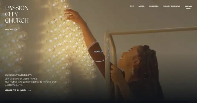
Passion City Church immediately captures visitor’s attention with a full-screen video background and two CTAs. In the center of the page, there’s a CTA inviting visitors to watch the full video of a Sunday Gathering (the weekly service at Passion City Church). In the bottom left corner, there’s information about when services are held and what their purpose is. Below that is a simple CTA inviting visitors to “Come to Church.” Using whitespace and a highly legible typography, the website directs visitors’ attention to several other opportunities to take action by donating, downloading the pastor’s podcast, registering for the Passion 2022 event, and more.
2. Renewal
Why this works:
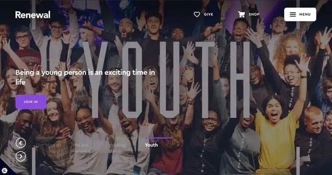
Renewal combines bold colors and animations to engage visitors on their site right away without overwhelming them with information. For example, there are four CTAs on the homepage banner: read Renewal’s mission, plan a visit, get involved, and join their Youth program. Rather than present all four options at once, the website displays them one at a time in an animated slider. Each is represented by a vibrant CTA button that changes color when a visitor hovers over it.
3. Second Baptist Church
Why this works:
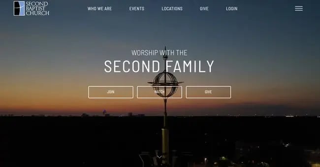
Second Baptist Church deftly guides the user journey with animations, videos, and other interactive elements. Visitors are immediately captivated by the video background and encouraged to take three actions: join the community, watch a sermon, or donate. Each of these buttons will change from a white outline to blue background when a visitor hovers over it. If visitors want more information before taking one of these actions, they can scroll down to the grid section to learn more about the church’s summer events, Holy Land tour, ministries, and more.
4. Elevation Church
Why this works:
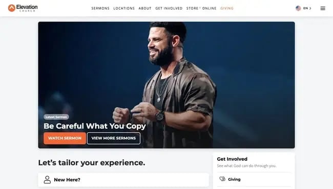
What sets Elevation Church apart from other church websites is that it offers personalized experiences to users based on whether they’re first-time visitors, existing members of the online “eFam” community, or members of a campus community. If you click on the “New Here?” button, for example, you’re redirected to a welcome landing page that invites you to learn more about the church, find a campus near you, meet the pastors, and more. If you click on the “I’m already part of the eFam community” button, then you’re taken to a different landing page where you’re prompted to watch online sermons, join an eGroup, or connect on Facebook.
5. Freedom Church
Why this works:
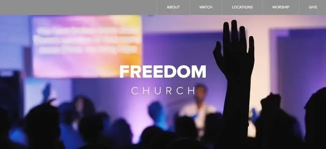
Freedom Church uses a full-screen video background and unique grid layout to capture visitor’s attention and present them with different ways to navigate the website. They can click on one of the CTA buttons in a grid section to learn more about joining the “Firestarter” community or check out one of the church’s archive pages. Each of these pages has a grid layout to display Freedom Church’s creative collateral, true stories, or sermon series, respectively. If visitors aren’t interested in any of those four options, then they can find more options in the navigation bar at the top of the screen.
6. Granger Community Church
Why this works:
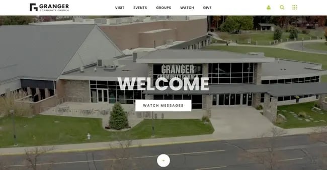
Granger Community Church is designed to welcome both first-time and return visitors. Visitors are presented with two options: to watch messages or to keep scrolling down the page. They can also click on any of the links in the sticky navigation menu above. As they scroll, visitors will see several calls-to-action inviting them to watch the current weekly gathering series, check out events held by the church, join a group, volunteer, and more. Each of these buttons is animated so that it turns bright green when a user hovers over it, which can help motivate visitors to actually click.
7. Crossroads Community Church
Why this works:
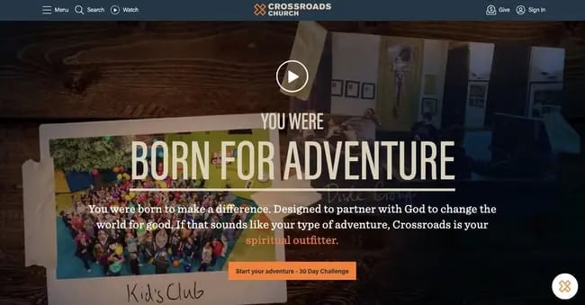
Crossroads Community Church uses visual hierarchy and color to direct visitors to take a specific action: sign up for the 30-day challenge, which will provide email subscribers with something to read, something to watch, or something to try every day for a month. If visitors aren’t ready to commit, they can scroll down and find blog posts, news, about the Crossroads community, and videos, among other resources. If visitors still can’t find what they’re looking for or have questions, they can use the website’s live chat feature.
Simple Church Websites
The church websites below have a minimalist design. This type of design emphasizes simplicity, balance, alignment, and contrast. Minimalist websites typically use lots of whitespace, large images, and bold typography. They also only offer the features and content a user needs to accomplish a specific task, like learning about the church’s mission, getting in contact with the organization, or making a donation. Let’s take a look at some examples.
8. Faith Community Church
Why this works:
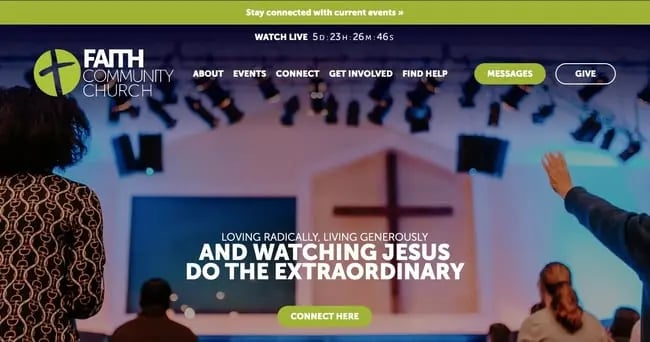
Faith Community Church — or FCCH.org — offers an excellent example of visual hierarchy. Visual hierarchy refers to how website elements are arranged and organized so that visitors naturally gravitate toward the most important elements first. On FCCH.org, the visitor’s attention is drawn to the mission statement first due to its size and center position on the page. This is followed by a colorful “Connect Here” CTA, which prompts visitors to fill out a contact form. Users can click this CTA if they’re ready — or scan the menu items at the top of the page to learn more or take another action (like donate).
9. Loft City Church
Why this works:
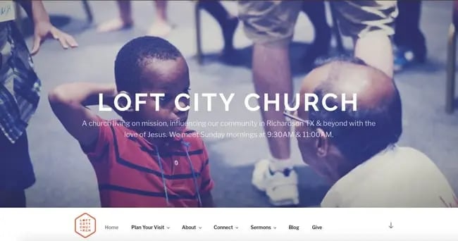
Loft City Church uses parallax scrolling and pops of bright orange to capture visitors’ attention and keep it as they scroll. The site provides all the information visitors need right away, explaining what the church’s mission is and when they hold services. If visitors are looking for additional information or ways to take action, they can explore the options in the navigation menu. This menu is sticky so it stays at the top of the screen as visitors scroll down the page, making it easy for them to navigate the site.
10. One Church
Why this works:
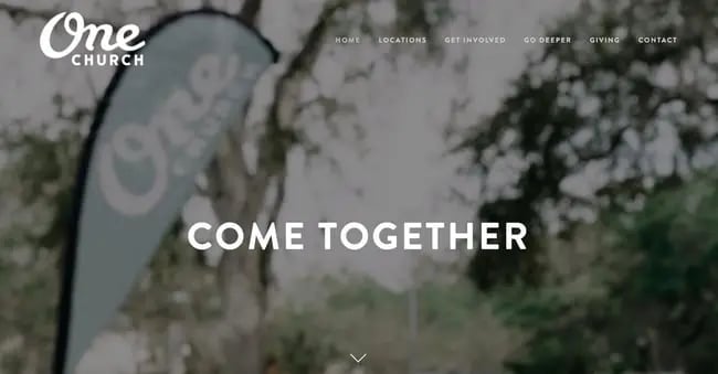
Using parallax video and image sections, bold typography, and a sticky navigation menu, One Church provides a simple but engaging user experience to its visitors. As they scroll down the homepage, visitors can check out the church’s four locations, learn more about its art school and community outreach program, sign up for their newsletter, and follow One Church on social media. If they’re interested in other actions or information, then they can hover over the different navigation options at the top of the page. Some have sub-navigation menus that display the multiple ways to get involved or “go deeper.” This provides an easy and decluttered interface for visitors to explore the site.
11. Calvary
Why this works:
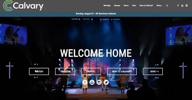
Calvary combines simplicity, visual hierarchy, and other usability guidelines to encourage visitors to take action right away. Calvary presents multiple calls-to-action on its homepage. Visitors can either watch sermons online, join a small or Serve group, donate, or follow Calvary on social media. First-time visitors also have the option of clicking the “New to Calvary?” button, which will redirect them to a personalized About page where they can learn what to expect when joining the community and watch videos about the church and pastor.
12. Park West Church
Why this works:
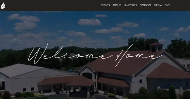
Park West Church is an excellent example of user-centricity. Visitors landing on the page are immediately greeted with the sentiment “Welcome Home” and informed when services are held. As they continue to scroll, visitors are presented with multiple calls-to-action that anticipate what they want to do or learn more about. They can sign up for an event, watch a sermon online, join a livestream mass, donate, subscribe to the church bulletin, or contact the church. If they still can’t find what they’re looking for, then visitors can hover over the sticky navigation menu to reveal drop-down menus of additional actions and information.
13. Lancaster County Bible Church
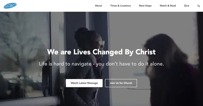
Why this works:
Lancaster County Bible Church provides another excellent example of visual hierarchy. Due to font size and its position on page, the mission statement catches the visitor’s eye immediately. Below there are two CTAs, one of which pops thanks to its white background. By highlighting a recommended option, LCBC’s website design reduces the time it takes a user to make a decision and makes it more likely that they do watch the latest message.
Feeling Inspired?
The best church websites provide an informative and engaging experience to visitors who may never have heard of the church, or may already be members. Looking at the websites above, you may feel inspired to implement bold typography, interactive elements, and a minimalist color scheme in your own design.

![Artistic Web Design: Best Tips [+ 15 Examples We Love]](https://blog.hubspot.com/hubfs/artistic-web-design (1).png)


![10 Brochure Website Examples to Inspire You in 2022 [+ How to Make One]](https://blog.hubspot.com/hubfs/GettyImages-1306185043 copy.jpg)


