There’s nothing quite like entering a new bakery for the first time. The sites, the sounds, and the smells hit you all at once, creating an atmosphere of comfort that’s hard to replicate anywhere else.

 If you’re building or redesigning a website for your bakery business, you should have the same goal in mind. Above all else, you want to make visitors feel comfortable while showing off your trademark creations, and maybe even sharing a bit about your backstory. What makes your treats unique, and how will you prove that to potential customers?
Of course, technology hasn’t progressed to the point where we can smell things through our phones and laptops. Fortunately, you can still include mouth-watering imagery on your website to produce a similar effect and get customers in the door.
To help get you started, we’ve found 20 bakery websites with unparalleled design. Each brings something unique to the table, so let’s dig in.
Best Bakery Websites
- King Arthur Baking Company
- Back Door Donuts
- OWL Bakery
- Chambelland
- Wildwood Bakery
- Steven Baker
- Salt N Sprinkles
- La Cannelle de Martini
- Sweet Mae’s Cookies
- Jane The Bakery
- Gruberbrot
- Partake
- Dominique Ansel Bakery
- Balthazar Bakery
- Justice of the Pies
- Hovey and Harrison
- Zak The Baker
- Yann Couvreur Pâtisserie
- La Newyorkina
- Gilles Marchal
1. King Arthur Baking Company
Why it works:
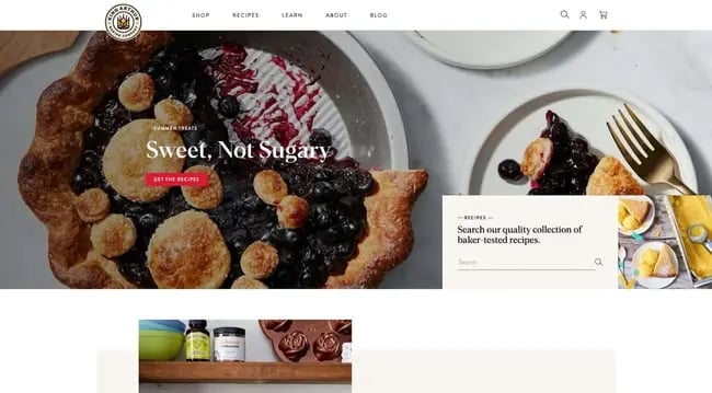
First up on our list is King Arthur Baking Company, an employee-owned bakery dedicated to responsibly sourced ingredients, environmental causes, and philanthropy. Its website is a fantastic display of its offerings, showcasing each item in a broken grid layout.
The colors are bright but not overwhelming, and its featured photos are detailed and crisp. Plus, the site is easily navigable whether you’re looking to shop, read the blog, or learn more about the company’s mission.
2. Back Door Donuts
Why it works:
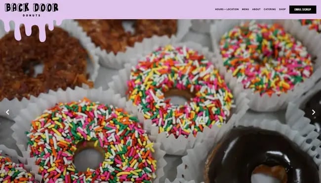
Based out of the serene island of Martha’s Vineyard, Back Door Donuts has a website that might just make you want to book a ferry ticket. The homepage features a prominent hero image slideshow, a pleasing color palette, and fun frosting drip effects consistent with their branding.
Visitors to the website can also explore the shop’s menu, backstory, store, and catering options. It’s an impressive testament to what the Bentobox website platform can do, though these design strategies can be carried over to any CMS or site builder with a bit of tweaking.
3. OWL Bakery
Why it works:
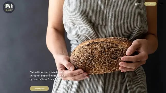
OWL Bakery’s website is another great example of an elegant, achievable bakery website that manages to feature both its creations and its story in harmony. The North Carolina-based bakery specializes in naturally leavened bread and European-inspired treats (hence the name Old World Levain).
This website makes excellent use of parallax scrolling on its homepage — text content sections are interspersed with large, detailed food images that scroll by smoothly. The online store component is also easy and intuitive, allowing visitors to easily fill their cards and place orders.
4. Chambelland
Why it works:
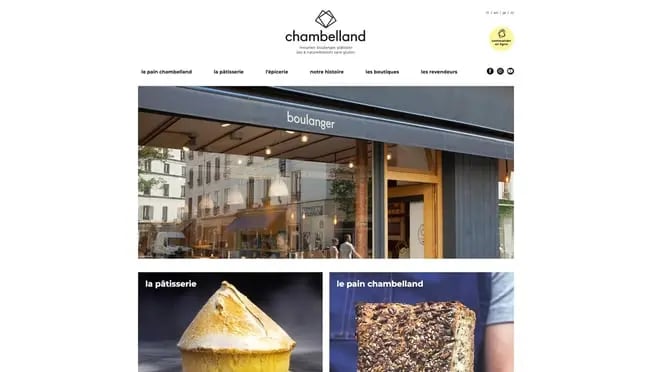
When in Paris, stopping by a bakery or a pastry shop (or both!) is an absolute must. As such, we’ve featured several Parisian bakery sites on this list, the first being Chambelland in the neighborhood of Folie-Méricourt. This incredibly clean site captures the modern appeal of the shop while keeping your eyes and taste buds engaged.
Clicking a homepage grid image will bring you to a product listing page where you can quickly order items online. Scroll a bit farther and you can learn more about the company’s history, recipes, and process illustrated in a one-of-a-kind comic. As a final helpful feature, the website lets visitors switch their site language to English, Japanese, or Dutch.
5. Wildwood Bakery

Why it works:
Based out of Australia, Wildwood bakery is worth a stop for delicious treats down under, and the same can certainly be said for its website. What makes this site stand out are its subtle but effective animations and earthy colors, creating a unique energy that you don’t get on competing sites.
The designers recognized the beauty in simplicity, opting to limit visitors’ options to a store, deliveries, and subscriptions. Other aspects of the business — like sustainability — have been pushed to the footer. This way, the website limits information overload and channels our attention where it wants.
6. Steven Baker
Why it works:
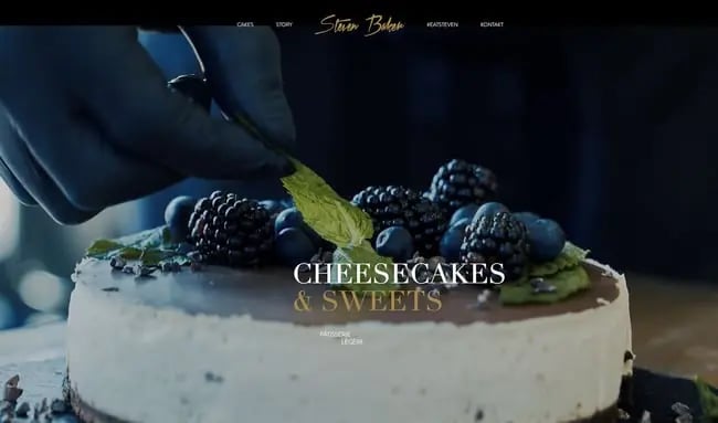
You can almost taste the images on Steven Baker’s website — the homepage greets you with detailed closeups of cheesecake and other sweets. Scroll down for a classy card carousel with the shop’s signature offerings, then the story behind them.
Interestingly, this website assumes a dark theme, not as common among bakery websites. However, this design choice shows this pastry chef isn’t afraid to stand out or leave an impression.
7. Salt N Sprinkles
Why it works:
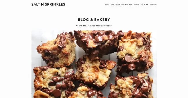
Salt N Sprinkles is a food blog and purveyor of vegan treats — her minimalist, Squarespace-powered website tells you everything you need to know to be sold. The homepage features delectable close-up photos of baked goods, along with CTAs to her newsletter and blog posts.
Not all sites require fancy gimmicks to convert visitors, and Salt N Sprinkles is proof of this. By focusing on clean designs, it’s easy to showcase your content and your creations in an irresistible manner.
8. La Cannelle de Martini
Why it works:
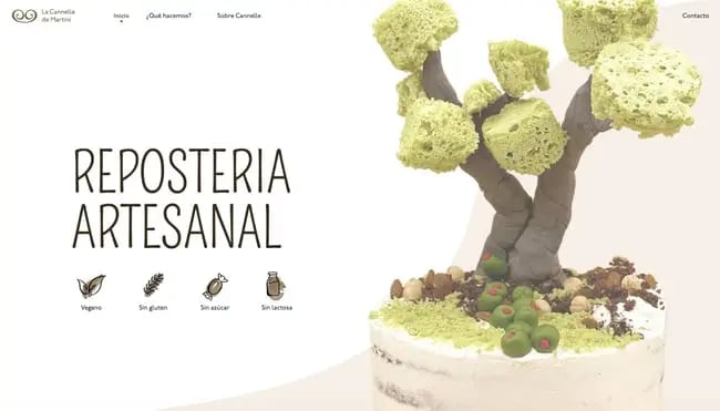
The Barcelona-based bakery La Cannelle de Martini is deeply committed to natural, Earth-friendly ingredients with its vegan, sugar-free, gluten-free, and dairy-free cakes. This is clear when you first land on the homepage — the site showcases one of its cakes topped with a spongy tree.
La Cannelle de Martini’s one-page website also has a unique scrolling experience. As you move down the page, images “paint” themselves on the screen with fun animations. It packs all visitors are looking for in one place, putting few obstacles between a first visit and an order.
9. Sweet Mae’s Cookies
Why it works:
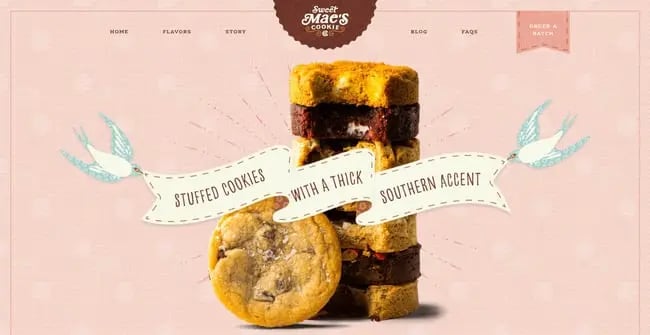
A departure from the more stripped-back designs we’ve seen so far, Sweet Mae’s Cookies goes all-out with its website’s visuals. The maximalist approach makes it one of my personal favorites here — the use of textures, the hover animations, and appetizing closeups all align for a perfectly cohesive design.
Built with WordPress and WooCommerce, the Sweet Mae’s Cookies website entices visitors to order as many of its creations as possible. By calling its creations “flavors,” the brand taps into our primal need for sugary snacks while inviting us in with Southern charm.
10. Jane The Bakery
Why it works:
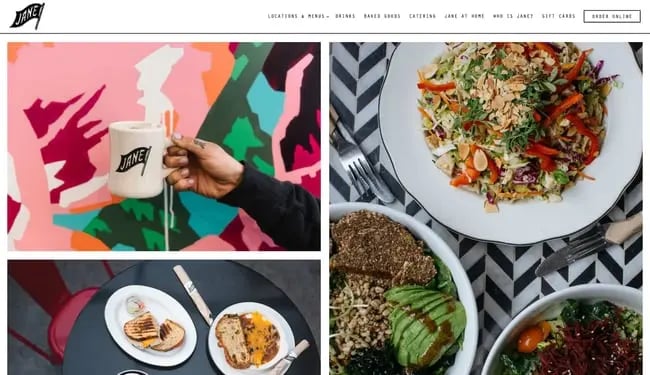
This website goes beyond simply featuring images of food — it’s a full-on collage of culinary delights. The prominent images draw San Francisco residents and visitors alike to one of its multiple locations — without a doubt, flooding our eyes with photos of sweet and savory treats is bound to work for some of us.
Unlike some other bakery websites, Jane places its story on the back burner. If you want, there’s an option in the main navigation menu to learn more about the company, but this website prioritizes the food. It goes to show that, while backstory is an important aspect for many eateries, it doesn’t need to be first-and-foremost on your site.
11. Gruberbrot
Why it works:
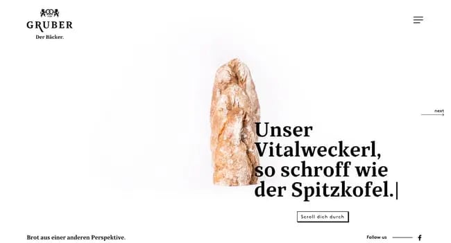
The creators of Gruberbrot’s website understand the value of whitespace in creating visual impact. This site’s layout is sparse, but what visuals it does include are impactful, prominent, and a little off-kilter. There are also some subtle effects sprinkled in, including animations triggered by scrolling and a navigation menu with an interesting hover effect.
12. Partake
Why it works:
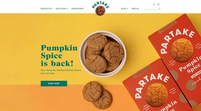
Built with Shopify, the Partake Foods website invites users in with a warm pastel color palette and friendly copy. Its products are vegan, gluten-free, and free from common allergens — an inclusive snack merits an inclusive website, and this one delivers.
Product pages on this website are also a delight to browse. The product packaging is consistent and in line with the website’s branding to the point where everything feels visually coherent and pleasing.
13. Dominique Ansel Bakery
Why it works:
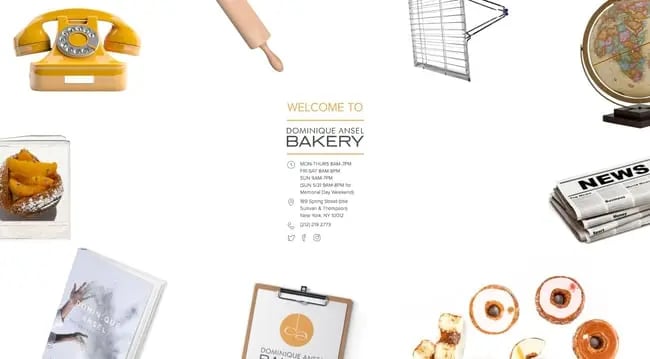
The website for Dominique Ansel’s New York City bakery is unlike anything else on this list, namely for its navigation. Instead of listing links in a text menu, This homepage has images for each link, with on-hover animation effects to indicate selection.
While unusual in its design, we think this website succeeds in its attempt to try something unique. Besides, if you have your heart set on a Cronut, a slightly unconventional site isn’t going to dissuade you.
14. Balthazar Bakery
Why it works:
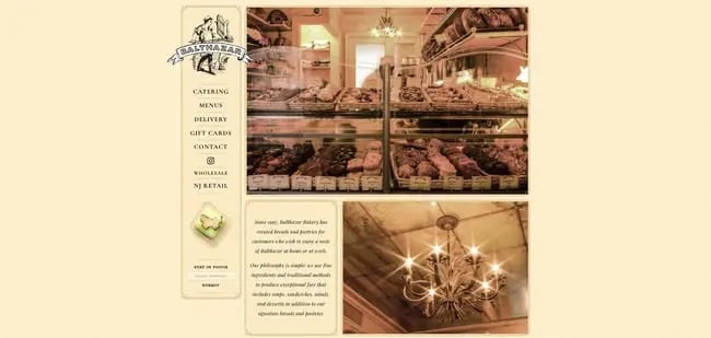
Here’s another NYC bakery that takes the opposite approach: The famous Balthazar Bakery has a website that mimics the look of a traditional restaurant menu, and keeps things consistent with a sepia color palette. This example demonstrates how, in order to capture the essence of your bakery, a throwback design might be more effective than a minimalist, modern design.
15. Justice of the Pies
Why it works:
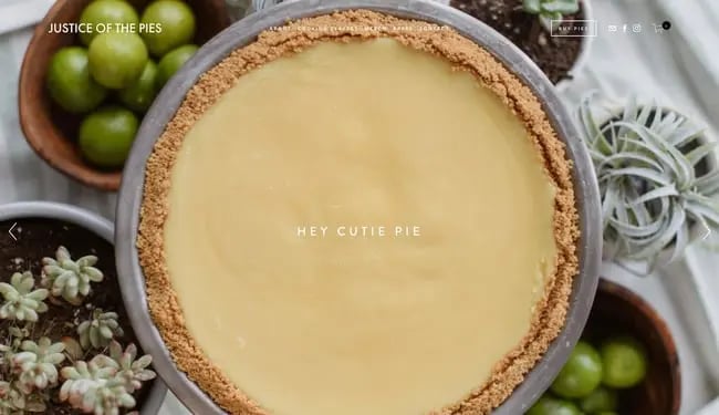
Justice of the Piece is another delightful bakery website that uses prominent images, parallax effects, and a touch of humorous copy to sell new visitors on its creations. It manages to balance a modern look and feel with a homey atmosphere.
Looking past the visuals, Justice of the Pies also emphasizes its story and its mission — visitors can easily learn more about the bakery’s backstory and learn how the L3C company gives back to its Chicago community.
16. Hovey & Harrison
Why it works:
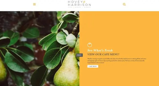
Hovey & Harrison does away with traditional scroll navigation altogether, instead opting for a one-of-a-kind homepage slider that combines images and informative copy. By clicking “Next”, users can view info about the bakery’s philosophy, produce sourcing, events, and menu. It’s a welcome break from the norm while retaining a familiarity that visitors will appreciate.
17. Zak The Baker

Why it works:
It’s clear why Zak The Baker’s website is special from the moment you land on the page — there’s a fullscreen animated video to welcome users aboard. The video adopts a watercolor aesthetic, depicting owner Zak departing his boat in the Miami harbor and heading to work. It’s a charming touch that adds a ton of character.
18. Yann Couvreur Pâtisserie
Why it works:
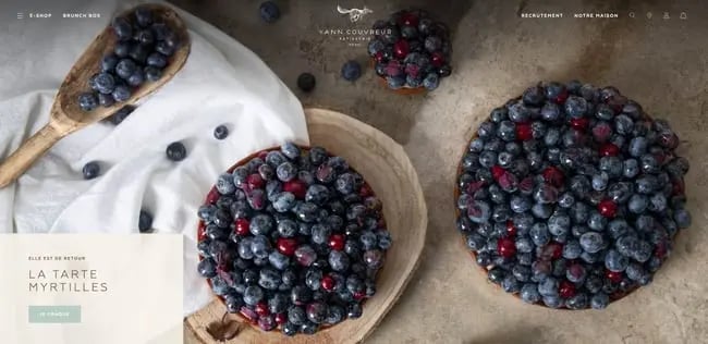
Yann Couvreur Pâtisserie is another Paris bakery that gets enough buzz to sustain itself without a dedicated website, but went and made a beautiful one anyway. This site might feature my favorite food images so far (a major achievement), with its close-ups of bread, cakes, and tarts that drift into view as the user scrolls down the page.
With a click, visitors can visit the bakery’s e-shop and place online orders. On the product pages and in the checkout process, it becomes clear that this site keeps to its branding and colors throughout — clearly, every detail was considered while crafting this bakery’s online home.
19. La Newyorkina
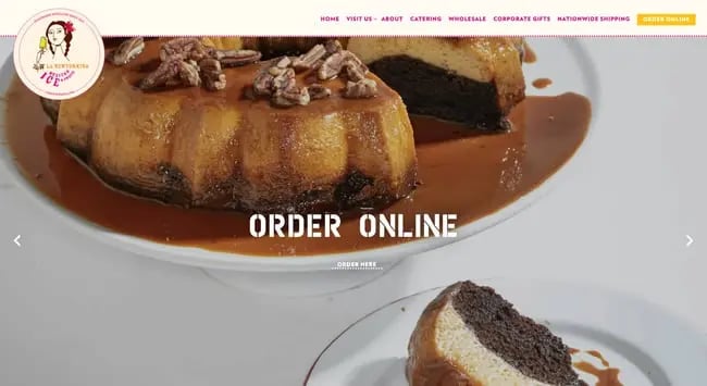
Why it works:
This list could use some more splashes of color — enter La Newyorkina, a New York City destination for sweet baked goods and frozen foods. The experience of browsing this site can be summed up with just a word: fun. From the hero slideshow to the order pages, everything is soaked in vibrant colors and enchanting imagery.
20. Gilles Marchal
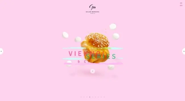
Why it works:
For our last example, let’s take one more trip back to Paris and visit the bakery (well, the bakery website) of Gilles Marchal. Perhaps the most contemporary take on a bakery website we’ve seen, Marchal’s website combines a slider effect, animated text boxes and colored brush strokes, and high-quality confectionery photography to bring users to its doors.
Where Else to Find Bakery Website Inspiration
Still need more ideas for your bakery site? We also recommend checking Pinterest and Instagram for examples of high-quality bakery websites. Here you’ll find collections from which you can draw color schemes, font ideas, and layouts that you might not have considered previously.
Of course, you can (and should) also find inspiration in your own work: Beyond your creations, what story are you trying to sell? Are you looking to give off a homier vibe, or does a chic aesthetic better align with your taste? Food is such a visual medium, so use this to your advantage when crafting your site for lunch … ahem, launch. Sorry, I’m a bit hungry after writing this.

![Artistic Web Design: Best Tips [+ 15 Examples We Love]](https://blog.hubspot.com/hubfs/artistic-web-design (1).png)


![10 Brochure Website Examples to Inspire You in 2022 [+ How to Make One]](https://blog.hubspot.com/hubfs/GettyImages-1306185043 copy.jpg)


