Designing a website is an exciting time — you finally get to take all the ideas you’ve been juggling in your head and turn them into something real. You may already have a list of inspiration websites, whose designs and user experience you aim to capture yourself.

But, what about websites that are truly exceptional?
For a website to win awards, it needs to transcend the typical user experience, and even the great user experience, to deliver something one-of-a-kind and unmatched in its space.
While building an award-winning website may be out of your scope in terms of technical limitations, time, or budget, you can still incorporate certain elements from each on your site. Plus, these examples are just plain cool to look at — they remind us of what’s possible in web development.
In this post, we’ve handpicked five award-winning website designs from the past few years. For each one, we’ll break down what makes it great and what we can learn from the designers.
- Best User Interface 2021, 2021 Webby Awards
- Site of the Day (2020), Awwwards
- Best Homepage, 2020 Webby Awards
- Best Homepage Nominee, 2020 Webby Awards
- Website of the Day (2021), CSS Design Awards
- Websites That Deserve a Standing Ovation
Award-Winning Websites
From the Webbys to Awwwards, here are some of our favorite award winners — let’s roll out the red carpet.
Kettle
Best User Interface 2021, 2021 Webby Awards
Creative branding agency Kettle has created a stunning online presence, carefully structured to bring collaborators on board. From the website alone, it’s clear this organization knows how to capture your attention, hold it, and prompt action at the right times.
Kettle’s website greets visitors with a full-width video featuring a rapid-fire overview of its projects, approach, aesthetics, and philosophy. Each shot lingers just long enough to process visually, but fast enough to account for the average viewer’s attention span.

As you scroll, you’ll notice Kettle forgoes traditional vertical scrolling for an incremental scrolling method — sections in the homepage are presented like a slideshow. This “drip” of information focuses visitors’ attention more precisely. After the video, the website features projects with major brands to establish credibility (along with a CTA to a contact form).

Clicking away to one of these case studies presents an overview of the agency’s work. Note how all case study pages assume similar formatting and branding — the projects are different, but Kettle always applies its trademark approach.
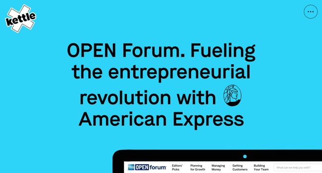
Returning to the homepage, Kettle uses the available real estate to highlight its standout projects. On each slide, the cursor itself acts as a CTA, prompting users to click anywhere to explore a project in-depth. This technique lowers interaction cost since the user need not move their cursor to a button or hyperlink.

While Kettle’s homepage scrolling method works, it applies standard scrolling to its other pages. That’s probably for the best, since staggered scrolling is bound to get tedious after a while. For faster site-wide navigation, there’s a menu in the top corner where users can jump between case studies. On unconventional sites like this, a more familiar component like a menu can help ground users and keep them around longer.

If you’re looking for more design inspiration, design agency websites and web development agency sites are great places to look — these websites are literally what these organizations do best.
Garoa Skincare
Site of the Day (2020), Awwwards
Especially with ecommerce websites, it’s easy to fall in line with design norms. There’s nothing wrong with that — ecommerce websites need to display a lot of information in ways that users are accustomed to. But, conventional online stores typically don’t win awards.
Our next featured website aims to defy conventions while retaining familiarity to promote sales. The website for Garoa Skincare sells seasonal skincare products sets an example for other businesses to strive for.

On the front end, this website is so rich with details that it's easy to miss many of them. Upon scrolling, you’re met with animated user interface elements, parallax effects of varying speeds, side-scrolling, subtle text animations, and fade transitions between pages.

These effects make the whole site feel like a living entity, recalling the natural environments that the site’s branding ties to evoke. Somehow, they’re incorporated in a way that feels not overwhelming, but cohesive.
This excellent design isn’t limited to the homepage either: Each product page itself is an experience, providing instructions and a comprehensive ingredient list for every product.

Even the cart adopts the rest of the site’s aesthetic. Whereas many ecommerce sites seem to ditch the front-end branding in the checkout section, Garoa skincare carries it over nicely.
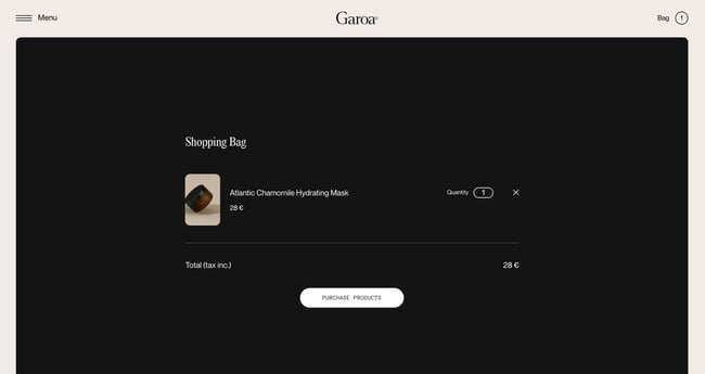
When you proceed with checkout you’ll be directed back to the homepage. This is because — sorry to break it to you — Garoa isn’t an actual business. This website is a portfolio project of designer Bruno Arizio. Of course, this doesn’t detract from the website’s merit, and there’s so much here to draw from and apply to your own (hopefully real) business.
The Third Strike
Best Homepage, 2020 Webby Awards
Creating emotional impact through a website is difficult. When browsing the web, users probably aren’t looking to be emotionally affected in the way they might be while consuming other art or entertainment. Some websites pull it off, though, including The Third Strike.
The Third Strike is a documentary film and campaign that brings attention to those affected by the three-strikes law in the United States, which imposes harsh punishments on repeat offenders of nonviolent drug offenses. It’s a heavy but important issue that this website communicates effectively.
The experience of visiting the Third Strike website begins with a splash page prompting visitors to turn on sound, always a good choice before an audio or video clip autoplays.

After that, there’s a short trailer for the documentary to serve as an introduction for the film, the website, and the Decarceration Collective, which is the organization featured in the documentary.

The real gem of this website is the audiovisual homepage that follows — a spread of photos of inmates incarcerated under the three-strikes rule. There’s no scrolling here. Instead, users navigate this page with their cursors. Selecting a photograph takes you to an offender’s story page.

The stories are expertly composed, combining text, imagery, vector graphics, and audio to recount each inmate’s life, deliver an emotional impact, and inspire action. Each story ends with a prompt to read the next story.

Lastly, the site’s navigation menu includes links to resources where you can learn more about the three-strikes rule and the work of the Decarceration Collective. The ordering of information matters here — you learn about the people first, as they’re the reason this website and this organization exist. Everything else comes after.
Crafted
Best Homepage Nominee, 2020 Webby Awards
Crafted organizes events (called “experiences”) for professionals, each centered on a different theme. Its website, while perhaps simpler on the surface than previous selections, brings attention to detail and careful design to help it stand out.
The first thing you’ll notice on Crafted’s homepage is the sparse broken grid, which emphasizes the prominent text. It’s important to convey Crafted’s purpose right away, as first-time visitors likely aren’t aware of what the nontraditional company does.
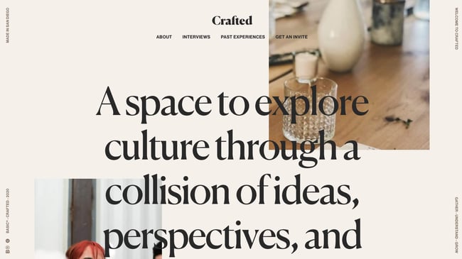
Notice how the images are scroll-responsive, zooming in and out as you move down the page. The effect is subtle, enough for users to register, though maybe not consciously. This small design touch elevates the images above other image-heavy websites and makes the page feel dynamic and fun.

Crafted also knows the value of whitespace (or, in this case, more like tan-space). It gives page elements space to breathe and retains only the most vital page elements
Users can explore past experiences hosted by crafted, each one a gallery of event photos and a guest list. But, watch what happens when you reach the bottom of a page. Instead of being instructed to click to the next page, you simply continue scrolling. The website eventually sends us to the next experience page. The whole experience is seamless — there are no visible loading elements, and it’s very well done.

And let’s not forget about the little illustrations that pop up during page loads — another way to keep things lighthearted as we move between pages on the website.

Giulia Tonon
Website of the Day (2021), CSS Design Awards
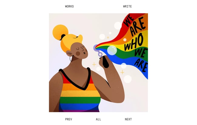
Our last feature is a portfolio website by illustrator and graphic designer Giulia Tonon, recipient of a CSS Design Award. Like all great portfolio websites, this one keeps things simple and focused on the art. However, unlike most, the site itself highlights the work beyond what a simple gallery might do.
The standout section of the website is the homepage, in which users scroll to reveal art entering from the top and the bottom, moving in both directions. This works particularly well for Tonon’s art pieces, which have consistent dimensions. The animations make the work appear as if they’re floating in space, like papers in the air.
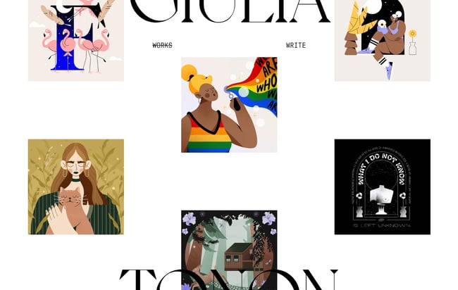
Click on an image to view a larger version, then either return to the homepage or click through the images in a more traditional slideshow view.
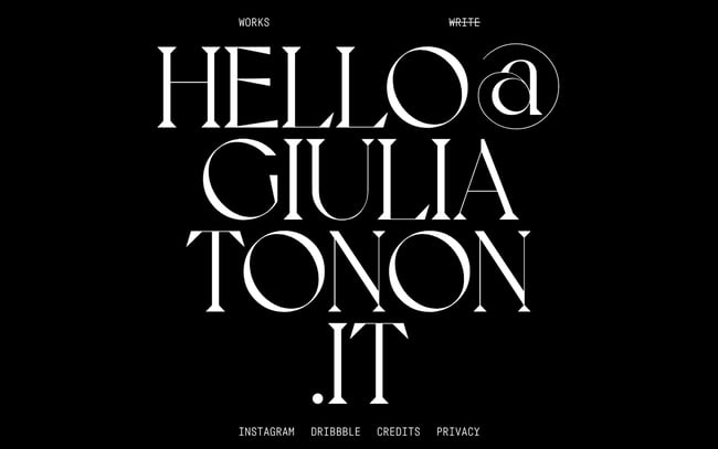
It’s clear how to contact the artist as well — the site presents a contact page, which is simply a mailto link that’s too big to miss.
This simple but effective site reminds us that some of the best website designs aren’t always the most elaborate or content-rich (though the quality of the content certainly matters). Rather, these designs utilize techniques in ways that complement the existing content, to present it in new and delightful ways.
Websites That Deserve a Standing Ovation
You may not be attempting to build a business or personal website that wins awards, but it doesn’t hurt to find inspiration from the best that the internet has to offer. Even if you take just one or two small ideas from your research, it’s worth it.
Finally, these examples teach us that the most standout websites aren’t just collections of web pages — they’re complete experiences whose design elevates the content without drawing our attention away, ultimately leading to better engagement and more conversions. Sure, a trophy is nice, but those are the real rewards.


![Artistic Web Design: Best Tips [+ 15 Examples We Love]](https://blog.hubspot.com/hubfs/artistic-web-design (1).png)


![10 Brochure Website Examples to Inspire You in 2022 [+ How to Make One]](https://blog.hubspot.com/hubfs/GettyImages-1306185043 copy.jpg)

