As an artist, you'll likely be focused on your medium of choice — whether that be photography, paint, video, or a multimedia mix. However, every artist also needs a grasp of web design. Why? They need to make a website that pops.
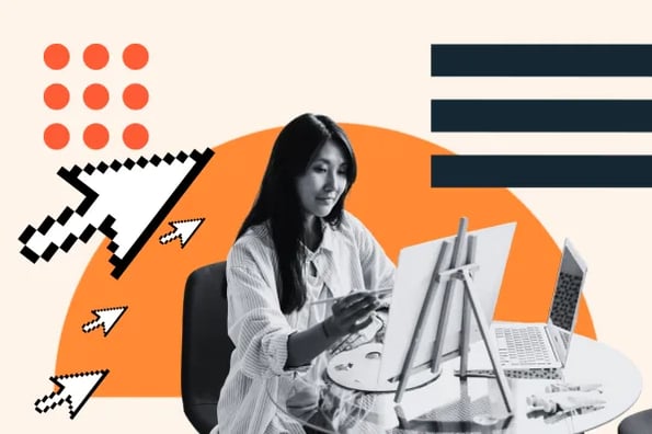
A website is a great way to show off your artistic style and direction. You can connect with your fans, showing them where your work will be next. You can also sell your work, amplify your story, and create a digital portfolio to garner commissions.

Naturally, artists' websites are some of the most creative websites we've seen. We've pulled together a list of 21 of our favorite websites that have caught our eye. These role models will inspire you to level up your digital presence. Let's dive in.
The Best Artist Website Examples
- Leah Gardner
- June Digan
- Jennifer Cartright
- Zaria Forman
- Andrea Lawl Manning
- Andrew L. Shea
- Alonsa Guevara
- Steven Kozar
- Livia Falcaru
- Alex Weir
- Charly Palmer
- Robert Wilson
- Mark Maggiori
- Nathalie Lete
- Owen Gent
- Nedavius
- Timothy Goodman
- Jessie Maxwell Bearden
- Shira Bar
- Wim Delvoye
1. Leah Gardner
 The artist's bright paintings shine through on the homepage and welcome the viewer to the website. Here, you can click through digital images of her work and get a better understanding of her style.
Gardner also includes a section where visitors can sign up for her newsletter. The bright yellow CTA pops, catching the viewer's eye.
What we like: Gardner recently partnered with JIGGY to turn one of her paintings into a puzzle. How do I know? A popup appeared on the site when it loaded, allowing me to shop the connection off-platform. This was a great way to notify me of this new collaboration.
2. June Digan
 Manila-based artist June Digan uses state-of-the-art web design to showcase her illustrations. The header on each page uses parallax scrolling, where the background of the section remains still as the foreground changes. My eyes linger on the vibrant background, even after I finish reading the text.
Digan then uses a full-page grid to showcase her work. Each portion of the grid is one of her illustrations. If you cover over the image, a pink overlay appears, along with the reason the work was created. With a click, you can learn more about the collection and see other works it includes.
What we like: The header is simple but includes all vital information. Digan has the perfect balance of text and vivid imagery.
3. Jennifer Cartright

Jennifer Cartright knows how to use color and typography to elevate her site. Let's take a look at the homepage to start. The background image is eye-catching, both literally and figuratively. Bright yellow is used sparingly for her name, the art icon, and as a way to highlight which page you're currently on. Only the title of her site is in bold.
The photo gallery section also shows the brilliance of simple design. If you click on an image, the lightbox effect occurs. You can see the image in large and learn more about the photo.
What we like: The website has limited buttons, which strengthens the navigation. You're never distracted and know exactly what the artist wants you to do next.
4. Zaria Forman

I love the opening image on Zaria Forman's site. You see her holding a photo of an icy landscape as she paints the scene on a large canvas. Her bright blue shirt matches the painting, while the vibrancy of the shade catches your eye. If you scroll, the header disappears, so you can see the image in all its glory.
This image is a strong introduction to Forman's passion for documenting climate change with pastels. If you're looking to connect yourself with your subject, take a page out of Forman's sketchbook.
What we like: The site's header includes different tabs that are easily navigated. The prints section automatically redirects to an external store where visitors can shop.
5. Andrea Lawl Manning
 When I think of galleries, I picture white walls that allow the artistic work to pop. Andrea Lawl Manning's website captures this aesthetic. The design is light, airy, and breezy, with spaced-out work on the homepage.
The sidebar identifies easy navigation for the viewer. You can picture yourself enjoying the work at an exhibition in person.
What we like: Manning's site also makes use of the lightbox effect. If you click on an image, it appears on your screen in its full size.
6. Andrew L. Shea

When you visit Andrew L. Shea's site, you have two ways to view the home page. The first is a digital gallery, showcasing each of his recent paintings. You can scroll with the click of an arrow between works. The section option is a grid showing all of his recent paintings at once.
I love how this simple feature centers the user in the experience. You can choose your preferred way to view the work on Shea's site. The same effect is carried between each page on the platform.
What we like: Shea's website is another excellent example of a website that highlights the work to entice the audience. The copy is clean and consistent, and the photos bring attention to the artist's style.
7. Alonsa Guevara
 Alonsa Guevara's website immerses you in the artist's work immediately. The homepage has one painting in vibrant green. The only text? The artist's name. You're invited to stare at this initial work, assessing its meaning.
The time you spend staring becomes increasingly rewarding. You can see the image of two birds kissing, an owl looking from the background, and the branches of trees. You can see that Guevara's style pulls from magic-eye paintings and makes the most of optical illusions.
What we like: Once you click her name, Guevara's site transforms. There is more information about the work and the artist. You're already primed and excited to learn more.
8. Steven Kozar
.webp?width=650&height=354&name=StevenKozar%20(2).webp) Ignore the bold header. Am I looking at a painting or a photograph? At first, I thought it was a photograph. However, once I read the site heading, I learned that the image is a hyper-realist painting. My jaw dropped at how well every detail was captured.
Ignore the bold header. Am I looking at a painting or a photograph? At first, I thought it was a photograph. However, once I read the site heading, I learned that the image is a hyper-realist painting. My jaw dropped at how well every detail was captured.
The homepage makes Kozar's paintings seem like photographs. The truth is only discovered at a further glance. The text is simple and doesn't crowd the piece, allowing it to speak for itself.
What we like: Kozar wants you to visit his studio, which he makes clear on his website. Here, you can find his address, a map to his shop, and an enticing message to say hi to his dog, Lucy.
9. Livia Falcaru
 This website features some of the most recent campaigns Falcaru has worked on. If you're interested in commissioning her work, you'll be enticed by all of the big brands she's worked with. That includes magazine Vogue, digital publication Apartment Therapy, and soda brand Fanta.
What we like: Falcaru's site makes the most of gifs. If multiple images were used in a publication, gifs switch between them. If the images were used in an animation, the image moves.
10. Alex Weir
 Looking to buy an art piece? Can you picture it in your home or business? Having the pieces in the real world allows the viewer to envision what the work will look like in their space. Weir knows this, showcasing images of where his work is displayed.
Seeing many pieces of work at once allows us to get an understanding of the artists' work. The visuals are fun to flip through, as they've included a carousel style on their homepage.
What we like: In the work section, you can learn about the types of projects he's made. That includes painting, prints, and zines.
11. Charly Palmer
 Instead of still images or a gallery, Charly Palmer's website opens with a feature video. Here, we can see the artist at work. We watch as he goes through different media to create his work. The headers also include all the information needed about the portfolio and store.
What we like: Palmer's site uses a unique, graffiti-like font. This reflects the street art inspirations that influence his work.
12. Robert Wilson
 Typically, on websites, navigation appears at the top of the page. Robert Wilson's site subverts expectations. The links to move throughout the site appear where the footer would traditionally be. This allows his work to be the first thing you see.
Wilson uses a black background for his site. This allows his work and font of choice to pop. Your eye is immediately drawn in to learn more. The images shift the longer you linger, so you can see more and more of the artist's work.
What we like: The website also makes note of the next time the artist will put on a show. You can see all upcoming exhibitions in a calendar view for convenience.
13. Mark Maggiori 
Mark Maggiori's website is another that features both the artist and the artwork. Further, the site has truly minimalist navigation. There are only three sections for you to explore.
What we like: Maggiori doesn't always have work available for purchase, so his site tells you when you can expect his next drop. This creates a sense of excitement. Further, there's an urgency to make a purchase when pieces are available.
14. Nathalie Lete
 Nathalie Lete's website showcases her work in an innovative way on her website. When the homepage loads, you see a grid of icons in Lete's style. The font on the site looks like handwriting, and the background pulls inspiration from sketchpad paper. The gridded background also uses parallax scrolling to add extra depth.
What we like: Lete immerses you immediately in her style, bringing you into the mind of an artist. This makes the process of exploring the site interactive and fun.
15. Owen Gent
 As an artist, you likely have multiple streams of revenue. You can create commissioned work for publications, draw covers for books, or sell your work directly. Owen Gent shows all of his offerings in his site header. This makes it easy for potential clients to explore the work that he does.
In his header, Gent also has a link to courses he's made. These links bring you to an external platform where you can learn more.
What we like: Gent's work is prominent immediately on the site. You can easily identify the style he specializes in.
16. Nedavius
 If you're reading this article, you've definitely used a desktop computer at least once. You know how to click through folders to find what you're looking for. Nedavius uses this iconic format as a unique way to showcase his work. He uses folders reminiscent of a desktop, allowing the viewer to click through and interact with the platform.
What we like: Nedavius makes creative projects through visual world-building. His 3D DJ on the home page, bobbing animated logo, and alien lounging across his website all show off this style.
17. Timothy Goodman

I could stare at Timothy Goodman's homepage all day. The header image has a coloring book quality, with white space highlighting the yellow that makes the design pop. Further, the longer you look, the more you see the image move. Mouths open, letters light up, and a hand bobs up and down. This captivates me and makes me more likely to spend time on the site.
What we like: The homepage only has two navigation options on the left-hand side, the most prominent site. You are drawn to learn more about the work he makes or his graphic memoir. The calls-to-action are clear.
18. Jessie Maxwell Bearden
 This website opens with a sweeping video, welcoming the viewer. The image itself changes over time. The eyes wink, and text slides in. The fun and whimsical design makes the site stand out. The colors play more into the fun nature of the page.
What we like: Bearden lists her clients clearly on her website. Here, you see recognizable brands like Grubhub, Nickelodeon, Marvel, and ESPN. If you're interested in working with her, you already know that Bearden has collaborated with well-known brands.
19. Shira Bar
 As with many artists' websites we've seen, the art is on display, front and center on the homepage. The viewer's eye is brought right to the piece. The artist also included essential tabs at the top of the page, allowing the viewer to click through and learn more.
What we like: You can intuit that Bar is a photograph from the first image of her site. The picture is crisp but has clearly identifiable film grain. The work lets you infer the medium.
20. Wim Delvoye

If you've ever played the Sims, you're familiar with the grided overview of the city you've made. Wim Delvoye pays homage to this popular video game in WimCity, the first image you see on his website. Here, you can click through the different plots and discover his work through other pages.
What we like: Delvoye used a popular video game as a unique theme for his site. The navigation is intuitive and interactive. I had fun exploring his artistic work.
How to Design an Artist Website
Plan what to display.
Your website should showcase two things: your art and your business. You'll need to pick out what works to put on your site. These should be the most representative of your personality and style. If you choose to showcase all your work, pick out your best pieces for your homepage.
From there, you should list the types of offerings that you have for people to buy. Do you take commissions? Do you work for magazines? Do you have a shop? Your website should make this clear.
When thinking about what you would like your website to look like, create a list of elements and designs you would like to see for your work or yourself. The examples above are a great starting point.
Understand your software needs.
Once you know what you want to show, it's time to be honest about your technical abilities. If you're an artist who can code, you may be able to bring your vision to life yourself. If not, you can consider hiring a web designer or using a customizable, premade template.
The content management system or website builder you choose will have a directory of themes or templates. Here, you can search for options related to your artistic vision. Always be sure that the one you choose is mobile responsive since most people browse the internet on their smartphones.
Looking for a CMS to start with? HubSpot offers a no-code free CMS.
Update and personalize your design.
The fun part begins once you've picked where to build your website. To capture your unique brand identity and make the design your own, you'll want to include the following on your site:
-
Your logo.
-
A color palette and font to match your art style.
-
Fresh copy to describe your work.
-
Social media icons.
-
Personalized forms.
Once you've taken this step, you can really see your design come to life.
Add a store.
If you want to sell your art, add an online shop. You can add different plug-ins to sell prints, merch, postcards, and coffee table books if you have them. If you already have an online shop, you can link to it externally in your site navigation.
The Best Website Designs to Inspire Yours
While art styles vary widely between artists, all of their websites use the foundational principles of good design. Take pointers from the examples you like, then combine them into something that's truly your own. We know you'll want the work to talk for itself, but this process can help you reach new eyes and new clients.

![Artistic Web Design: Best Tips [+ 15 Examples We Love]](https://blog.hubspot.com/hubfs/artistic-web-design (1).png)


![10 Brochure Website Examples to Inspire You in 2022 [+ How to Make One]](https://blog.hubspot.com/hubfs/GettyImages-1306185043 copy.jpg)